FlexButton
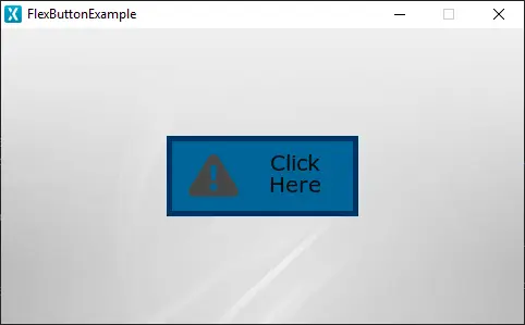
A FlexButton in TouchGFX is a widget that is aware of touch events and can send a callback when the FlexButton is triggered. The FlexButton is adaptable to the needs of the user. It can combine the behaviour and appearance of other button types but takes up a bit more RAM as a tradeoff. This will, however, in most cases be an insignificant amount. The FlexButton can be composed of a maximum of 4 visual elements: BoxWithBorder, Icon, Text and Image.
Widget Group
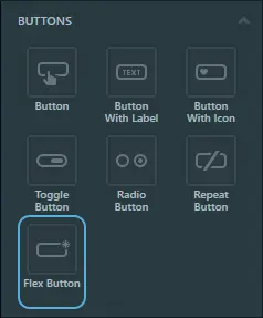
The FlexButton can be found in the Buttons widget group in TouchGFX Designer.
Properties
The properties for a FlexButton in TouchGFX Designer.
| Property Group | Property Descriptions |
|---|---|
| Name | Name of the widget. Name is the unique identifier used in TouchGFX Designer and code. |
| Location | X and Y specify the top left corner of the widget relative to its parent. W and H specify the width and height of the widget. Visible specifies the visibility of the widget. Making the widget invisible also disables interacting with the widget through the screen. |
| Appearance | Alpha specifies the transparency of the widget. The alpha value ranges between 0 and 255 for the widget. 0 is fully transparent and 255 is solid. |
| Trigger | Click , Touch , Toggle and Repeat specify which action triggers the button callback. |
| Visual Elements | Image , Box With Border , Text and Icon specify which elements make up the widgets visual appearance. |
| Mixins | Draggable specifies if the widget is draggable at runtime. ClickListener specifies if the widget emits a callback when clicked. FadeAnimator specifies if the widget can animate changes to its Alpha value. MoveAnimator specifies if the widget can animate changes to X and Y values. |
Interactions
The actions and triggers supported by the FlexButton are described in the following sections.
Actions
| Standard widget action | Description |
|---|---|
| Move widget | Move a widget to a new position over time. |
| Fade widget | Modify alpha value of widget over time. |
| Hide widget | Hides a widget (sets visibility to false). |
| Show widget | Make a hidden widget visible (sets visibility to true). |
Triggers
| Trigger | Description |
|---|---|
| Button is clicked | A button has been clicked. |
Performance
A FlexButton is potentially composed of up to two Boxes, four Images and one Text, and relies on image and text drawing. Text drawing is very similar to general image drawing (though due to the nature of text characters, a significant amount of alpha blending takes place). Therefore, the FlexButton is considered a fast widget on most platforms.
For more details on drawing performance, read the General UI Component Performance section.
Examples
Generated Code
In the generated code for the View base class we can see how TouchGFX Designer sets up a FlexButton. The code corresponds to the FlexButton shown at the start of this section, combining the behavior and appearance of the BoxWithBorder, Icon and Text elements.
Screen1ViewBase.cpp
#include <gui_generated/screen1_screen/Screen1ViewBase.hpp>
#include "BitmapDatabase.hpp"

Screen1ViewBase::Screen1ViewBase() :
    buttonCallback(this, &Screen1ViewBase::buttonCallbackHandler)
{
                            // Box with Border behavior and appearance
    flexButtonName.setBoxWithBorderPosition(0, 0, 176, 74);
    flexButtonName.setBorderSize(5);
    flexButtonName.setBoxWithBorderColors(touchgfx::Color::getColorFrom24BitRGB(0, 102, 153), touchgfx::Color::getColorFrom24BitRGB(0, 153, 204), touchgfx::Color::getColorFrom24BitRGB(0, 51, 102), touchgfx::Color::getColorFrom24BitRGB(51, 102, 153));
                            // Text behavior and appearance
    flexButtonName.setText(TypedText(T_SINGLEUSEID1));
    flexButtonName.setTextPosition(30, 12, 176, 74);
    flexButtonName.setTextColors(touchgfx::Color::getColorFrom24BitRGB(10, 10, 10), touchgfx::Color::getColorFrom24BitRGB(10, 10, 10));
                            // Icon behavior and appearance
    flexButtonName.setIconBitmaps(Bitmap(BITMAP_BLUE_ICONS_ALERT_32_ID), Bitmap(BITMAP_BLUE_ICONS_ALERT_32_ID));
    flexButtonName.setIconXY(20, 17);
                            // Widget
    flexButtonName.setPosition(152, 99, 176, 74);
    flexButtonName.setAction(flexButtonCallback);

    add(flexButtonName);
}

void Screen1ViewBase::flexButtonCallbackHandler(const touchgfx::AbstractButtonContainer& src)
{
    if (&src == &flexButtonName)
    {
        //InteractionName
        //When FlexButtonName clicked calls the new virtual function "functionName()" set by the user
        functionName();
    }
}
Tip
flexButtonName.invalidate() if you change the appearance of the widget.TouchGFX Designer Examples
To further explore the FlexButton, try creating a new application within TouchGFX Designer with the following UI template:


