ButtonWithLabel
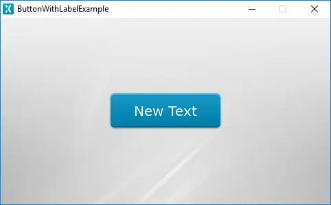
A ButtonWithLabel in TouchGFX is a widget that is aware of touch events and can send a callback when the ButtonWithLabel is released. Each state, pressed and released, is associated with an image and a text.
The ButtonWithLabel can be replicated with the FlexButton. A FlexButton is a more configurable button that takes up a bit more RAM in exchange for flexibility.
Widget Group
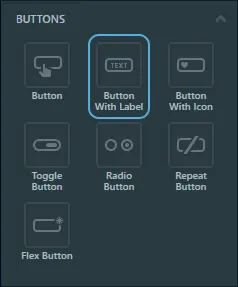
The ButtonWithLabel can be found in the Buttons widget group in TouchGFX Designer.
Properties
The properties for the ButtonWithLabel are described in the following sections.
| Property Group | Property Descriptions |
|---|---|
| Name | Name of the widget. Name is the unique identifier used in TouchGFX Designer and code. |
| Location | X and Y specify the top left corner of the widget relative to its parent. W and H specify the width and height of the widget. The size of a ButtonWithLabel is determined by the size of the selected images. Visible specifies the visibility of the widget. Making the widget invisible also disables interacting with the widget through the screen. |
| Text | Single Use and Ressource specify the type of text: unique or from a known ressource. When Single Use is selected: Text specifies the content of the text to be displayed. Typography specifies the format of the text. Alignment specifies the horizontal alignment of the text relative to the widget. When Ressource is selected: Ressource ID specifies the ressource to retrieve the text from. For more details on text configuration, refer to the Using texts and fonts section. |
| Text Appearance | Released Color and Pressed Color specify the color of the Text in the pressed and released states. Alpha specifies the transparency of the widget. The alpha value ranges between 0 and 255 for the widget. 0 is fully transparent and 255 is solid. Text Rotation specifies the angle in degrees of rotation of the text. There are four possible angles : 0, 90, 80 and 270 degrees. |
| Style | Style specifies a predefined setup of the widget, that sets select properties to predefined values. These styles contain images that are free to use. |
| Image | Released Image and Pressed Image specify the images assigned to the pressed and released states fron the Designer skin library or the Project folder. |
| Mixins | Draggable specifies if the widget is draggable at runtime. ClickListener specifies if the widget emits a callback when clicked. FadeAnimator specifies if the widget can animate changes to its Alpha value. MoveAnimator specifies if the widget can animate changes to X and Y values. |
Interactions
The actions and triggers supported by the ButtonWithLabel are described in the following sections.
Actions
| Specific widget action | Description |
|---|---|
| Set label color type | Set the color of the text. |
| Standard widget action | Description |
|---|---|
| Move widget | Move a widget to a new position over time. |
| Fade widget | Modify alpha value of widget over time. |
| Hide widget | Hides a widget (sets visibility to false). |
| Show widget | Make a hidden widget visible (sets visibility to true). |
Triggers
| Trigger | Description |
|---|---|
| Button is clicked | A ButtonWithLabel has been clicked. |
Performance
A ButtonWithLabel is composed of two images and text, and is dependent on image and text drawing. Text drawing is very similar to general image drawing (though due to the nature of text characters, a significant amount of alpha blending takes place). Therefore, the ButtonWithLabel is considered a fast widget on most platforms.
For more details on text drawing performance, read the General UI Component Performance section.
Examples
Generated Code
In the generated code for the View base class we can see how TouchGFX Designer sets up a ButtonWithLabel.
Screen1ViewBase.cpp
#include <gui_generated/screen1_screen/Screen1ViewBase.hpp>
#include "BitmapDatabase.hpp"
#include <texts/TextKeysAndLanguages.hpp>
#include <touchgfx/Color.hpp>

Screen1ViewBase::Screen1ViewBase() :
    buttonCallback(this, &Screen1ViewBase::buttonCallbackHandler)
{
    buttonWithLabelName.setXY(155, 106);
    buttonWithLabelName.setBitmaps(touchgfx::Bitmap(BITMAP_BLUE_BUTTONS_ROUND_EDGE_SMALL_ID), touchgfx::Bitmap(BITMAP_BLUE_BUTTONS_ROUND_EDGE_SMALL_PRESSED_ID));
    buttonWithLabelName.setLabelText(touchgfx::TypedText(T_SINGLEUSEID1));
    buttonWithLabelName.setLabelColor(touchgfx::Color::getColorFrom24BitRGB(255, 255, 255));
    buttonWithLabelName.setLabelColorPressed(touchgfx::Color::getColorFrom24BitRGB(255, 255, 255));
    buttonWithLabelName.setLabelRotation(TEXT_ROTATE_0);
    buttonWithLabelName.setAction(buttonCallback);

    add(buttonWithLabelName);
}

void Screen1ViewBase::buttonCallbackHandler(const touchgfx::AbstractButton& src)
{
    if (&src == &buttonWithLabelName)
    {
        //InteractionName
        //When buttonName clicked calls the new virtual function "functionName()" set by the user
        functionName();
    }
}
Tip
buttonWithLabelName.invalidate() if you change the appearance of the widget.TouchGFX Designer Examples
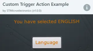
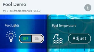
To further explore the ButtonWithLabel, try creating a new application within TouchGFX Designer with the following UI templates:


