Slider
A Slider uses three images to display a slider either in a vertical or horizontal orientation. The indicator image of a Slider can be dragged to modify an internal integer value that is broadcasted through callbacks. The value broadcasted operates on an integer value range e.g. 0 to 100.
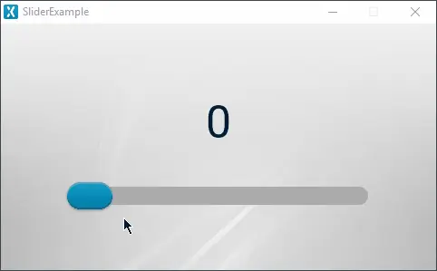
Slider running in the simulator
Widget Group
The Slider can be found in the Miscellaneous widget group in TouchGFX Designer.
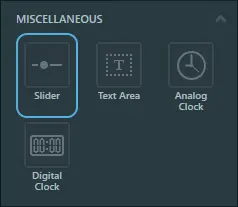
Slider in TouchGFX Designer
Properties
The properties for a Slider in TouchGFX Designer.
| Property Group | Property Descriptions |
|---|---|
| Name | Name of the widget. Name is the unique identifier used in TouchGFX Designer and code. |
| Type | Type specifies whether the Slider should be vertically or horizontally oriented. |
| Location | X and Y specify the top left corner of the widget relative to its parent. W and H specify the width and height of the widget. The size of a Slider is taken from the size of the associated images and cannot be altered except by changing the images. Visible specifies the visibility of the widget. Making the widget invisible also disables interacting with the widget through the screen.. |
| Style | Style specifies a predefined setup of the widget, that sets select properties to predefined values. These styles contain images that are free to use. |
| Image | Background Image specifies the background image that the indicator slides across. Background Filled Image specifies the image filling the area on top of the background image behind the indicator. Indicator Image specifies the image that can be dragged to change the value of the slider. The background image and background filled image must both be the same size. |
| Positions | Background Position X and Background Position Y specify the top left corner position of the Background Image and Background Filled Image. Indicator Position Min and Indicator Position Max specify the minimum and maximum positions of the Indicator Image. For a horizontal slider these two values are in the x-axis and for a vertical slider they are in the y-axis. Indicator Position Y specifies the indicator image's position in the y-axis. If the slider is vertically oriented this value instead adjusts in the x-axis. |
| Values | Min and Max specifies the internal integer range that is broadcast from the Slider using callbacks. Start specifies the initial internal value in the Slider. This also changes the initial position of the indicator. |
| Mixins | Draggable specifies if the widget is draggable at runtime. ClickListener specifies if the widget emits a callback when clicked. MoveAnimator specifies if the widget can animate changes to X and Y values. |
Interactions
The actions and triggers supported by the Slider are described in the following sections.
Actions
| Standard widget action | Description |
|---|---|
| Move widget | Move a widget to a new position over time. |
| Hide widget | Hides a widget (sets visibility to false). |
| Show widget | Make a hidden widget visible (sets visibility to true). |
Triggers
| Trigger | Description |
|---|---|
| Slider adjustment initiated | A Slider has been clicked or dragged. |
| Slider adjustment confirmed | A Slider indicator is no longer being dragged. |
| Slider value changed | A Sliders value has changed. |
Performance
A Slider consists of three images. Therefore, a Slider is dependent on image drawing and is considered a fast performing widget on most platforms.
For more details on image drawing performance, read the General UI Component Performance section.
Examples
Generated Code
In the generated code for the View base class we can see how TouchGFX Designer sets up a Slider.
mainViewBase.cpp
#include <gui_generated/main_screen/mainViewBase.hpp>
#include "BitmapDatabase.hpp"
#include <texts/TextKeysAndLanguages.hpp>
#include <touchgfx/Color.hpp>

mainViewBase::mainViewBase()
{
    slider.setXY(71, 173);
    slider.setBitmaps(touchgfx::Bitmap(BITMAP_BLUE_SLIDER_HORIZONTAL_MEDIUM_SLIDER2_ROUND_BACK_ID), touchgfx::Bitmap(BITMAP_BLUE_SLIDER_HORIZONTAL_MEDIUM_SLIDER2_ROUND_FILL_ID), touchgfx::Bitmap(BITMAP_BLUE_SLIDER_HORIZONTAL_MEDIUM_INDICATORS_SLIDER2_ROUND_NOB_ID));
    slider.setupHorizontalSlider(2, 6, 0, 0, 284);
    slider.setValueRange(0, 100);
    slider.setValue(0);

    add(slider);
}

void mainViewBase::setupScreen()
{

}
Tip
slider.invalidate() if you change the appearance of the widget.User Code
The following code example shows how to setup the three callbacks of a Slider:
setStartValueCallbacksetNewValueCallbacksetStopValueCallback
mainView.hpp
#ifndef MAINVIEW_HPP
#define MAINVIEW_HPP

#include <gui_generated/main_screen/mainViewBase.hpp>
#include <gui/main_screen/mainPresenter.hpp>

class mainView : public mainViewBase
{
public:
    mainView();
    virtual ~mainView() {}
    virtual void setupScreen();
    virtual void tearDownScreen();
protected:

    /*
     * Callback Declarations
     */
    touchgfx::Callback<mainView, const touchgfx::Slider&, int> sliderValueStartedChangeCallback;
    touchgfx::Callback<mainView, const touchgfx::Slider&, int> sliderValueChangedCallback;
    touchgfx::Callback<mainView, const touchgfx::Slider&, int> sliderValueConfirmedCallback;

    /*
     * Callback Handler Declarations
     */
    void sliderValueStartedChangeCallbackHandler(const touchgfx::Slider& src, int value);
    void sliderValueChangedCallbackHandler(const touchgfx::Slider& src, int value);
    void sliderValueConfirmedCallbackHandler(const touchgfx::Slider& src, int value);
};

#endif // MAINVIEW_HPP
mainView.cpp
#include <gui/main_screen/mainView.hpp>

mainView::mainView():
    sliderValueStartedChangeCallback(this, &mainView::sliderValueStartedChangeCallbackHandler),
    sliderValueChangedCallback(this, &mainView::sliderValueChangedCallbackHandler),
    sliderValueConfirmedCallback(this, &mainView::sliderValueConfirmedCallbackHandler)
{

}

void mainView::setupScreen()
{
    mainViewBase::setupScreen();
    slider.setStartValueCallback(sliderValueStartedChangeCallback);
    slider.setNewValueCallback(sliderValueChangedCallback);
    slider.setStopValueCallback(sliderValueConfirmedCallback);
}

void mainView::tearDownScreen()
{
    mainViewBase::tearDownScreen();
}

void mainView::sliderValueStartedChangeCallbackHandler(const touchgfx::Slider& src, int value)
{
    if (&src == &slider)
    {
        //execute code whenever the slider starts changing value.
    }
}

void mainView::sliderValueChangedCallbackHandler(const touchgfx::Slider& src, int value)
{
    if (&src == &slider)
    {
        //execute code whenever the value of the slider changes.
    }
}

void mainView::sliderValueConfirmedCallbackHandler(const touchgfx::Slider& src, int value)
{
    if (&src == &slider)
    {
        //execute code whenever the slider stops the changing value.
    }
}
TouchGFX Designer Examples
To further explore the Slider, try creating a new application within TouchGFX Designer with one of the following UI templates:
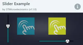
Slider Example UI template in TouchGFX Designer
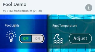
Pool Demo UI template in TouchGFX Designer