Circle
A Circle is a widget based on the CanvasWidget capable of drawing a circle. This circle can be a partial circle, and either filled or outlined. The center, radius, line width, line cap and circle arc can be modified. The Circle can either use an image or a single color as fill.
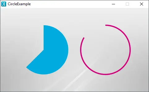
Circle running in the simulator
Widget Group
The Circle can be found in the Shapes widget group in TouchGFX Designer.
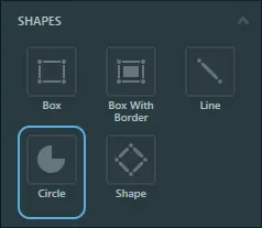
Circle in TouchGFX Designer
Properties
The properties for the Circle are described in the following sections.
| Property Group | Property Descriptions |
|---|---|
| Name | Name of the widget. Name is the unique identifier used in TouchGFX Designer and code. |
| Location | X and Y specify the top left corner of the widget relative to its parent. W and H specify the width and height of the widget. Visible specifies the visibility of the widget. Making the widget invisible also disables interacting with the widget through the screen. |
| Image & Color | Image specifies the image used to fill the circle from the Designer skin library or the Project folder. If an image is not chosen, Color specifies the color used to fill the circle. |
| Appearance | Center Position X and Center Position Y specify the coordinates for the center of the circle, relative to the top left corner of the widget. Start & End Angle specify the angles in degrees of the start and ending points of the circle. Radius specifies the radius of the circle. Line Width specifies the width of the line forming the circumference of the circle. Set this to 0 to get a filled circle. Cap Style specifies the shape of the edges of the circle. Alpha specifies the transparency of the widget. The alpha value ranges between 0 and 255 for the widget. 0 is fully transparent and 255 is solid. |
| Mixins | Draggable specifies if the widget is draggable at runtime. ClickListener specifies if the widget emits a callback when clicked. FadeAnimator specifies if the widget can animate changes to its Alpha value. MoveAnimator specifies if the widget can animate changes to X and Y values. |
Interactions
The actions and triggers supported by the Circle are described in the following sections.
Actions
| Standard widget action | Description |
|---|---|
| Move widget | Move a widget to a new position over time. |
| Fade widget | Modify alpha value of widget over time. |
| Hide widget | Hides a widget (sets visibility to false). |
| Show widget | Make a hidden widget visible (sets visibility to true). |
Triggers
A Circle does not emit any triggers.
Performance
A Circle is based on the CanvasWidget and is heavily dependent on the MCU for rendering. Therefore, the Circle is considered a demanding widget on most platforms.
For more details on CanvasWidget drawing performance, read the General UI Component Performance section.
Examples
Generated Code
In the generated code for the View base class we can see how TouchGFX Designer sets up a Circle.
Screen1ViewBase.cpp
#include <gui_generated/screen1_screen/Screen1ViewBase.hpp>
#include "BitmapDatabase.hpp"
#include <touchgfx/Color.hpp>

Screen1ViewBase::Screen1ViewBase()
{

    touchgfx::CanvasWidgetRenderer::setupBuffer(canvasBuffer, CANVAS_BUFFER_SIZE);

    circleName.setPosition(40, 36, 200, 200);
    circleName.setCenter(100, 100);
    circleName.setRadius(80);
    circleName.setLineWidth(0);
    circleName.setArc(0, 225);
    circleName.setCapPrecision(180);
    circleNamePainter.setColor(touchgfx::Color::getColorFrom24BitRGB(0, 171, 223));
    circleName.setPainter(circleNamePainter);

    add(circleName);
}
Tip
circleName.invalidate() if you change the appearance of the widget.TouchGFX Designer Examples
To further explore the Circle, try creating a new application within TouchGFX Designer with the following UI template:
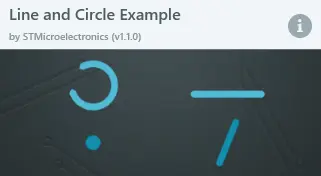
Line and Circle Example UI template in TouchGFX Designer