BoxWithBorder
A BoxWithBorder in TouchGFX is a rectangular shaped widget that can be assigned a single color for all contained pixels within a specified border with a seperate color and size. The BoxWithBorder can be assigned any size and position.
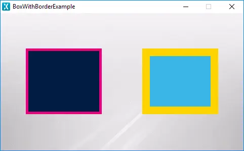
BoxWithBorder running in the simulator
Widget Group
The BoxWithBorder can be found in the Shapes widget group in TouchGFX Designer.
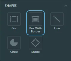
BoxWithBorder in TouchGFX Designer
Properties
The properties for a BoxWithBorder in TouchGFX Designer.
| Property Group | Property Descriptions |
|---|---|
| Name | Name of the widget. Name is the unique identifier used in TouchGFX Designer and code. |
| Location | X and Y specify the top left corner of the widget relative to its parent. W and H specify the width and height of the widget. Visible specifies the visibility of the widget. Making the widget invisible also disables interacting with the widget through the screen. |
| Appearance | Color specifies the color of all the pixels contained within the rectangle. Border Color specifies the color of the outer border pixels. Border Size specifies the size of the outer border. Alpha specifies the transparency of the widget. The alpha value ranges between 0 and 255 for the widget. 0 is fully transparent and 255 is solid. |
| Mixins | Draggable specifies if the widget is draggable at runtime. ClickListener specifies if the widget emits a callback when clicked. FadeAnimator specifies if the widget can animate changes to its Alpha value. MoveAnimator specifies if the widget can animate changes to X and Y values. |
Interactions
The actions and triggers supported by a BoxWithBorder in TouchGFX Designer.
Actions
| Widget specific actions | Description |
|---|---|
| Resize widget | Resize a widget. |
| Change box color | Change the color of a Box widget. |
| Standard widget actions | Description |
|---|---|
| Move widget | Move a widget to a new position over time. |
| Fade widget | Modify alpha value of widget over time. |
| Hide widget | Hides a widget (sets visibility to false). |
| Show widget | Make a hidden widget visible (sets visibility to true). |
Triggers
A BoxWithBorder does not emit any triggers.
Performance
A BoxWithBorder is one of the most lightweight widgets in all of TouchGFX because it does not have to read any pixel data or do any complicated calculations. Therefore, the BoxWithBorder is considered a very fast performing widget on most platforms.
For more details on drawing performance, read the General UI Component Performance section.
Examples
Generated Code
In the generated code for the View base class we can see how TouchGFX Designer sets up a BoxWithBorder widget.
Screen1ViewBase.cpp
#include <gui_generated/screen1_screen/Screen1ViewBase.hpp>
#include <touchgfx/Color.hpp>

Screen1ViewBase::Screen1ViewBase()
{
    boxWithBorderName.setPosition(240, 56, 337, 132);
    boxWithBorderName.setColor(touchgfx::Color::getColorFrom24BitRGB(212, 27, 27));
    boxWithBorderName.setBorderColor(touchgfx::Color::getColorFrom24BitRGB(21, 24, 202));
    boxWithBorderName.setBorderSize(20);

    add(boxWithBorderName);
}
Tip
boxWithBorderName.invalidate() if you change the appearance of the widget.