ScrollWheel
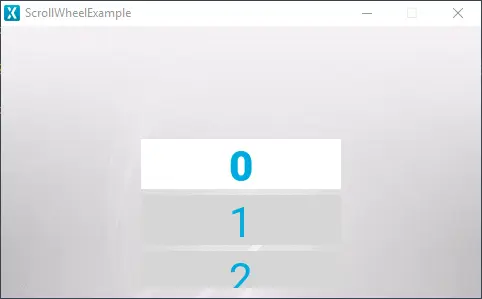
The ScrollWheel is a scrollable menu containing multiple items, which are dynamically updated when scrolling through the items in the wheel, and the item which is selected is moved into focus. Enabling the code to react to interactions with the ScrollWheel, different callbacks can be invoked based on the interaction with the items in the wheel.
Widget Group
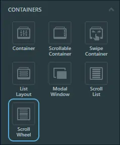
The ScrollWheel can be found in the Containers widget group in TouchGFX Designer.
Properties
The properties for a ScrollWheel in TouchGFX Designer.
| Property Group | Property Descriptions |
|---|---|
| Name | Name of the widget. Name is the unique identifier used in TouchGFX Designer and code. |
| Type | Type specifies whether the ScrollWheel is oriented vertically or horizontally. |
| Location | X and Y specify the top left corner of the widget relative to its parent. W and H specify the width and height of the widget. Visible specifies the visibility of the widget. Making the widget invisible also disables interacting with the widget through the screen. |
| Item Template | Item Template specifies which CustomContainer to use as template. Number of Items specifies the number of items present in the ScrollWheel. Initial Selected Item specifies which item is selected first. Use Selected Style Template specifies whether to use a seperate template for the selected item. Selected Style Template specifies which CustomContainer to use as selected template. |
| List Appearance | Circular specifies if the items in the ScrollWheel will loop when reaching the end. Selected Item Offset specifies the location of the selected item. Item Margin specifies the spacing between items. Extra Size Before and Extra Size After specify the size of the area in which Selected Style Template is shown. Margin Before and Margin After specify the size of the margin before and after the area in which Selected Style Template is shown. |
| Animation | Easing and Easing Option specify which easing equation to use for animations. Swipe Acc. and Drag Acc. specify the acceleration when scrolling. |
| Mixins | Draggable specifies if the widget is draggable at runtime. ClickListener specifies if the widget emits a callback when clicked. MoveAnimator specifies if the widget can animate changes to X and Y values. |
Item Templates
The items in a ScrollList are based on a concept called Item Template which is a CustomContainer that serves as a base for the graphical elements for the items in the ScrollWheel. To highlight the selected item, the ScrollWheel has the option to select an Item Template called Selected Style Template, which is only used for the selected item. Before creating a ScrollWheel, a CustomContainer for the Item Template, along with a Selected Style Template if enabled, should be created.
After the ScrollWheel is created, the CustomContainer can be selected under the property Item Template. When selecting the Custom Container for the Item Template, the ScrollWheel resizes to fit with the size property that is not in the scrollable direction (width for vertical orientation and height for horizontal orientation) of the selected Custom Container. Changing the other size property (height for vertical orientation and width for horizontal orientation) determines the number of items visible.
Interactions
The actions and triggers supported by the ScrollWheel are described in the following sections.
Actions
| Standard widget action | Description |
|---|---|
| Move widget | Move a widget to a new position over time. |
| Hide widget | Hides a widget (sets visibility to false). |
| Show widget | Make a hidden widget visible (sets visibility to true). |
Triggers
A ScrollWheel does not emit any triggers.
Performance
A ScrollWheel is a Container type, and does not per default appear in the draw chain. Therefore, the performance is wholly dependent on the drawing performance of the children.
For more details on drawing performance, read the General UI Component Performance section.
Examples
Generated Code
In the generated code for the View base class we can see how TouchGFX Designer sets up a ScrollWheel.
Screen1ViewBase.cpp
#include <gui_generated/screen1_screen/Screen1ViewBase.hpp>
#include "BitmapDatabase.hpp"

Screen1ViewBase::Screen1ViewBase() :
    updateItemCallback(this, &Screen1ViewBase::updateItemCallbackHandler)
{
    scrollWheel.setPosition(140, 10, 200, 252);
    scrollWheel.setHorizontal(false);
    scrollWheel.setCircular(false);
    scrollWheel.setEasingEquation(touchgfx::EasingEquations::backEaseIn);
    scrollWheel.setSwipeAcceleration(10);
    scrollWheel.setDragAcceleration(10);
    scrollWheel.setNumberOfItems(60);
    scrollWheel.setSelectedItemOffset(100);
    scrollWheel.setSelectedItemExtraSize(0, 0);
    scrollWheel.setSelectedItemMargin(0, 0);
    scrollWheel.setDrawableSize(50, 3);
    scrollWheel.setDrawables(scrollWheelListItems, updateItemCallback,
                              scrollWheelSelectedListItems, updateItemCallback);
    scrollWheel.animateToItem(0, 0);

    add(scrollWheel);
}

void Screen1ViewBase::setupScreen()
{
    scrollWheel.initialize();
    for (int i = 0; i < scrollWheelListItems.getNumberOfDrawables(); i++)
    {
        scrollWheelListItems[i].initialize();
    }
    for (int i = 0; i < scrollWheelSelectedListItems.getNumberOfDrawables(); i++)
    {
        scrollWheelSelectedListItems[i].initialize();
    }
}

void Screen1ViewBase::updateItemCallbackHandler(touchgfx::DrawableListItemsInterface* items, int16_t containerIndex, int16_t itemIndex)
{
    if (items == &scrollWheelListItems)
    {
        touchgfx::Drawable* d = items->getDrawable(containerIndex);
        TextContainer* cc = (TextContainer*)d;
        scrollWheelUpdateItem(*cc, itemIndex);
    }
    else if (items == &scrollWheelSelectedListItems)
    {
        touchgfx::Drawable* d = items->getDrawable(containerIndex);
        TextCenterContainer* cc = (TextCenterContainer*)d;
        scrollWheelUpdateCenterItem(*cc, itemIndex);
    }
}
Tip
scrollWheel.invalidate() if you change the appearance of the widget.User Code
After the graphical elements for the ScrollWheel and its properties are set, user code can be written to update the items in the ScrollWheel. The header file for the Screen1ViewBase class which is generated by the TouchGFX Designer is shown below:
Screen1ViewBase.hpp
class Screen1ViewBase : public touchgfx::View
{
public:
    Screen1ViewBase();
    virtual ~Screen1ViewBase() {}
    virtual void setupScreen();

    virtual void scrollWheel1UpdateItem(CustomContainer1& item, int16_t itemIndex)
    {
        // Override and implement this function in Screen1
    }

    virtual void scrollWheel1UpdateCenterItem(CustomContainer2& item, int16_t itemIndex)
    {
        // Override and implement this function in Screen1
    }

protected:
    FrontendApplication& application() {
        return *static_cast<FrontendApplication*>(Application::getInstance());
    }

    touchgfx::BoxWithBorder boxWithBorder1;
    touchgfx::ScrollWheelWithSelectionStyle scrollWheel1;
    touchgfx::DrawableListItems<CustomContainer1, 6> scrollWheel1ListItems;
    touchgfx::DrawableListItems<CustomContainer2, 2> scrollWheel1SelectedListItems;

private:
    void updateItemCallbackHandler(DrawableListItemsInterface* items, int16_t containerIndex, int16_t itemIndex);
    touchgfx::Callback<Screen1ViewBase, DrawableListItemsInterface*, int16_t, int16_t> updateItemCallback;

};
When the TouchGFX Designer generates the code for ScrollWheel, the functions scrollWheel1UpdateItem and scrollWheel1UpdateCenterItem, highlighted above, is created for the user to override and update the items in the ScrollWheel.
The UpdateItem function is always generated for a ScrollWheel and can be implemented to updated the contained items, while the UpdateCenterItem function updates the item based on the Selected Style Template and is therefore only generated if the usage of a Selected Style Template is selected. Other than updating different items, the two functions contain the same parameters used for updating the items in the the ScrollWheel.
The parameter itemIndex contains the index value of the item, which is used to identify which item is being updated. The parameter item is a reference to a visible item in the ScrollWheel. Updating the appearance for the parameter item results in an update to the render for a visible item in the ScrollWheel.
An example implementation of scrollWheel1UpdateItem and scrollWheel1UpdateCenterItem in the user code files Screen1View.hpp and Screen1View.cpp is shown below:
Screen1View.hpp
#ifndef SCREEN1_VIEW_HPP
#define SCREEN1_VIEW_HPP

#include <gui_generated/screen1_screen/Screen1ViewBase.hpp>
#include <gui/screen1_screen/Screen1Presenter.hpp>

class Screen1View : public Screen1ViewBase
{
public:
    Screen1View();
    virtual~Screen1View() {}
    virtual void setupScreen();
    virtual void tearDownScreen();

    virtual void scrollWheel1UpdateItem(CustomContainer1& item, int16_t itemIndex);
    virtual void scrollWheel1UpdateCenterItem(CustomContainer2& item, int16_t itemIndex);
protected:
};

#endif // SCREEN1_VIEW_HPP
Screen1View.cpp
#include <gui/screen1_screen/Screen1View.hpp>

Screen1View::Screen1View()
{

}

void Screen1View::setupScreen()
{
    Screen1ViewBase::setupScreen();
}

void Screen1View::tearDownScreen()
{
    Screen1ViewBase::tearDownScreen();
}

void Screen1View::scrollWheel1UpdateItem(CustomContainer1& item, int16_t itemIndex)
{
    item.setIndex(itemIndex);
}

void Screen1View::scrollWheel1UpdateCenterItem(CustomContainer2& item, int16_t itemIndex)
{
    item.setIndex(itemIndex);
}
In the header file Screen1View.hpp, the scrollWheel1UpdateItem and scrollWheel1UpdateCenterItem functions are overridden and are then implemented in Screen1View.cpp.
The goal of this example is to update the text in the Item Template with the index value of the items which are visible, like the example shown in the beginning of this section. Since both the Item Template and the Selected Style Template are based on CustomContainer, a setIndex function is created for both CustomContainers. The setIndex function is able to take the itemIndex parameter and update the text in the Item Template and the Selected Style Template.
Calling the setIndex for an item results in an update to the appearance of the visible items thereby showing their index value.
TouchGFX Designer Examples
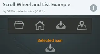
To further explore the ScrollWheel, try creating a new application within TouchGFX Designer with one of the following UI templates:


