SVG
TouchGFX supports using SVG images starting from version 4.21. SVG images can be used to create user interfaces with vector graphics in combination with the traditional bitmap based graphics.
SVG images are included in the user interface through the SVGImage Widget. This widget is available in TouchGFX Designer and can be added to the user interface as any other widget.
SVG images are only supported on 16bpp, 24bpp, or 32bpp frame buffers.
What is SVG
Scalable Vector Graphics, SVG, is an XML-based file format for defining 2D images through the use of a small set of graphics primitives. Some of the primitives are rectangles, circles, and curves. The primitives can be filled with a color or gradient. The outline (stroke) can also be drawn with a specific width.
The first big feature of SVG graphics is that it scalable. This means that the drawing specified is not only usable in a single resolution but can be scaled up or down without loosing quality. This is a big advantage compared to Bitmaps where artifacts are introduced when you scale up and details are lost when you scale down.
The second important feature of SVG graphics is that it is vector based. This means that an image is made up of a set of geometric figures like lines and circles that combines to make the drawing. This is in contrast to a bitmap image that basically defines a color value to all pixels in the image. The advantage of the vector definition is that the image in most cases are very small compared to bitmaps and that it is much more flexible. An image showing e.g. a few yellow ellipses can easily be changed in to am image consisting of green ellipses.
TouchGFX supports a subset of SVG Tiny 1.2. It is not possible to support the whole specification within the restrictions imposed by the hardware, the runtime environment, and the performance characteristics of TouchGFX.
SVG images can be created with many imaging tools, e.g. , or they can be written by hand. If you want to learn how to write your own SVG we recommend the introduction here.
Using SVGs with TouchGFX
SVG images are used in the same way as PNG images. The SVG files that you want to use in a project must be placed in the assets/images folder. The TouchGFX Image Converter and TouchGFX Designer read the images found in that folder.
SVG images are converted to CPP code and linked into the
application. This CPP code is saved in the file
generated/images/src/SVGDatabase.cpp
SVG images are used with the SVGImage widget. Either in code or in the TouchGFX Designer. This widget allows scaling, translation, and rotation of an SVG image.
The SVGImage widget is using another component, VectorRenderer, to perform the rendering.
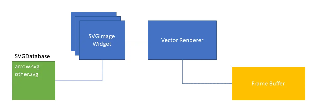
Software components when using SVG images
Example
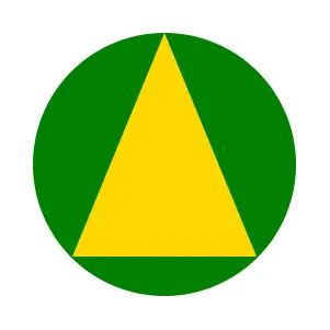
As an example we will use this SVG:
<?xml version="1.0" encoding="iso-8859-1"?>
<svg xmlns="http://www.w3.org/2000/svg" width="100" height="100">
  <circle cx="50" cy="50" r="40" fill="green" />
  <polygon points="50,10 78,78 22,78" fill="gold" />
</svg>
The SVG consists of a dark green circle with radius 40 and a yellow (golden) triangle.
As we see, SVG images are simple text files that can be modified with a normal text editor. SVG files can be opened with a long range of standard tools. The Chrome browser is one example of an SVG viewer.
The rendering of this SVG looks like this:
Arrow SVG
To use this SVG with TouchGFX we put the file (arrow.svg) in the
assets/images directory of our project. This is the same
directory as the PNG-files and the images used by the TouchGFX
Designer:
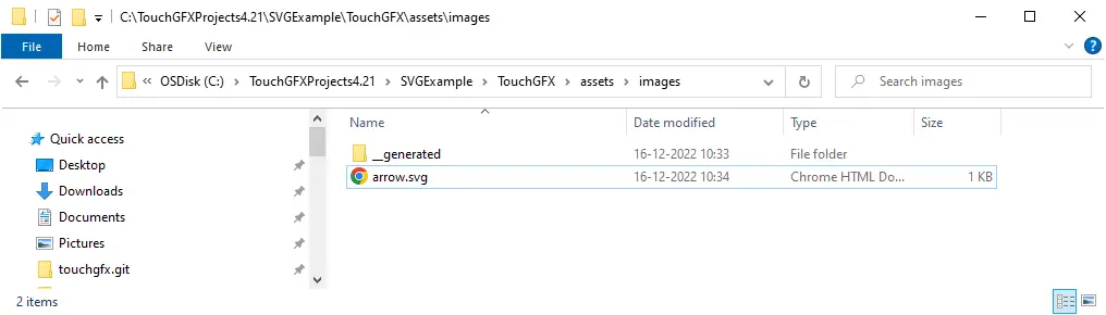
SVG files are put in the assets/images folder
In TouchGFX Designer we can insert an SVGImage widget:
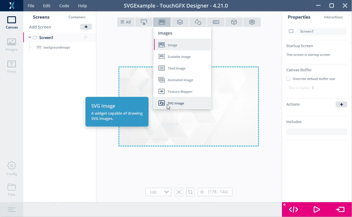
Inserting the SVGImage widget
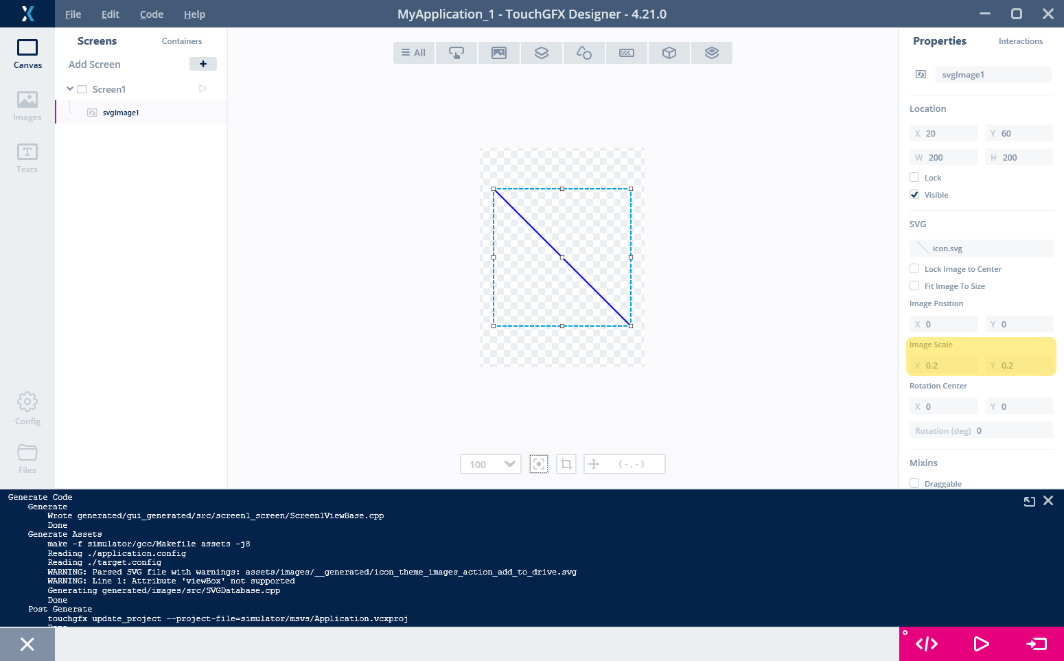
Using the properties of the SVGImage on the right, we can change the size of the widget and the scale:
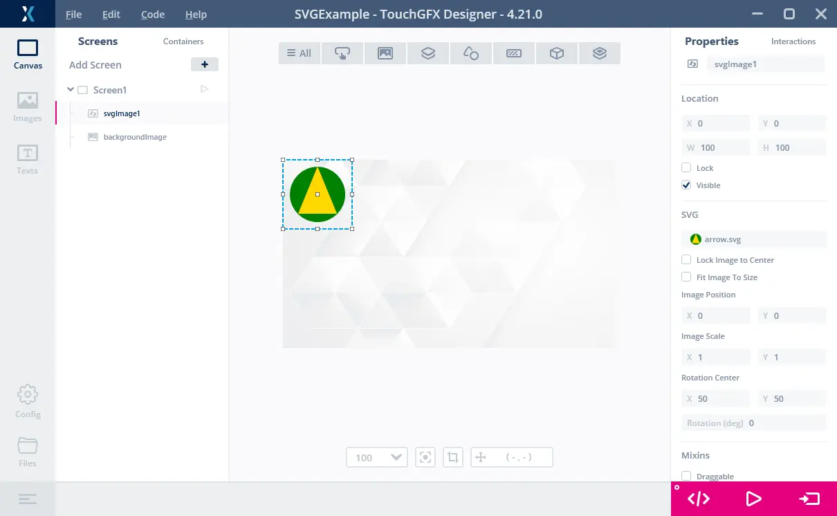
Showing the SVG arrow
Note the "Fit Image To Size" check box. If you check it, the SVG is scaled to fit the size of the widget (and rotation is reset). This is a helper function that allows you to resize the SVG by dragging the corners of the Widget until the size fits your needs.
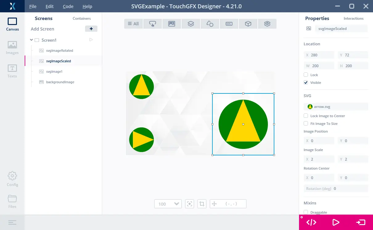
Showing the SVG arrow three times
To do the rotation as above it is important to set the rotation center. The default values are x=0, y=0, the upper left corner of the Widget. If we use this rotation center and rotate the SVG, it rotates clock-wise out to the left of the SVGImage Widget as illustrated in the figure below:
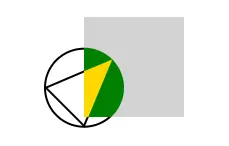
Showing the SVG arrow rotated 45 degrees around 0,0
The parts of an SVG that are outside the SVGImage are clipped (not shown) as illustrated by the above figure. The gray rectangle represents SVGImage. Anything outside the gray area is not draw. To rotate the SVG inside the SVGImage we must set the rotation center to the center of the widget (50, 50).
See also the later section on transformation details.
Target configuration
To use SVG images on a target you need to have Vector Rendering enabled in STM32CubeMX. This inserts the required code in the project to create the Vector Renderer that is required by SVGImage.
Note
If Vector Rendering is not enabled you will get a linker error (undefined reference to `touchgfx::VectorRenderer::getInstance()) when building the project:
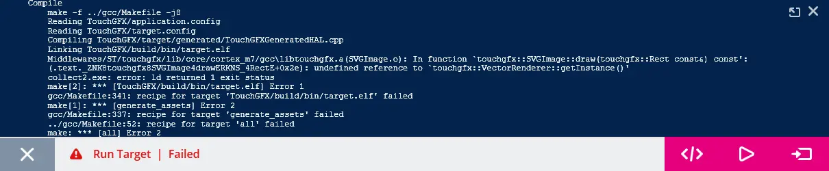
Linker error when Vector Rendering is not enabled
This problem is resolved by changing the configuration in STM32CubeMX. See also the Generator User Guide
SVG images are automatically included in the target project as C++ code, so no further action is required.
As rendering times for SVG images can be considerably higher than the bitmaps, we recommend use of double buffering (or single buffering with displays with embedded GRAM). Single frame buffer can be used, but the rendering time and display tearing should be monitored. Read more about using one frame buffer here.
Canvas Buffer
On most platforms (except U5X9) the SVG is rendered using the Canvas Widget Renderer. This software component uses a buffer during rendering. The size of this buffer impacts the performance. It is recommended to increase the size of the buffer if possible (often 20-30Kb is adequate). The buffer is easily changed in TouchGFX Designer:
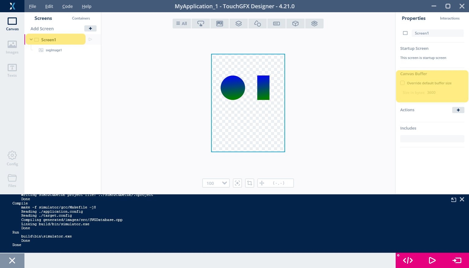
Changing the Canvas Buffer size
Remember to change the value in all relevant screens.
Target performance and flash usage
The size of the generated SVG data for the arrow is below 350 bytes. This shows one of the benefits using SVG compared to bitmaps. The size of the arrow as a bitmap in size 100x100 would be 30,000 bytes in 24bit colors. The size of the SVG is thus close to 1% of the size of bitmap.
| Image Type | Flash usage |
|---|---|
| Bitmap | 30,000 bytes |
| SVG | 350 bytes |
The use of SVG images adds 5-10K of extra code in the application.
The downside of using SVGs is the performance of drawing the SVG images which is worse than bitmaps in most cases. The rendering of an SVG depends on the number of elements in the SVG and has no upper limit. Rendering of a bitmap depends on the resolution and alpha blending, and has an upper limit. Secondly SVG images are rendered with a high use of software rendering so the CPU-load is high. Bitmaps on the other hand can be rendered exclusively by the DMA2D accelerator which gives a low CPU-load.
The render time of the SVG arrow is 1.32ms on the STM32F746 (frame buffer in external RAM) which is very usable. Faster MCUs from the H7 series will give lower rendering times. The rendering time increases when the SVG is scaled up (more pixels to render), while rotation does not add substantially. The picture shows the arrow on an STM32F746 Discovery kit:
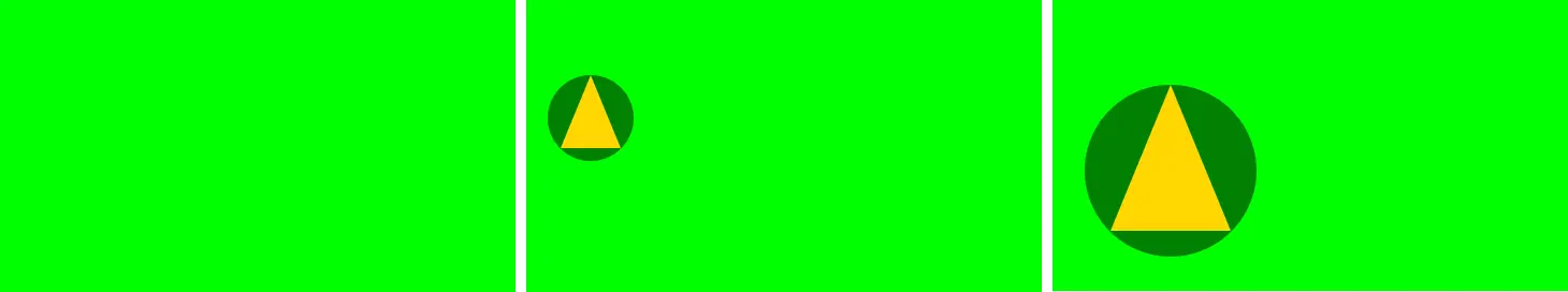
Showing the SVG arrow on a F746 Discovery kit
The left-most picture shows no SVG, but just a green Box background. The middle shows the arrow in scale 1. The right-most shows the arrow in scale 2. The rendering times for the full frame and just the SVG are shown below:
| Screen | Rendering time | Just SVG |
|---|---|---|
| Left | 2.96 ms | N/A |
| Middle | 4.28 ms | 1.32 ms |
| Right | 6.37 ms | 3.41 ms |
| Rotated | 6.53 ms | 3.57 ms |
The last row shows the rendering time with the arrow rotated 77 degrees. We see that rotation affects the rendering time insignificantly.
Graphics Quality
The picture below shows a project running on an STM32F746 Discovery kit:
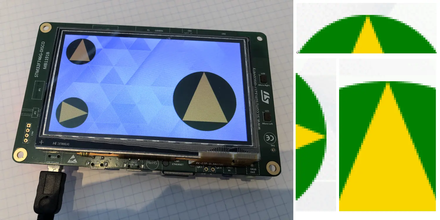
Showing the SVG arrows on a F746 Discovery kit
In this project we have used the same SVG in multiple SVGImage widgets.
On the right size of the photo we have inserted zoomed details from the frame buffer (the three arrow heads). This shows that the lines in the SVG drawing are all anti-aliased, even when rotated and scaled. This is the main reason to use SVG images: Preservation of quality during rotation and scaling.
Supported SVG elements
TouchGFX does not implement the whole SVG Tiny 1.2 standard. The image converter in TouchGFX that reads the .svg files will give you a warning if you use any of the unsupported elements or attributes. The important missing parts radial gradient, texts, and animations.
TouchGFX supports the following SVG elements. The examples show the supported attributes of the element:
Rectangle <rect x="10" y="20" width="100" height="200" rx="5" ry="40" />
Circle <circle cx="100" cy="200" r="20" />
Ellipse <ellipse cx="100" cy="200" rx="20" ry="30" />
Line <line x1="10" y1="10" x2="300" y2="150 />
Path <path d="M100 100L75 200h50z" />
Polygon <polygon points="10,10 30,30 10,90" />
Polyline <polyline points="10,10 30,30 10,90" />
LinearGradient <lineargradient id="grad1" gradientUnits="objectBoundingBox" x1="0%" y1="0%" x2="100%" y2="100%" />
These structural elements are also supported
- Group <g />
- Defs <defs />
TouchGFX supports all the shape transformations: matrix, translate, scale, rotate, skewX, skewY.
The linear gradients must be defined inside a <defs> element.
For the <path> element TouchGFX supports all the path commands: M, m, L, l, H, h, V, v, C, c, S, s, Q, q, T, t, A, a.
Filling and stroking is supported.
Unsupported SVG elements
TouchGFX does not support the following elements:
- Animations <animate>, <animateColor>, <animateMotion>, <animateTransform>, <discard>, <handler>, <listener>, <mpath>, <script>, <set>, <switch>
- Audio <audio />
- ClipPath <clipPath id=.... />
- Desc <desc />
- Filter <filter>
- Foreign Object <foreignObject>
- Gradient transform <linearGradient gradientTransform="..." />, <prefetch>
- Radial gradient <radialGradient ... />
- Solid color <solidColor>
- Stroke dasharray property <path stroke-dasharray="10,10" ... />
- Text and fonts <font>, <glyph>, <text>, <hkern>, <missing-glyph>, <tbreak>, <textArea>, <tspan>
- Use <use>
- Image <image>
- Video <video>
Metadata and title elements are ignored.
ViewBox
The viewBox attribute, which is often used in SVG images, is not supported by TouchGFX. The viewBox attribute is used to define a transformation of the coordinate system that is used in the SVG drawing (user-space) to the view port where the SVG is drawn.
Here is an example:
<svg xmlns="http://www.w3.org/2000/svg" viewBox="0 0 200 200">
   ...
</svg>
This means that any graphics drawn by this SVG in the rectangle from (0,0) to (200,200) should be stretched (or shrinked) to fit the view (the SVGImage widget).
In TouchGFX the viewBox attribute is ignored. This means that the graphics is not scaled. In many SVG images this is not a problem since the graphics was drawn in the correct scale. If this is the case you can just leave the viewBox attribute or delete it. The graphics is also not clipped according to the viewBox, but to the SVGImage widget.
If the viewBox is actually required to scale a specific drawing you can either apply the scaling in the SVG file by inserting a transformation, e.g. on an extra <g> element or scale the drawing in TouchGFX.
Here is an example where a line from (0,0) to (1000,1000) is scaled down to (0,0) to (100,100) with a viewBox (which will not work):
<svg xmlns="http://www.w3.org/2000/svg" width="200" height="200" viewBox="0 0 1000 1000">
  <path d="M10 10L990,990" stroke="blue" stroke-width="10" stroke-linecap="round"/>
</svg>
The (intended) result is a line from (0,0) to (200,200). But as TouchGFX ignores the ViewBox, we get an SVG image of 1000x1000 pixels. One way to convert this is to modify the SVG file to include a scaling transformation:
<svg xmlns="http://www.w3.org/2000/svg" width="200" height="200">
  <g transform="scale(0.2)">
    <path d="M10 10L990,990" stroke="blue" stroke-width="10" stroke-linecap="round"/>
  </g>
</svg>
This transform scales everything down by a factor of 5.
This effect can also be obtained by applying a scaling on the SVGImage widget:
Scaling down an SVG in TouchGFX Designer
If you are scaling anyway in your application, it might be preferable to not modify the .svg file.
Linear Gradients must use ObjectBoundingBox
Linear Gradients in SVG can be specified using two different coordinate systems. Either "userSpaceOnUse" or "objectBoundingBox". TouchGFX only supports "objectBoundingBox". We will here briefly discuss how to use "objectBoundingBox", so you can change any SVG that uses "userSpaceOnUse" to "objectBoundingBox". We will start with an example:
<svg xmlns="http://www.w3.org/2000/svg" width="200" height="100">
  <defs>
    <linearGradient id="gradient1" x1="0%" y1="0%" x2="100%" y2="100%">
      <stop offset="0%" stop-color="blue" />
      <stop offset="50%" stop-color="green" />
      <stop offset="100%" stop-color="red" />
    </linearGradient>
  </defs>
  <circle cx="50" cy="50" r="40" fill="url(#gradient1)" />
  <rect x="130" y="10" width="40" height="80" fill="url(#gradient1)" />
</svg>
This defines a gradient that transitions from blue in the beginning over green in the middle to red in the end. The gradient is used to fill a circle and a rectangle:

Linear gradient with blue in top-left corner and red in bottom-right corner
The start point of the gradient is specified as (x1, y1) = (0%, 0%). This refers to the top-left corner of the bounding box of any shape (e.g. circle or rectangle) that is painted with this gradient. Similarly the end point is the lower-right corner of the bounding box.
Since the two shapes, the circle and the rectangle, have different widths (80 pixels and 40 pixels), the angle of the gradient differs when applied to the shape. If you don't want this behaviour, you can define multiple gradients. One for each figure.
The other possibility in SVG is to use the "userSpaceOnUse" coordinate system:
<svg xmlns="http://www.w3.org/2000/svg" width="200" height="100">
  <defs>
    <linearGradient id="gradient1" gradientUnits="userSpaceOnUse" x1="0%" y1="0%" x2="100%" y2="100%">
      <stop offset="0%" stop-color="blue" />
      <stop offset="50%" stop-color="green" />
      <stop offset="100%" stop-color="red" />
    </linearGradient>
  </defs>
  <circle cx="50" cy="50" r="40" fill="url(#gradient1)" />
  <rect x="130" y="10" width="40" height="80" fill="url(#gradient1)" />
</svg>
This will result in a different rendering (not supported by TouchGFX):

Linear gradient using userSpaceOnUse
This looks different because for both shapes, the starting point of the gradient is the top-left corner of the whole image (covering both shapes).
If you have an SVG that uses userSpaceOnUse you can transform it to objectBoundingBox by calculating the starting point of the gradient relative to the shape using the gradient. Here is an example where the gradient colors the circle using userSpaceOnUse with pixel coordinates:
<svg xmlns="http://www.w3.org/2000/svg" width="200" height="100">
  <defs>
    <linearGradient id="gradient1" gradientUnits="userSpaceOnUse" x1="10" y1="10" x2="90" y2="90">
      <stop offset="0%" stop-color="blue" />
      <stop offset="50%" stop-color="green" />
      <stop offset="100%" stop-color="red" />
    </linearGradient>
  </defs>
  <circle cx="50" cy="50" r="40" fill="url(#gradient1)" />
</svg>
We can convert the gradient to use objectBoundingBox by calculating the bounding box of the circle. It is (10,10) to (90,90), which matches the gradient. We can thus convert the coordinates to relative shape coordinates by replacing "10" with "0%" and "90" with "100%".
<svg xmlns="http://www.w3.org/2000/svg" width="200" height="100">
  <defs>
    <linearGradient id="gradient1" x1="0%" y1="0%" x2="100%" y2="100%">
      <stop offset="0%" stop-color="blue" />
      <stop offset="50%" stop-color="green" />
      <stop offset="100%" stop-color="red" />
    </linearGradient>
  </defs>
  <circle cx="50" cy="50" r="40" fill="url(#gradient1)" />
</svg>
Remember the "%". y1="10" means y1="1000%".
Image Converter Warnings
The TouchGFX Image Converter will print a warning or error if you use an unsupported element or attributes. As an example we can put text of the arrow:
<?xml version="1.0" encoding="iso-8859-1"?>
<svg xmlns="http://www.w3.org/2000/svg" width="100" height="100">
  <circle cx="50" cy="50" r="40" fill="green" />
  <polygon points="50,10 78,78 22,78" fill="gold" />
  <text x="38" y="78">ABC</text>
</svg>
TouchGFX Designer runs the Image Converter on the .svg file and shows the error:
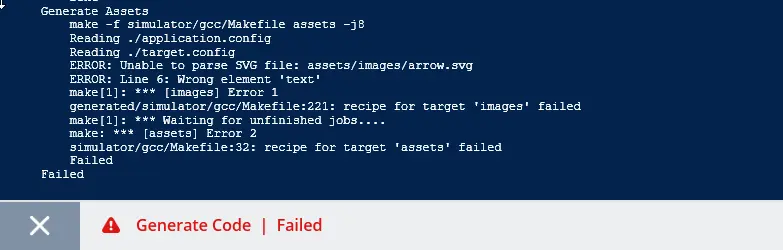
Error when using the unsupported SVG <text> element
The error output shows which SVG file contains the error, in which line the problem is found, and which unsupported elements was used.
Related articles
As mentioned above the vector graphics support for target project is configured in the TouchGFX Generator. See the Generator User Guide for instructions.
The SVGImage widget is available in TouchGFX Designer. The use of SVGImage widget in TouchGFX Designer is detailed here.