Texts View
The Texts View in TouchGFX Designer is used for configuring texts, translations and typographies in a project. The view consists of two tabs: Texts, and Typographies.
Texts
The Texts tab gives an overview of all texts elements. A text element can either have an auto-generated ID or a defined ID.
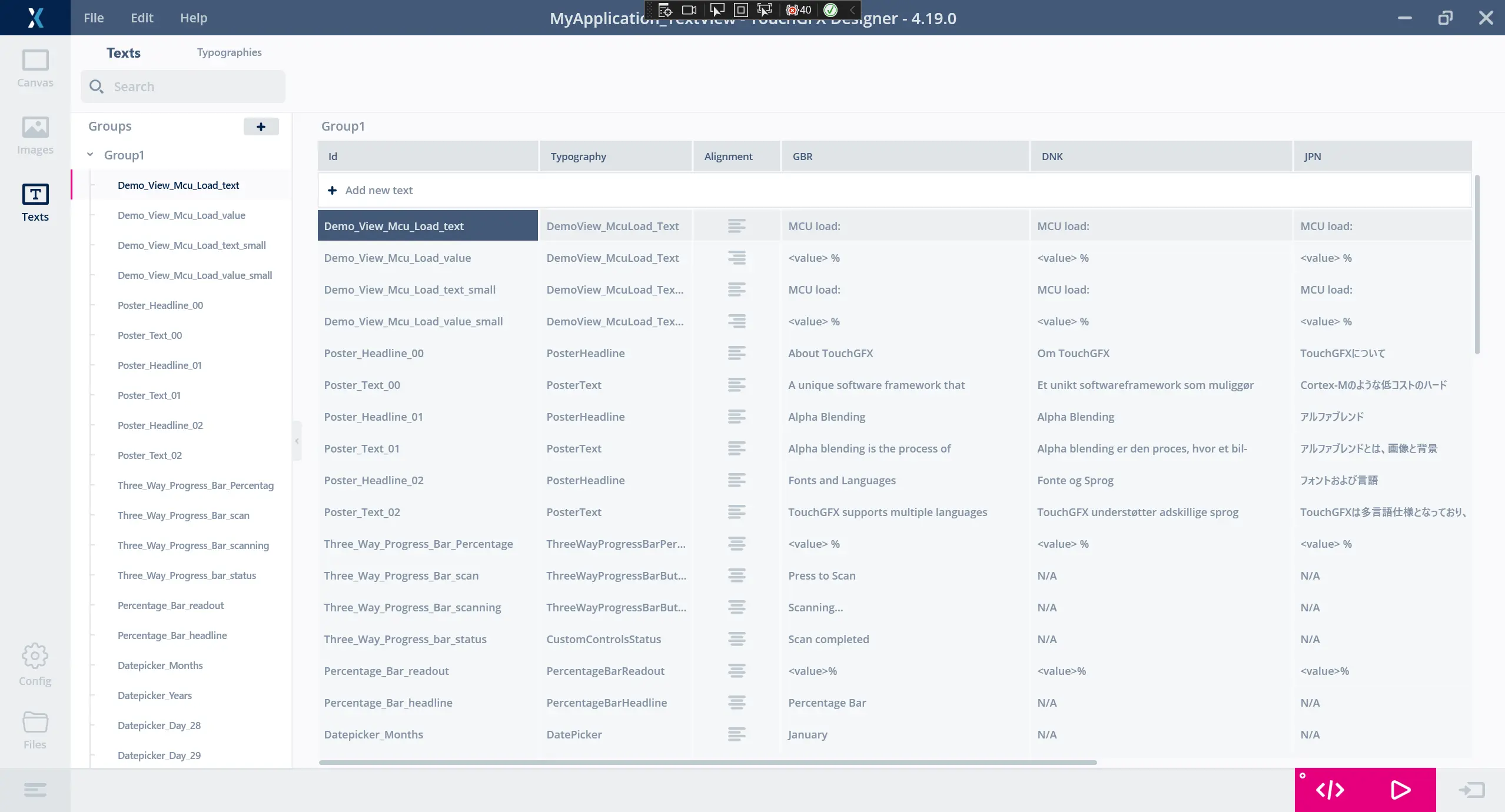
Texts View
Auto-generated ID
Texts with an auto-generated ID (also known as Single Use texts) are only used once, and cannot be used by more than one widget or action at a time. They are added automatically when used on a widget or action, and are deleted automatically when the widget or action is deleted.
When auto-generated texts are initially created, they are added to a text group named "Unsorted". if this group does not exist, it will be created.
The auto-generated ID can easily be renamed thereby enabling the use of the text on any number of widgets and actions.
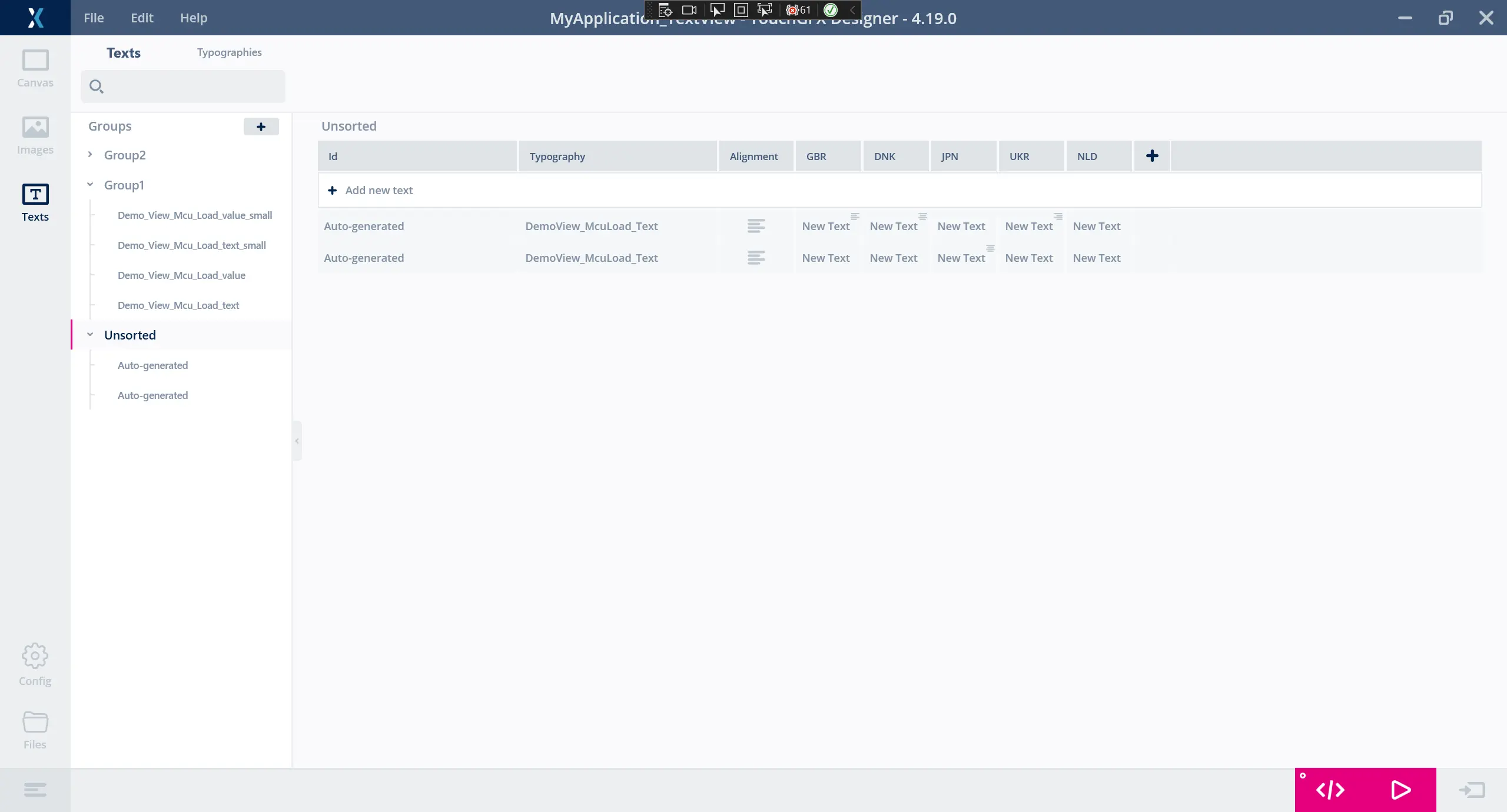
Auto-generated texts in Texts View
Defined ID
Texts with a defined ID (also known as Resources) can be reused on any number of widgets and actions in TouchGFX Designer. To add a new text with a defined ID, click the button labeled 'Add new text' in the Texts tab or rename a text with an auto-generated ID. One or more texts with a defined ID can be deleted in the Texts tab by selecting in grid or tree view and right clicking to open the shortcut menu or use the keyboard shortcut.
Texts tab features
Search
Use the search bar to locate a specific text element or translation. All available input in text columns is searched.
Tree view
The Texts tab contain a tree giving an overview of groups and text elements.
Groups
Every group in the tree, that contains one or more texts can be collapsed by pressing the chevron next to the group's name. Groups can have text added to them either by dragging a text in tree view or by right clicking a text in grid. To add a new group simply click the add button in tree view.
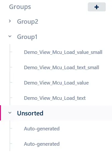
Text Groups
Header context menu
Right click the header in grid to see the header context menu. From here you can hide, edit, delete, and show a column (not all options are available for all columns).
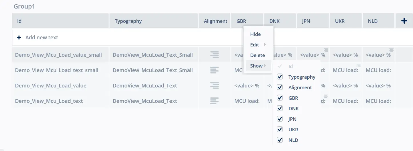
Header context menu
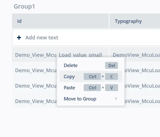
Grid context menu
Right click a text in grid to see the context menu. From here you can delete, copy, paste, and move a text to another group.
Text context menu
Translations
Typography
Specifies which typography the text and all its translations should use. Typographies can be added and configured in the Typographies tab.
Alignment
Specifies the horizontal alignment the text and all its translations should use as default. Possible values are Left, Right, and Center.
Translations Specifics
Each translation can overwrite the default Alignment. To reveal this control double click a translation. Setting a translation specific alignment is easily done through the inline Alignment selector, as shown in the figure below.
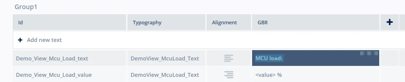
How to set Translation Specific Alignment
Adding languages
To add a new language, simply press the add button in the header menu. The popup in the figure below will appear, where the name of the language can be configured, and whether or not to use the translations from another language.
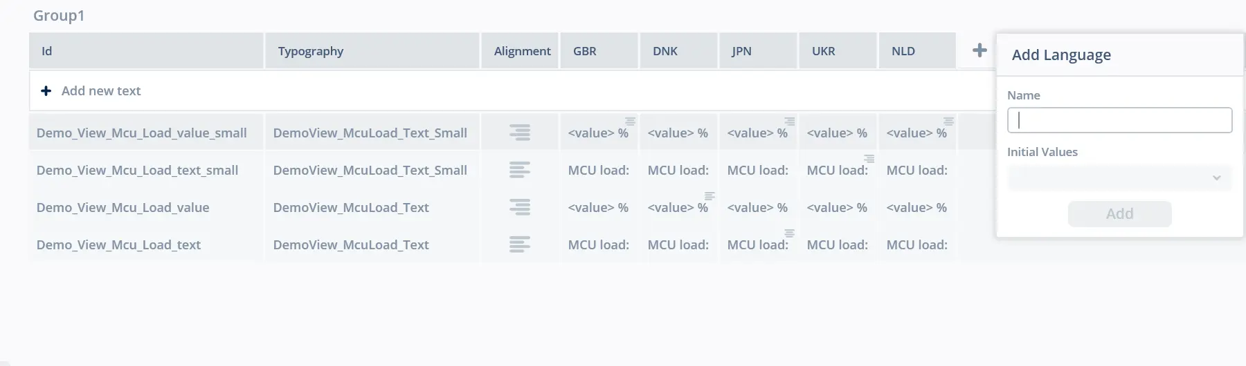
Add New Language popup
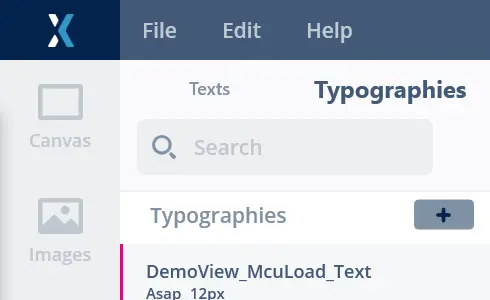
Typographies
In the Typographies tab an overview of all typographies in a project can be found, as shown in the figure below.
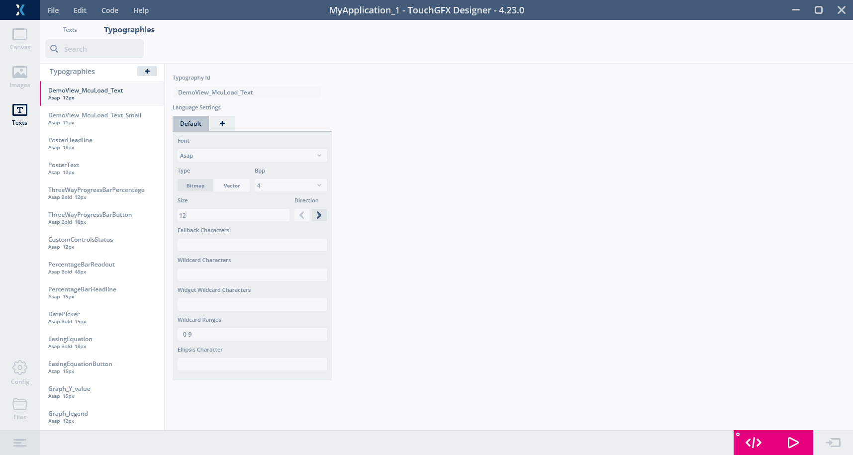
Typographies view
Typography ID
The name of the typography.
Language Settings
Contains the language settings of the typography. Default applies to all unspecified languages. To specify settings for a specific language click the add button and choose the desired language from the menu.
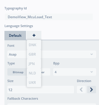
Add Language Setting to Typography
A language setting can be deleted by right clicking the desired language setting tab.
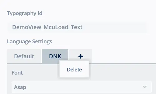
Delete Language Setting to Typography
Font
The name of the font to use for the given typography.
You can choose between all installed fonts in Windows, or add your own fonts in the assets/fonts folder. When adding fonts to this folder, TouchGFX Designer needs to be restarted to load them.
Type
The type of format to store the font in:
- Bitmap - the default format where every glyph used in the font is stored as a bitmap.
- Vector - if vector font functionality is enabled, choose this option to store the font as vector data.
Further reading
Size
The font size of the typography.
Bpp
Bits per pixel. The number of bits that are used per pixel to represent the font. Legal values are 1, 2, 4, 8.
Direction
Specifies which text direction the text should use. Possible values are LTR (Left-to-Right) and RTL (Right-to-Left), the default being LTR. The RTL option is primarily used for Arabic, Hebrew or other languages written from right to left.
Fallback Character
If TouchGFX needs to render a character, but the glyph is unavailable, the character specified in this column is used. Value can be a single character, a unicode value (in decimal or hexadecimal e.g. 0xABCD), the special keyword 'skip' or simply blank.
Wildcard Characters
Characters that should be available to display in the TouchGFX application. This is recommended over using a dummy text. A dummy text will generate all glyphs, but also the actual string (e.g. "0123456789-"). Putting "0123456789-" in this column will generate the glyphs, but not a string.
Widget Wildcard Characters
These are characters which some widgets that require a wildcard will add. As an example the Digital Clock widget will add "0123456789 :APM" to this field. The field is read only.
Wildcard Ranges
This is similar to Wildcard Characters, but ranges can easily be specified, e.g. "0-9,A-F" will be the same as putting "0123456789ABCDEF" in the Wildcard Characters column. Ranges can also be specified as numbers. For example "0-9" can also be specified as "48-57" or "0x30-0x39". Please note that the quotes should not be entered.
Ellipsis Character
This character is used to truncate long text in text areas.
Add Typography
To add a new typography, simply press the add button in tree view. A new typography containing default settings will be added to the bottom of the list.
Add Typography
Delete Typography
A typography can be deleted by right clicking the desired typography in tree view to open the shortcut menu or use the keyboard shortcut.
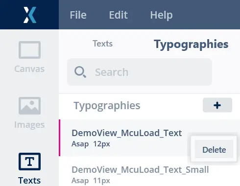
Delete Typography