Images View
The Images View is used to manage the images used in a TouchGFX application (located under the assets\images folder). It includes 3 sections: the tree view (left side), the table view (middle) and the properties view (right side).
The default configuration values for an image can be changed in the Default Image Configuration in the Config View.
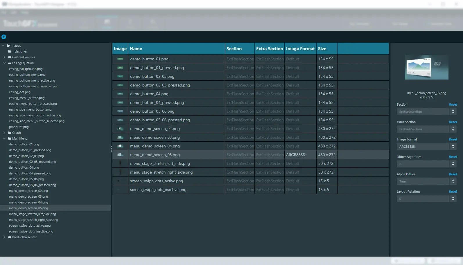
Images view in TouchGFX Designer
Tree View
The tree view provides an overview of the images and folders present in your application. The width of the tree view can be changed by dragging the grid-splitter thumb to suit your needs.
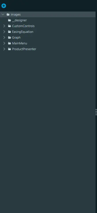
The tree view in Images
You can add images to the assets\images folder by clicking the blue button with a plus icon or by dragging the images directly to the Designer from the File Explorer. Images added to the assets\images folder will automatically show up in the Image Manager.
Clicking on a folder node will show the images in that folder in the table view (clicking on the root folder “images” will show all images in the application, including images located in subfolders).
Clicking on an image node will also show the other images under the same folder in the table view and select it such that its properties can be changed in the right side properties view.
Clicking the chevron next to a folder will collapse/expand the folder.
Clicking the x button while hovering over a node lets you delete that item from disk.
Table View
The table view shows a list of the images located under the currently selected folder and contains different columns corresponding to different properties for an image. Clicking the header of a column sorts the list either ascending or descending.
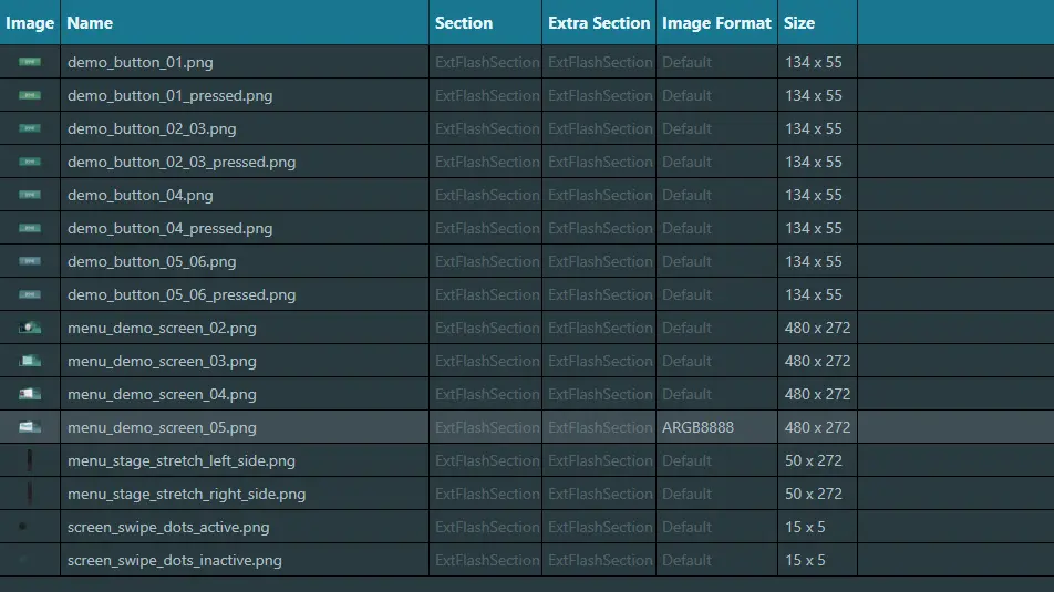
The table view in Images
The Image column contains a preview of the image. Hovering over the image preview will show the preview in full size. Clicking the preview will open the image in the default application associated with .png images (for example paint.net).
Clicking a row will select the image such that its properties can be changed in the right side properties view.
When the value of a cell is grayed out, it means that the default value is used. When an explicit value has been set on an image, the cell will light up, as seen in the image above, where the image 'menu_demo_screen_05.png' has had its default Image Format value changed to ARGB8888.
Properties View
The properties view is used to change the properties of an image. It includes an image preview at the top, which, like the preview in the table view, will show a full size version if you hover over it, and will also open up the default application associated with .png files when clicked.
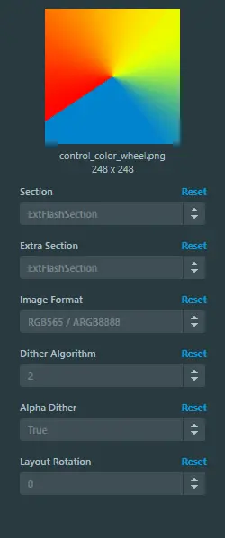
The properties view in Images
The different properties all have a default value. When no explicit value has been set on a property, the default value is shown in a grayed out manner in the selection boxes. When an explicit value is set, the value is shown in a lit up matter as shown below.
Pressing the Reset button will remove the current value and reset it back to its default value. When an explicit value has been set, changing the default value will not have an impact on that specific property.