Interactions
Interactions allow you to configure an action to take place when a trigger happens. An interaction in TouchGFX Designer is built up of a trigger and an action:
- A Trigger is what will start the interaction - what needs to happen in our application, for the Action to take place.
- An Action is what will happen after a Trigger has been emitted. This is where you can decide what happens in your application, when your defined trigger conditions have been met.
To add an interaction go to the Interactions tab for any Screen or Custom Container, and press the blue button labelled "Add Interaction" as shown in the image below.
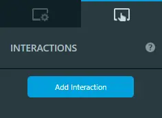
Interactions tab in TouchGFX Designer
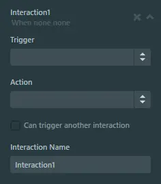
After pressing the "Add Interaction" button, the interaction in the image below will be added. The top of the Interaction view consists of the name given to the Interaction, a dynamic description, a button with a cross icon, and a button with a chevron icon.
The dynamic description is modified based on the Trigger and Action that has been selected. Since no Trigger and Action has been selected in the image below, the dynamic description is "When none none".
The button with a cross icon will delete the Interaction with a confirmation popup.
The button with a chevron icon will collapse the Interaction view, making the overview of interactions more manageable.
New Interaction in the Interactions tab
Triggers
The Trigger dropdown is populated based on what widgets have been added to a Screen or Custom Container.
An empty Screen will only have two Triggers available: Hardware button is clicked and Screen is entered.
Adding a widget will add the Triggers associated with it. For example, adding a Button widget will add the Button is clicked Trigger to the Screen or Custom Container.
Some Triggers, like Button is clicked, require a component to be selected as shown in the image below. However, if there is only one widget matching the Trigger, that widget will be auto-selected.
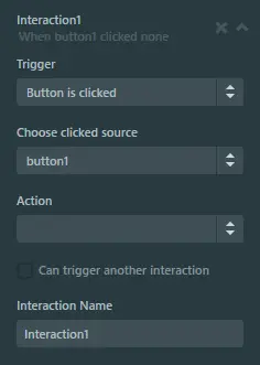
Button is Clicked Trigger selected on Interaction
As can be seen in the image above, after selecting the Trigger, the dynamic description has been updated from "When none none" to "When button1 clicked none".
Actions
The Action dropdown is populated based on what widgets have been added to a Screen or Custom Container.
An empty Screen will only have four Actions available:
- Call new virtual function
- Change screen
- Execute C++ code
- Wait for
Adding a widget will add the Actions associated with it. Adding a Button widget will add the following Actions:
- Move widget
- Fade widget
- Hide widget
- Show widget
Some Actions, like Move widget, require a component to be selected as shown in the image below. However, if there is only one widget matching the Action, that widget will be auto-selected. Selecting the action Move widget also adds more properties relevant to moving a widget.
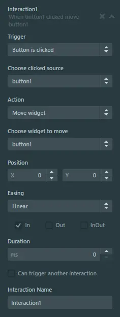
Move widget action selected on Interaction
As can be seen above, after selecting the Action, the dynamic description has been updated from "When button1 clicked none" to "When button1 clicked move button1".
Chaining Interactions
Interactions can also be triggered by another Interaction upon completing its Action.
To enable this behaviour, the checkbox labeled Can trigger another interaction needs to be enabled as shown in the image below:
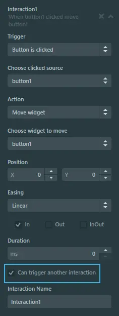
Can trigger another interaction enabled on Interaction
After enabling this behaviour, other Interactions can trigger on the Interaction, as shown in the image below:
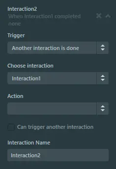
Interaction triggering on another Interaction