Dynamic Graph
A Dynamic Graph in TouchGFX is a widget that allows an application to display data points on a monotonous x-axis. The Dynamic Graph supports three types of dynamic behavior, that defines what happens when the graph runs out of space on the x-axis. The chosen dynamic behavior also greatly impacts the performance of the Dynamic Graph, as the behavior chosen impacts the area needed to be redrawn when inserting data points.
The Dynamic Graph, can have its visual appearance defined via, Graph Elements, Grid Lines and Labels
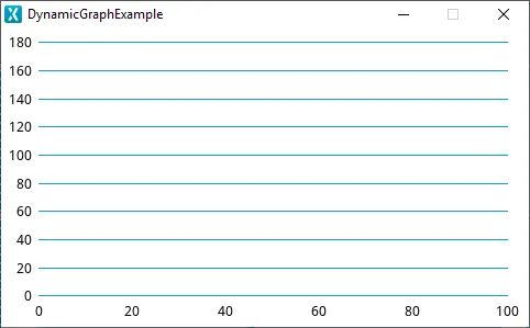
Dynamic Graph running in the simulator
Widget Group
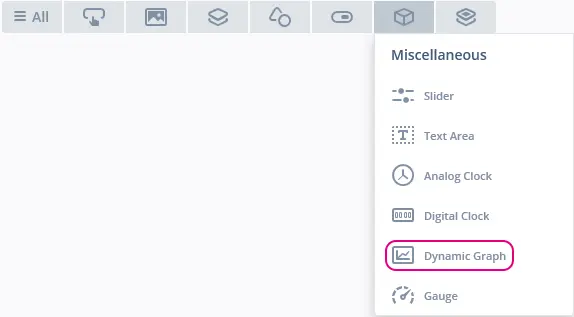
The Dynamic Graph can be found in the Miscellaneous widget group in TouchGFX Designer.
Dynamic Graph in TouchGFX Designer
Properties
The properties for a Dynamic Graph in TouchGFX Designer.
| Property Group | Property Descriptions |
|---|---|
| Name | Name of the widget. Name is the unique identifier used in TouchGFX Designer and code. |
| Location | X and Y specify the top left corner of the widget relative to its parent. W and H specify the width and height of the widget. Lock specifies if the widget should be locked in its current X, Y, W and H. Locking the widget also disables interacting with the widget through the screen. Visible specifies the visibility of the widget. Making the widget invisible also disables interacting with the widget through the screen. |
| Graph Area Margin | Margin specifies how much space for graph labels there should be. Top specifies the amount of space above the graph area. Bottom specifies the amount of space below the graph area. Left specifies the amount of space left of the graph area. Right specifies the amount of space right of the graph area. |
| Graph Area Padding | Padding specifies how much room around the graph elements inside the graph area there should be. Top specifies the amount of room at the top of the graph area. Bottom specifies the amount of room at the bottom of the graph area. Left specifies the amount of room left of the graph area. Top specifies the amount of room right of the graph area. |
| Data Points | Dynamic Behavior specifies the behavior of the graph when adding data points, available options are: Wrap And Clear, Scroll and Wrap and Overwrite. Number of Data Points specifies the number of values the graph is capable of showing. Value Range specifies the minimum and maximum y-axis values the graph is capable of showing. Level of Precision specifies how many decimal places the graph is capable of displaying. Visible Range (index values) specifies the range of values shown on the x-axis. Custom Value Mapping specifies the mapping of the index values of the x-axis to custom values. Generate Random Values specifies whether or not random values should be initialized in code generation. (Random values will always be shown in the Canvas of TouchGFX Designer) |
| Elements | Area, Boxes, Diamonds, Dots, Histogram and Line specify which elements make up the widgets visual appearance. More than one of each type can be added. |
| Vertical Grid Lines | Major Division specifies whether or not to enable vertical major division grid lines. Minor Division specifies whether or not to enable vertical minor division grid lines. Can only be enabled if Major Division has been enabled. |
| Horizontal Grid Lines | Major Division specifies whether or not to enable horizontal major division grid lines. Minor Division specifies whether or not to enable horizontal minor division grid lines. Can only be enabled if Major Division has been enabled. |
| X-Axis Labels | Major Division specifies whether or not to enable major division labels on the x-axis. Minor Division specifies whether or not to enable minor division labels on the x-axis. Can only be enabled if Major Division has been enabled. |
| Y-Axis Labels | Major Division specifies whether or not to enable major division labels on the y-axis. Minor Division specifies whether or not to enable minor division labels on the y-axis. Can only be enabled if Major Division has been enabled. |
| Appearance | Alpha specifies the transparency of the widget. The alpha value ranges between 0 and 255 for the widget. 0 is fully transparent and 255 is solid. |
| Mixins | Draggable specifies if the widget is draggable at runtime. ClickListener specifies if the widget emits a callback when clicked. FadeAnimator specifies if the widget can animate changes to its Alpha value. MoveAnimator specifies if the widget can animate changes to X and Y values. |
Precision
Internally the Dynamic Graph stores all data points in a 32 bit integer, therefore to add and display data points with a certain number of digits denoting the degree of accuracy, a level of precision can be defined.
If for example the level of precision is set to 0.1, each data point added to the Dynamic Graph, will be multiplied by 10 internally, thereby simulating one digit of precision. However it must be noted that as the level of precision increases, the highest/lowest possible value lowers/increases by the factor of the precision specified.
| Level of Precision | Lowest Possible Value | Highest Possible Value |
|---|---|---|
| 1 | -1 Billion | 1 Billion |
| 0.1 | -100 Million | 100 Million |
| 0.01 | -10 Million | 10 Million |
| 0.001 | -1 Million | 1 Million |
| 0.0001 | -100 Thousand | 100 Thousand |
The lowest/highest numbers given above are rough estimations
Dynamic Behavior
The Dynamic Graph supports three types of dynamic behavior, Wrap And Clear, Scroll and Wrap and Overwrite. The selected dynamic behavior specifies what will happen once the graph runs out of space on the x-axis, as can be seen in the three demontrations below.
Dynamic Graph Wrap and Clear example

Dynamic Graph Scroll example
Dynamic Graph Wrap and Overwrite example
Graph Area, Margin and Padding
The Dynamic Graph renders all graph elements and grid lines in a Graph Area, incapsulated by padding and margin. If both padding or margin are defined as zero, the Graph Area will follow the the size given to the Dynamic Graph.
To make space for labels along the x- and y-axis, a margin can be defined. The Margin settings move the graph area that contains the graph elements (Area, Boxes, Diamonds, etc.) inside the widget, reserving space for labels along the x- and y-axis.
In the figure below the red area represents a 20 px margin added to right, top, left and bottom.
Depending on their sizes, some elements will not be shown fully if they are positioned close to the edges of the Graph Area, therefore a padding can be defined. The Padding settings add some padding inside the graph area that contains the graph elements (Area, Boxes, Diamonds, etc.), this will allow Grid lines, Boxes, Dots, Diamonds, Histogram and Line elements drawn at the edges of the Graph Area to be drawn fully.
Padding can also be used to create extra space between the labels along the axes and the Graph Area.
In the figure below the orange area represents a 20 px padding added to right, top, left and bottom. It also shows how the Boxes element is allowed to draw into the padded area.
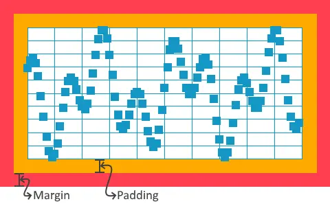
Dynamic Graph margin and padding example
Elements
The Dynamic Graph has six available element types to display data: Area, Boxes, Diamonds, Dots, Histogram and Line
Area
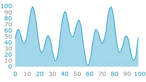
The Area element will fill the area below the line connecting the data points in the graph.
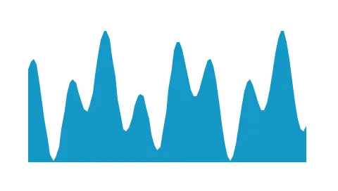
Dynamic Graph Area example
| Property | Property Description |
|---|---|
| Image | Specifies which image to use as fill for the area. |
| Color | Specifies which color to use as fill for the area. |
| Baseline | Specifies the base of the area drawn. Normally, the base is 0 which means that the area is drawn below positive y values and above negative y values. |
| Alpha | Specifies the transparency of the area. The alpha value ranges between 0 and 255 for the widget. 0 is fully transparent and 255 is solid. |
API Reference
Further reading
Boxes
The Boxes element will draw a square box for every data point in graph.
Dynamic Graph Boxes example
| Property | Property Description |
|---|---|
| Color | Specifies which color to use as fill for the boxes. |
| Box Size | Specifies the size of the boxes. |
| Alpha | Specifies the transparency of the boxes. The alpha value ranges between 0 and 255 for the widget. 0 is fully transparent and 255 is solid. |
API Reference
Further reading
Diamonds
The Diamonds element will draw a diamond (a square with the corners up/down/left/right) for every data point in graph.
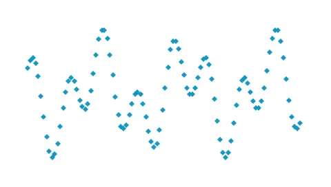
Dynamic Graph Diamonds example
| Property | Property Description |
|---|---|
| Image | Specifies which image to use as fill for the diamonds. |
| Color | Specifies which color to use as fill for the diamonds. |
| Diamond Size | Specifies the size of the diamonds |
| Alpha | Specifies the transparency of the diamonds. The alpha value ranges between 0 and 255 for the widget. 0 is fully transparent and 255 is solid. |
API Reference
Further reading
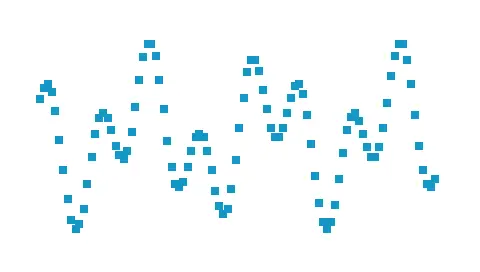
Dots
The Dots element will draw a circular dot for every data point in graph.
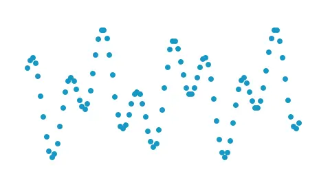
Dynamic Graph Dots example
| Property | Property Description |
|---|---|
| Image | Specifies which image to use as fill for the dots. |
| Color | Specifies which color to use as fill for the dots. |
| Dot Size | Specifies the size of the dots |
| Alpha | Specifies the transparency of the dots. The alpha value ranges between 0 and 255 for the widget. 0 is fully transparent and 255 is solid. |
API Reference
Further reading
Histogram
The Histogram element is used to draw blocks from the x-axis to the data point in the graph. If more graphs are placed on top of each other, the histogram can be moved slightly to the left/right.
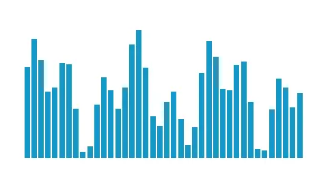
Dynamic Graph Histogram example
| Property | Property Description |
|---|---|
| Image | Specifies which image to use as fill for the histogram. |
| Color | Specifies which color to use as fill for the histogram. |
| Bar Width | Specifies width of the histogram bars. |
| Bar Offset | Specifies bar offset along the horizontal axis. |
| Baseline | Specifies the base of the histogram drawn. Normally, the base is 0 which means that the histogram is drawn below positive y values and above negative y values. |
| Alpha | Specifies the transparency of the histogram. The alpha value ranges between 0 and 255 for the widget. 0 is fully transparent and 255 is solid. |
API Reference
Further reading
Line
The Line element will draw a line with a given thickness through the data points in the graph.
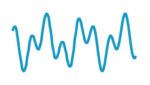
Dynamic Graph Line example
| Property | Property Description |
|---|---|
| Image | Specifies which image to use as fill for the line. |
| Color | Specifies which color to use as fill for the line. |
| Line Width | Specifies the width of the line |
| Alpha | Specifies the transparency of the line. The alpha value ranges between 0 and 255 for the widget. 0 is fully transparent and 255 is solid. |
API Reference
Further reading
Grid Lines
The Dynamic Graph can have horizontal and vertical grid lines in both major and minor divisions.
Minor divisions are overruled by major divisions, such that minor divisions will not be drawn on locations where major divisions are present.
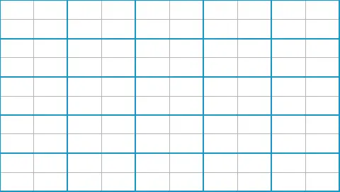
Dynamic Graph Grid Lines example
| Property | Property Description |
|---|---|
| Color | Specifies which color to use as fill for the grid line. |
| Interval | Specifies the interval at which grid lines should be drawn |
| Line Width | Specifies the width of the grid line |
| Alpha | Specifies the transparency of the line. The alpha value ranges between 0 and 255 for the widget. 0 is fully transparent and 255 is solid. |
API Reference
Further reading
Labels
. The Dynamic Graph can have x-axis and y-axis labels displaying the value in both major and minor divisions.
Minor divisions are overruled by major divisions, such that minor divisions will not be drawn on locations where major divisions are present.
Dynamic Graph Labels example
| Property | Property Description |
|---|---|
| Position | Specifies the location of the labels. Possible locations for x-axis labels are "Top" and "Bottom" Possible locations for y-axis labels are "Left" and "Right" |
| Text | ID specifies the text that is used. If the widget uses an auto-generated text, the ID will display 'Auto-generated'. Translation specifies the content of the text to be displayed. Typography specifies the format of the text. Alignment specifies the horizontal alignment of the text. For more details on text configuration, refer to the Using texts and fonts section. |
| Text Rotation | Specifies the rotation of the labels, possible values are "0", "90", "180" and "270". |
| Text Color | Specifies which color to use as fill for the labes. |
| Interval | Specifies the interval at which labels should be drawn |
| Number of Decimals | Specifies the number of decimals the labels along the axis should show. |
| Decimal Separator | Specifies whether to use ',' or '.' as the decimal separator. |
| Alpha | Specifies the transparency of the line. The alpha value ranges between 0 and 255 for the widget. 0 is fully transparent and 255 is solid. |
API Reference
Further reading
Interactions
The actions and triggers supported by a Dynamic Graph in TouchGFX Designer.
Actions
| Standard widget actions | Description |
|---|---|
| Move widget | Move a widget to a new position over time. |
| Fade widget | Modify alpha value of widget over time. |
| Hide widget | Hides a widget (sets visibility to false). |
| Show widget | Make a hidden widget visible (sets visibility to true). |
Triggers
| Trigger | Description |
|---|---|
| Graph Clicked | A Dynamic Graph has been clicked. |
| Graph Dragged | A Dynamic Graph has been dragged across. |
Performance
The Dynamic Graph performance will vary, depending upon the setup of the widget.
The chosen dynamic behavior impacts the performance.
- "Wrap And Clear" is a fast performing behavior because it only draws the newest data point added.
- "Wrap And Overwrite" is a fast performing behavior because it only draws the newest data point added.
- "Scroll" is a demanding behavior, since everytime a data point is added, all the previous data points visible also need to be redrawn.
Certain graph elements will be faster to draw.
Boxes and Histogram are the fastest performing graph elements, because they do not have to read any pixel data or do any complicated calculations.
Area, Diamonds, Dots and Line, are CanvasWidgets and are heavily dependent on the MCU for rendering.
For more details on drawing performance, read the General UI Component Performance section.
Changing the canvas buffer size can, in some cases, improve performance. For more information, refer to the canvas widget article.
Examples
Generated Code
In the generated code for the View base class we can see how TouchGFX Designer sets up a Dynamic Graph.
Screen1ViewBase.cpp
dynamicGraph.setScale(1);
dynamicGraph.setPosition(0, 0, 320, 240);
dynamicGraph.setGraphLabelPadding(0, 0, 0, 0);
dynamicGraph.setGraphPadding(0, 0, 0, 0);
dynamicGraph.setGraphRangeY(0, 100);

dynamicGraphLine1.setScale(1);
dynamicGraphLine1Painter.setColor(touchgfx::Color::getColorFromRGB(20, 151, 197));
dynamicGraphLine1.setPainter(dynamicGraphLine1Painter);
dynamicGraphLine1.setLineWidth(2);
dynamicGraph.addGraphElement(dynamicGraphLine1);
Tip
dynamicGraph.invalidate() if you change the appearance of the widget.User Code
To add data points to the Dynamic Graph, the method addDataPoint() is used. The following code example shows how to add data points to a Dynamic Graph, by overwriting the handleTickEvent() method.
Screen1View.hpp
class Screen1View
{
public:
    Screen1View();
    virtual ~Screen1View() {}
    virtual void setupScreen();
    virtual void tearDownScreen();
protected:
    int tickCounter;
    void handleTickEvent();
};
Screen1View.cpp
#include <gui/screen1_screen/Screen1View.hpp>

Screen1View::Screen1View()
{
    tickCounter = 0;
}

void Screen1View::handleTickEvent()
{
    tickCounter++;

    // Insert each second tick
    if (tickCounter % 2 == 0)
    {
      // Insert data point
      dynamicGraph.addDataPoint(/* Your data point here, either float or integer */);
    }
}
TouchGFX Designer Examples
To further explore the Dynamic Graph, try creating a new application within TouchGFX Designer with one of the following UI templates:
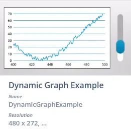
Dynamic Graph Example UI template in TouchGFX Designer