Gauge
A Gauge is a widget capable of drawing a needle and arc indicating a given value within a specified range.

Gauge running in the simulator
Widget Group
The gauge can be found in the Miscellaneous widget group in TouchGFX Designer.
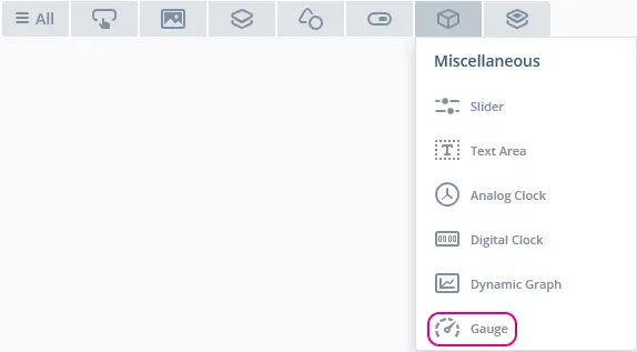
Gauge in TouchGFX Designer
Properties
The properties for a Gauge in TouchGFX Designer.
| Property Group | Property Descriptions |
|---|---|
| Name | Name of the widget. Name is the unique identifier used in TouchGFX Designer and code. |
| Location | X and Y specify the top left corner of the widget relative to its parent. W and H specify the width and height of the widget. Lock specifies if the widget should be locked in its current X, Y, W and H. Locking the widget also disables interacting with the widget through the screen. Visible specifies the visibility of the widget. Making the widget invisible also disables interacting with the widget through the screen. |
| Style | Style specifies a predefined setup of the widget, that sets select properties to predefined values. These styles contain images that are free to use. |
| Background | Background Image specifies the image to be used as background. Background offset specifies the x- and y-axis offset of the selected background image. |
| Gauge | Rotation Center specifies the x- and y-axis point in the widget at which the needle and arc should rotate. Start and End Angle specify the start and end angle of the needle and arc. Value Range specifies the minimum and maximum integer values of the indicator. Initial Value specifies the initial value of the gauge. |
| Animation | Animate Movement specifies if animation of the needle and arc are enabled. Easing and Easing Option specify the easing equation used. |
| Needle | Needle Image specifies the image to be used as background. Needle Rotation Center specifies the position in the needle image around which it will rotate. Moving Rendering Algorithm specifies the algorithm used to draw the needle image while moving to new value. Steady Rendering Algorithm specifies the algorithm used to draw the needle image while stationary. |
| Arc | Use Arc specifies whether or not to use an arc. Image/Color specifies either a color or an image to use as fill for the arc. Set Arc position specifies whether or not to override the default arc size and position. By default arc is placed in 0, 0 and has the same size as the gauge itself. Overriding the default setting is useful when you want to use an image as painter for the arc, but the arc, and thus the image, is smaller than the size of the gauge. So instead of having a large image of the size of the gauge with a lot of transparent lines, the the image can be cut to the wanted size and place the arc at a specific position. The arc will still follow the same rotation center. Arc Position X and Y specifies the x- and y-axis position of the arc. Arc Width and Height specifies the size of the arc. Radius specifies the radius of the arc. Line Width specifies the line width of the arc. If the value is 0, the arc is as large as the radius. Cap Style specifies line ending style of the arc. If the line width is set to 0, the capstyle selected will have no effect. Arc on top of Needle specifies whether or not the arc is on top of the needle. |
| Appearance | Alpha specifies the transparency of the widget. The alpha value ranges between 0 and 255 for the widget. 0 is fully transparent and 255 is solid. |
| Mixins | Draggable specifies if the widget is draggable at runtime. ClickListener specifies if the widget emits a callback when clicked. FadeAnimator specifies if the widget can animate changes to its Alpha value. MoveAnimator specifies if the widget can animate changes to X and Y values. |
By default arc is placed in 0, 0 and has the same size as the gauge itself. Overriding the default setting is useful when you want to use an image as painter for the arc, but the arc, and thus the image, is smaller than the size of the gauge. So instead of having a large image of the size of the gauge with a lot of transparent lines, the the image can be cut to the wanted size and place the arc at a specific position. The arc will still follow the same rotation center.
Interactions
The actions and triggers supported by a Gauge in TouchGFX Designer.
Actions
| Widget specific actions | Description |
|---|---|
| Set value | Set the value of the Gauge. |
| Update value | Update the value of the Gauge with a duration. |
| Standard widget actions | Description |
|---|---|
| Move widget | Move a widget to a new position over time. |
| Fade widget | Modify alpha value of widget over time. |
| Hide widget | Hides a widget (sets visibility to false). |
| Show widget | Make a hidden widget visible (sets visibility to true). |
Triggers
| Trigger | Description |
|---|---|
| Gauge value set | Will be triggered for both instant updates and intermediate steps during an update animation. Will only trigger when the new value differs from the current one. |
| Gauge value updated | Will be triggered when an update animation is completed. If duration of the update is 0 the update will happen instantly but will still trigger this event. |
Performance
A Gauge consists of an Image, Circle and a Texture Mapper.
The Circle and Texture Mapper components are MCU resource intensive components. Therefore, the Gauge is considered a demanding widget on most platforms.
For more details on drawing performance, read the General UI Component Performance section.
Examples
Generated Code
In the generated code for the View base class we can see how TouchGFX Designer sets up a Gauge.
MainViewBase.cpp
#include <gui_generated/main_screen/mainViewBase.hpp>
#include "BitmapDatabase.hpp"

mainViewBase::mainViewBase()
{
    gauge.setBackground(touchgfx::Bitmap(BITMAP_BLUE_GAUGES_ORIGINAL_GAUGE_BACKGROUND_STYLE_01_ID));
    gauge.setPosition(115, 11, 251, 251);
    gauge.setCenter(125, 125);
    gauge.setStartEndAngle(-85, 85);
    gauge.setRange(0, 100);
    gauge.setValue(0);
    gauge.setEasingEquation(touchgfx::EasingEquations::elasticEaseOut);
    gauge.setNeedle(BITMAP_BLUE_NEEDLES_ORIGINAL_GAUGE_NEEDLE_STYLE_01_ID, 11, 55);
    gauge.setMovingNeedleRenderingAlgorithm(touchgfx::TextureMapper::BILINEAR_INTERPOLATION);
    gauge.setSteadyNeedleRenderingAlgorithm(touchgfx::TextureMapper::BILINEAR_INTERPOLATION);
    gauge.setArcVisible();
    gaugePainter.setBitmap(touchgfx::Bitmap(BITMAP_BLUE_GAUGES_ORIGINAL_GAUGE_FILL_STYLE_01_ID));
    gauge.getArc().setPainter(gaugePainter);
    gauge.getArc().setRadius(94);
    gauge.getArc().setLineWidth(14);
    gauge.getArc().setCapPrecision(180);
    gauge.setArcPosition(28, 30, 196, 88);

    add(gauge);
}
Tip
gauge.invalidate() if you change the appearance of the widget.User Code
To set the value of the Gauge, setValue(int value) and updateValue(int value, uint16_t duration) can be used.
setValue(int value) will immediately move the needle and arc to the new value with no animation.
updateValue(int value, uint16_t duration) animates needle and arc to new value over the defined duration in ticks. If duration is equal to 0, the update will be done immediately. The animation used will be the one defined on the gauge using setEasingEquation(EasingEquation easingEquation)
MainView.cpp
#include <gui/main_screen/MainView.hpp>

MainView::MainView()
{
    tickCounter = 0;
}

void MainView::handleTickEvent()
{
    tickCounter++;

    // Change value every 120 tick.
    if (tickCounter % 120 == 0)
    {
      // Insert data point
      gauge.updateValue(/* new integer value */, 30); // animates needle and arc to new value with a duration of 30 ticks
    }
}
TouchGFX Designer Examples
To further explore the Gauge, try creating a new application within TouchGFX Designer with one of the following UI templates:
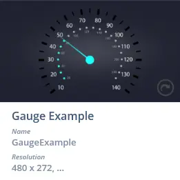
Gauge Example UI template in TouchGFX Designer