TouchGFX Stock
TouchGFX Stock is a library of thousands of ready-to-use free graphical assets for embedded user interfaces. It includes backgrounds, icons, visual styling of widgets, top bars, and much more. The assets are arranged in themes to give you a browsable overview and enable selecting matching designs for your UI components.
The TouchGFX Stock elements can supplement your own design or be used for the entire UI.
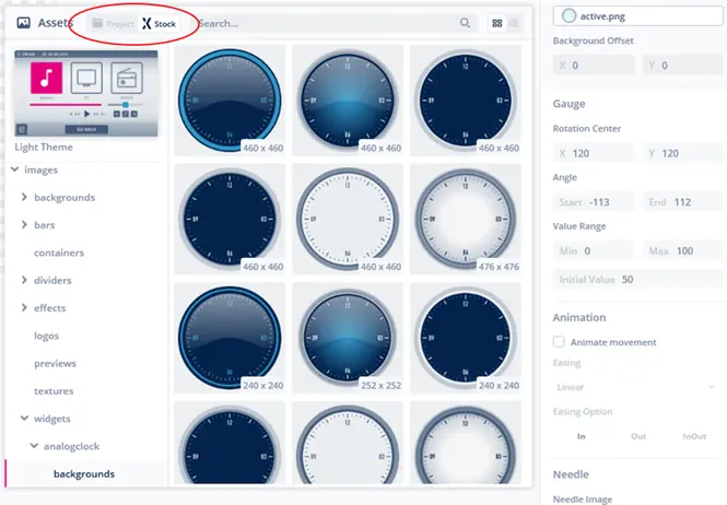
Access to TouchGFX Stock is integrated in the TouchGFX Designer tool and lets you access the assets just as if they were part of your project. Press the TouchGFX Stock button in the image picker pop-up when setting image properties.
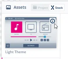
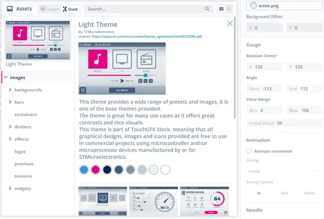
Each theme comes with a description page that tells you of the design, theme colors, license terms and complete design examples. Simply press the info icon on the theme to go to the description page.
License terms
Since the icons are from Google’s free-to-use Material Icons library and ST owns the rights to all the other resources, TouchGFX Stock has a generous license that allows teams to use the assets for free, even for commercial projects, as long as they run on STM32 devices. Users are allowed to grab the assets to resize them for their interface or edit them to fit their specific needs as well.
Read more on the license terms here.
Browsing
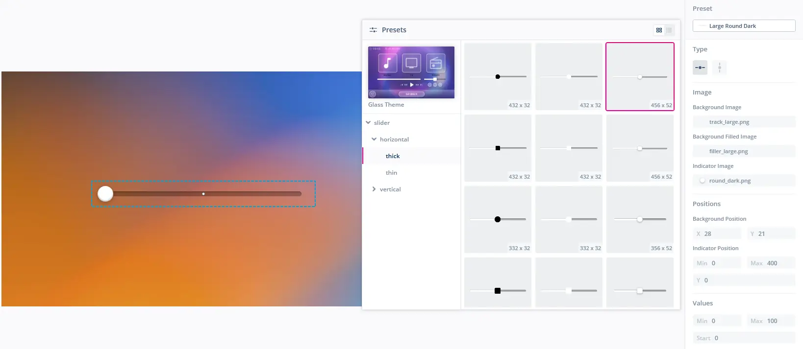
The TouchGFX Stock elements can be browsed when editing image or preset properties of a widget. When browsing, click the currently selected theme to select another theme.
Navigate the folder tree below the selected theme, to inspect more images or presets. All are categorized by purpose, widget type and/or size. Clicking an image or preset will select the element.
Assets
The assets provided in the themes of TouchGFX Stock are in one of two formats
Images
Each TouchGFX Stock image is of a certain size, appearance and purpose. The images are made to fit visually into applications of most regular resolutions.
As an example, the images for buttons found in the Alternate Theme are divided into
- round or rounded appearance
- icon and regular sizing
- icon for buttons that only need an icon on top
- regular for more rectangular buttons that might support a piece of text or an icon or both
- different width and height to fit display resolution and UI constraints
Some images are not meant for any particular widget, but can used in accentuating your UI. Typical examples hereof are effects like gradients, bars for containing elements, dividers for spliting the UI into different parts. Many more can be found by browsing through the TouchGFX Stock.
Icons
Icons are an essential part of many user interfaces, visually expressing objects, actions and ideas. When done correctly, they communicate the core idea and intent of a product or action, and they bring a lot of nice benefits to user interfaces, such as saving screen real estate and enhancing aesthetic appeal.
TouchGFX Stock includes more than 1500 different icons in the theme called Material Icons. These icons are based on the set of free Material Icons supplied by Google.
In TouchGFX Designer you are able to set the size as well as the color of the selected icon, as shown in the figure below.
The original format of the icons in TouchGFX Stock is SVG, but when used in a TouchGFX project they are transformed to PNGs and thereafter, in the build step, into the internal bitmap format used for all PNG based images in TouchGFX.
Presets for widgets
When inserting a new widget in your application, the widget will have a default preset selected. A preset is a predefined visual appearance for a given widget type. This is not only the images used for a widget, but also other parameter settings that affect the visual appearance, such as the placement of the icon inside an Button With Icon or the minimum and maximum knob positions of a Slider.
You are free to change the parameters set by a preset. When doing this the preset setting will be changed to No preset. This means that the current widget is not configured by a particular preset. You can always reselect a preset to update the parameters to the values of that preset.
Customizing TouchGFX Stock assets
If images or icons found in the TouchGFX Stock needs customization to match your application, you are free to customize them. An example of customization is resizing the images for a button. This can be done by removing the inner parts and combining the end pieces.
Customizing can be done by
- Use the asset to be customized in a widget in your application
- Generate code
- Copy the selected generated asset from the
assets/images/__generatedfolder - Alter the copied asset
- Paste the customized asset into the
assets/imagesfolder - Use the customized asset in your application
