Image Progress
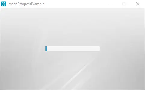
An Image Progress shows the current progress by using a Tiled Image as the progress indicator on top of a background Image. The progress image, the Alpha and the Direction towards which the image will progress can be configured. It is possible to create a custom background image and change the different parameters of the progress indicator such as the position and the size to fit the custom background image.
Widget Group
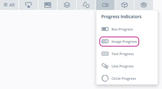
The Image Progress can be found in the Progress Indicators widget group in TouchGFX Designer.
Properties
The properties for an Image Progress in TouchGFX Designer.
| Property Group | Property Descriptions |
|---|---|
| Name | Name of the widget. Name is the unique identifier used in TouchGFX Designer and code. |
| Location | X and Y specify the top left corner of the widget relative to its parent. W and H specify the width and height of the widget. The size of an Image Progress is determined by the size of the selected background image. Lock specifies if the widget should be locked in its current X, Y, W and H. Locking the widget also disables interacting with the widget through the screen. Visible specifies the visibility of the widget. Making the widget invisible also disables interacting with the widget through the screen. |
| Style | Style specifies a predefined setup of the widget, that sets select properties to predefined values. These styles contain images that are free to use. |
| Image | Background sets the background image. Progress sets the image used to display progress. |
| Progress Position | X and Y coordinates specify the top left corner of the progress image relative to the position of the Progress Indicator. W and H specify the width and height of the progress image. |
| Values | Range Min and Range Max specify the minimum and maximum integer values of the indicator. Initial specifies the initial value of the progress indicator.Steps Total specifies at what granularity the progress indicator reports new values. For instance, if the progress needs to be reported as 0%, 10%, 20%, ..., 100%, the total value should be set to 10. Steps Min specifies the minimum steps the progress indicator shows. |
| Appearance | Direction specifies in which direction the progress indicator should progress. Anchor progress image at zero specifies if the progress image should be anchored in the 0 point relative to the progress direction, i.e. whether the image is "revealed" or "pulled". Alpha specifies the transparency of the widget. The alpha value ranges between 0 and 255 for the widget. 0 is fully transparent and 255 is solid. |
| Mixins | Draggable specifies if the widget is draggable at runtime. ClickListener specifies if the widget emits a callback when clicked. FadeAnimator specifies if the widget can animate changes to its Alpha value. MoveAnimator specifies if the widget can animate changes to X and Y values. |
Interactions
The actions and triggers supported by the Image Progress are described in the following sections.
Actions
| Widget specific actions | Description |
|---|---|
| Set value | Set the value of the progress indicator. |
| Standard widget actions | Description |
|---|---|
| Move widget | Move a widget to a new position over time. |
| Fade widget | Modify alpha value of widget over time. |
| Hide widget | Hides a widget (sets visibility to false). |
| Show widget | Make a hidden widget visible (sets visibility to true). |
Triggers
| Trigger | Description |
|---|---|
| Value update complete | Will be triggered when an update animation is completed. If duration of the update is 0 the update will happen instantly but will still trigger this event. |
| Value updated | Will be triggered for both instant updates and intermediate steps during an update animation. Will only trigger when the new value differs from the current one. |
Performance
An Image Progress consists of a Tiled Image and a background Image. Therefore, the Image Progress is dependent on image drawing and is considered a fast performing widget on most platforms.
For more details on image drawing performance, read the General UI Component Performance section.
Examples
Generated Code
In the generated code for the View base class we can see how TouchGFX Designer sets up an Image Progress.
Screen1ViewBase.cpp
imageProgress.setXY(148, 126);
imageProgress.setProgressIndicatorPosition(2, 2, 180, 16);
imageProgress.setRange(0, 100);
imageProgress.setDirection(touchgfx::AbstractDirectionProgress::RIGHT);
imageProgress.setBackground(touchgfx::Bitmap(BITMAP_BLUE_PROGRESSINDICATORS_BG_MEDIUM_PROGRESS_INDICATOR_BG_SQUARE_DEGREES_ID));
imageProgress.setBitmap(BITMAP_BLUE_PROGRESSINDICATORS_FILL_TILING_PROGRESS_INDICATOR_FILL_STRIPED_NORMAL_HORIZONTAL_ID);
imageProgress.setValue(0);
imageProgress.setAnchorAtZero(false);
Tip
imageProgress1.invalidate() if you change the appearance of the widget.User Code
The following example illustrates how to implement the handleTickEvent() function to simulate progress. Running this code creates the application shown at the beginning of this article.
Screen1View.hpp
class Screen1View : public Screen1ViewBase
{
public:
    Screen1View();
    virtual ~Screen1View() {}
    virtual void setupScreen();
    virtual void tearDownScreen();
    virtual void handleTickEvent();
protected:
    bool increase = true;
};
Screen1View.cpp
void Screen1View::handleTickEvent()
{
    int currentValue = imageProgress.getValue();
    int16_t max;
    int16_t min;
    imageProgress.getRange(min, max);

    if (currentValue == min)
    {
        increase = true;
    }
    else if (currentValue == max)
    {
        increase = false;
    }

    int nextValue = increase == true ? currentValue+1 : currentValue-1;

    imageProgress.setValue(nextValue);
}
TouchGFX Designer Examples
To further explore the Image Progress, try creating a new application within TouchGFX Designer with the following UI template:


