SVG Image
An SVG Image is a widget capable of drawing an SVG image file, that can be freely scaled and rotated around an adjustable rotation center.
Note
Widget Group
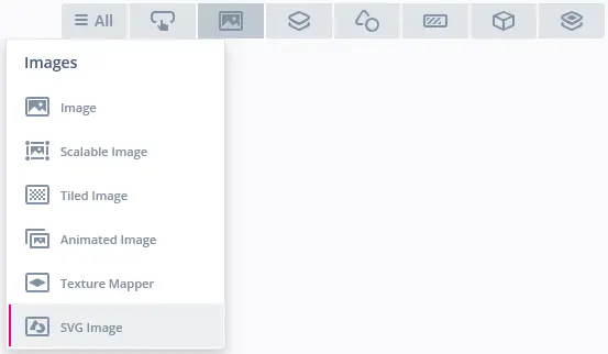
The SVG Image can be found in the Images widget group in TouchGFX Designer.
Properties
The properties for an SVG Image in TouchGFX Designer.
| Property Group | Property Descriptions |
|---|---|
| Name | Name of the widget. Name is the unique identifier used in TouchGFX Designer and code. |
| Location | X and Y specify the top left corner of the widget relative to its parent. W and H specify the width and height of the widget. The size of the widget is determined by the size of the associated image. Lock specifies if the widget should be locked in its current X, Y, W and H. Locking the widget also disables interacting with the widget through the screen. Visible specifies the visibility of the widget. Making the widget invisible also disables interacting with the widget through the screen. |
| SVG | SVG specifies the associated SVG image. Select either from the imported images in the Project tab or from the set of free TouchGFX images in the Stock tab. Lock Image to Center specifies if the image position should be locked to the center of the widget. This option only applies in the TouchGFX Designer, i.e. if the SVG Image is resized during runtime, this option doesn't have any effect on the centered position of the image. Fit Image To Size will scale the image to fit the size of the SVG Image widget. This option only applies in the TouchGFX Designer, i.e. if the SVG Image is resized during runtime, this option doesn't have any effect on the image size. Image Position X and Y specifies the top left corner of the image. Image Scale X and Y specifies the scaling factors used to scale the image in the X and/or Y direction. Rotation Center X and Y specifies the center of rotation and Rotation (deg) specifies the angle in degrees to rotate the image. |
| Mixin | Draggable specifies if the widget is draggable at runtime. ClickListener specifies if the widget emits a callback when clicked. MoveAnimator specifies if the widget can animate changes to X and Y values. |
Interactions
The actions and triggers supported by the SVG Image are described in the following sections.
Actions
| Widget specific action | Description |
|---|---|
| Rotate SVG Image | Rotate the SVG Image around its Rotation Center either relative to its current orientation or to a specific angle. |
| Scale SVG Image | Scale the SVG Image either relative to its current size or to a specific size. |
| Resize widget | Resize the width and height of a widget. |
| Standard widget actions | Description |
|---|---|
| Move widget | Move a widget to a new position over time. |
| Hide widget | Hides a widget (sets visibility to false). |
| Show widget | Make a hidden widget visible (sets visibility to true). |
Triggers
An SVG Image does not emit any triggers.
Performance
The performance of an SVG Image widget depends on the complexity of the SVG image file used, e.g. number of elements, number of paths, the path size, the use of gradients etc.. Therefore, an SVG Image is considered a demanding widget on most platforms.
For more details on drawing performance, read the General UI Component Performance section.
Examples
Generated Code
In the generated code for the View base class we can see how TouchGFX Designer sets up an SVG Image.
Screen1ViewBase.cpp
#include <gui_generated/screen1_screen/Screen1ViewBase.hpp>
#include <touchgfx/canvas_widget_renderer/CanvasWidgetRenderer.hpp>
#include <touchgfx/Color.hpp>
#include<images/SVGDatabase.hpp>

Screen1ViewBase::Screen1ViewBase()
{
    touchgfx::CanvasWidgetRenderer::setupBuffer(canvasBuffer, CANVAS_BUFFER_SIZE);

    svgImage.setSVG(SVG_ALTERNATE_THEME_IMAGES_LOGOS_TOUCHGFX_GRADIENT_EMBOSSED_SVG_ID);
    svgImage.setPosition(26, 25, 260, 180);
    svgImage.setScale(1.2f, 0.8f);
    svgImage.setImagePosition(40, 30);
    svgImage.setRotationCenter(130, 90);
    svgImage.setRotation(5);

    add(svgImage);
}

Screen1ViewBase::~Screen1ViewBase()
{
    touchgfx::CanvasWidgetRenderer::resetBuffer();
}

void Screen1ViewBase::setupScreen()
{
}
Tip
svgImage.invalidate() if you change the appearance of the widget.User Code
The following code example shows how to rotate the SVG Image by continuously adjusting the rotation in the handleTickEvent():
mainView.cpp
#include <gui/screen1_screen/Screen1View.hpp>

Screen1View::Screen1View()
{
}

void Screen1View::setupScreen()
{
    Screen1ViewBase::setupScreen();
}

void Screen1View::tearDownScreen()
{
    Screen1ViewBase::tearDownScreen();
}

void Screen1View::handleTickEvent()
{
    svgImage.setRotation(svgImage.getRotation() + 2.0f);
    svgImage.invalidate();
}
TouchGFX Designer Examples
To further explore the SVG Image, try creating a new application within TouchGFX Designer with the following UI template:


