Tutorial 4: Creating a Scroll Wheel with Custom Behavior
In this tutorial, you will learn how to create and configure the two widgets - Custom Container and Scroll Wheel. A Custom Container is a widget that enables you to create a new widget by combining multiple other widgets and add specific behavior for the widgets in the Custom Container. The Scroll Wheel is a widget used for creating a scrollable menu, consisting of multiple selectable items. The tutorial will also teach how user code can be created to change the behavior of a widget.
This time we will use a bigger screen, so start a new project for a board with a resolution of 800 x 480 pixels (e.g. STM32F469 Discovery) or the just use the simulator.
More information about the Custom Container and Scroll Wheel can be found on the two pages, Custom Containers and Scroll Wheel.
The graphics for the tutorial can be downloaded from this link. Unzip the file in the images folder under assets, which for the project used in this tutorial is MyApplication2\assets\images.
Step 1: Creating a Custom Container
Similar to step 1 in tutorial 2, start by creating a new project with the TouchGFX Designer. This time when the new project is ready, change from the screens tab in the TouchGFX Designer to the Container tab (1).
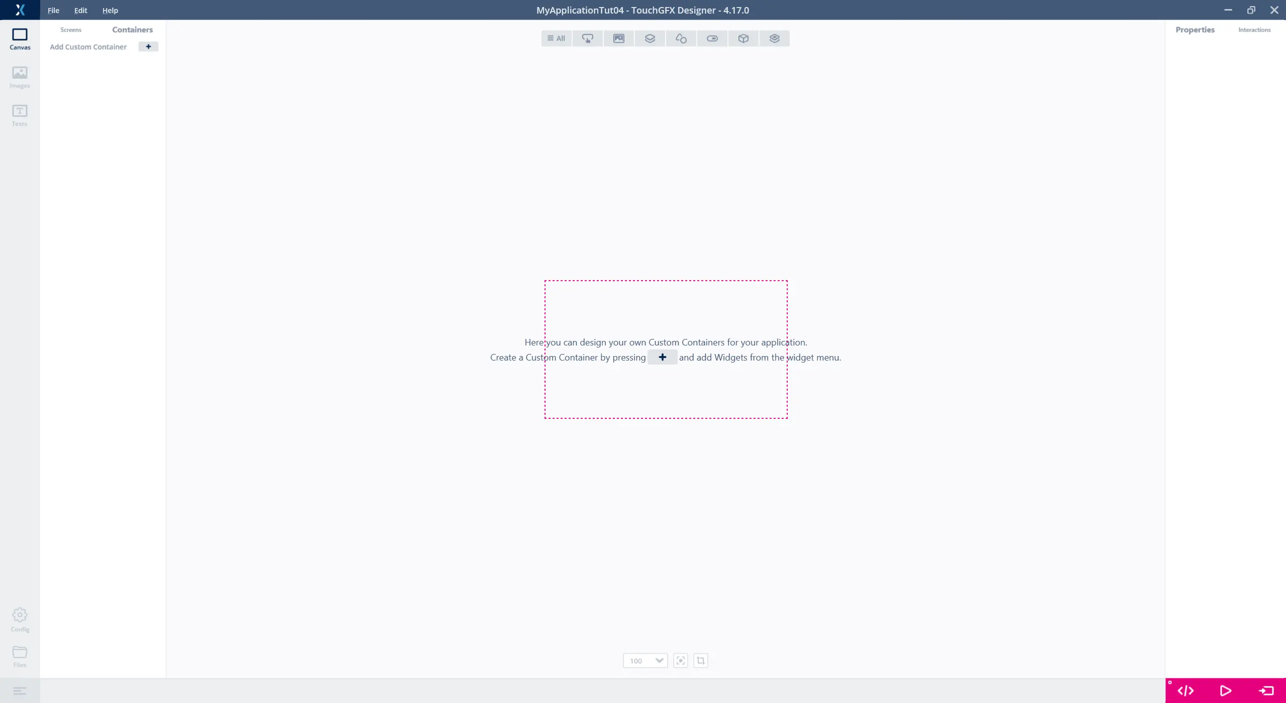
Selecting the Custom Container menu
The tab for creating a Custom Container is similar to the Screens tab and creating a new Custom Container is done in the same way as creating a new screen. After a Custom Container is created, widgets can be added to it, and the size and name of the Custom Container can be changed.
In the Custom Container tab, use the "+" button (1) to create a new Custom Container and rename it "MenuElement" (2), change the width to 390 and height to 70 (3).
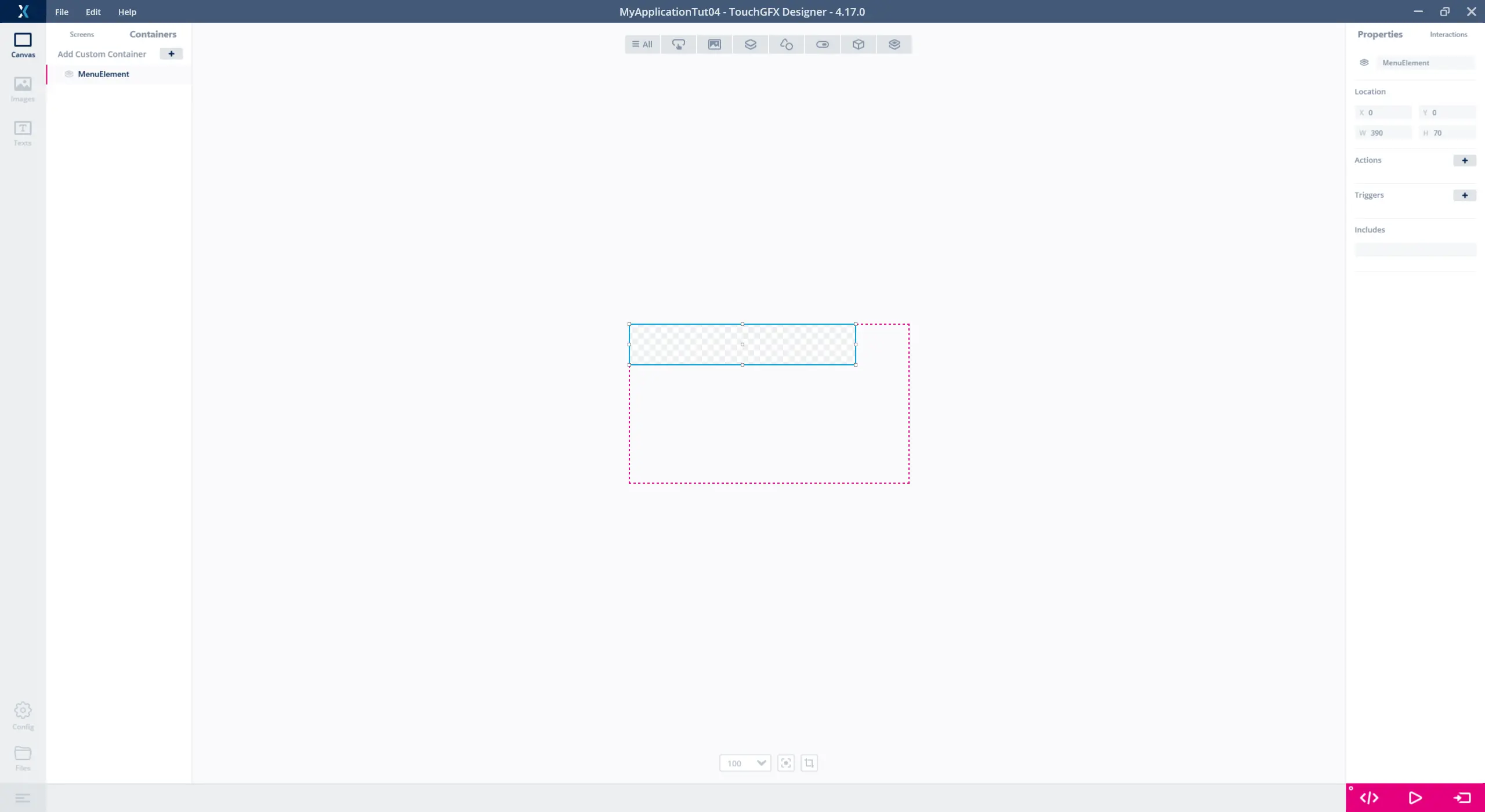
Creating a Custom Container and setting it properties
Adding Widgets to the Custom Container
With the Custom Container created and its properties set, widgets can be added to the Custom Container. The Custom Container in this tutorial is going to consist of an image and a text area with a wildcard:
Further reading
The two widgets are inserted in the following way:
| Widget | Properties |
|---|---|
| Image |
|
| TextArea |
|
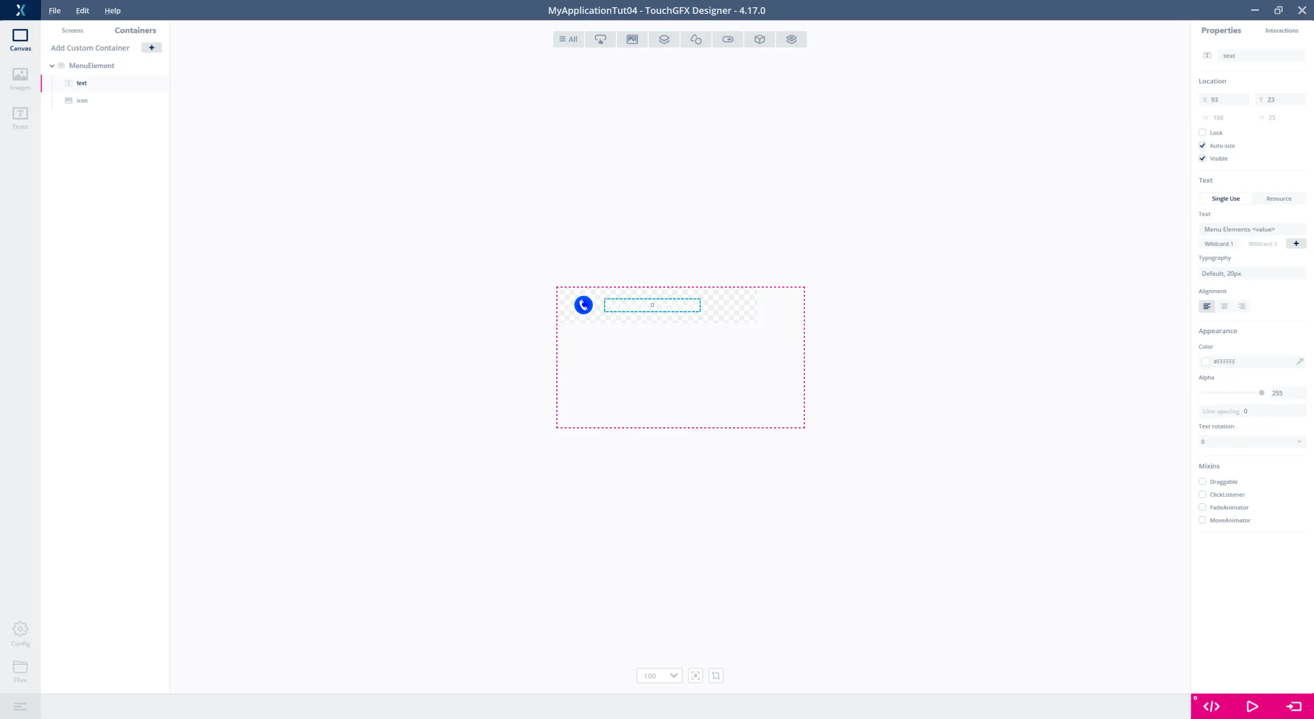
Adding content to the Custom Container (TextArea selected)
Adding the Custom Container to a Screen
Going back to the Screens tab, it is now possible to select the "MenuElement" in the widget menu under Custom Container (1).
Place a black box as background and add a couple of the created Custom Container on the canvas. Note that you can move the inserted Containers freely on the Screen.
The Custom Containers will appear as one element in the Widget list on the left (2).
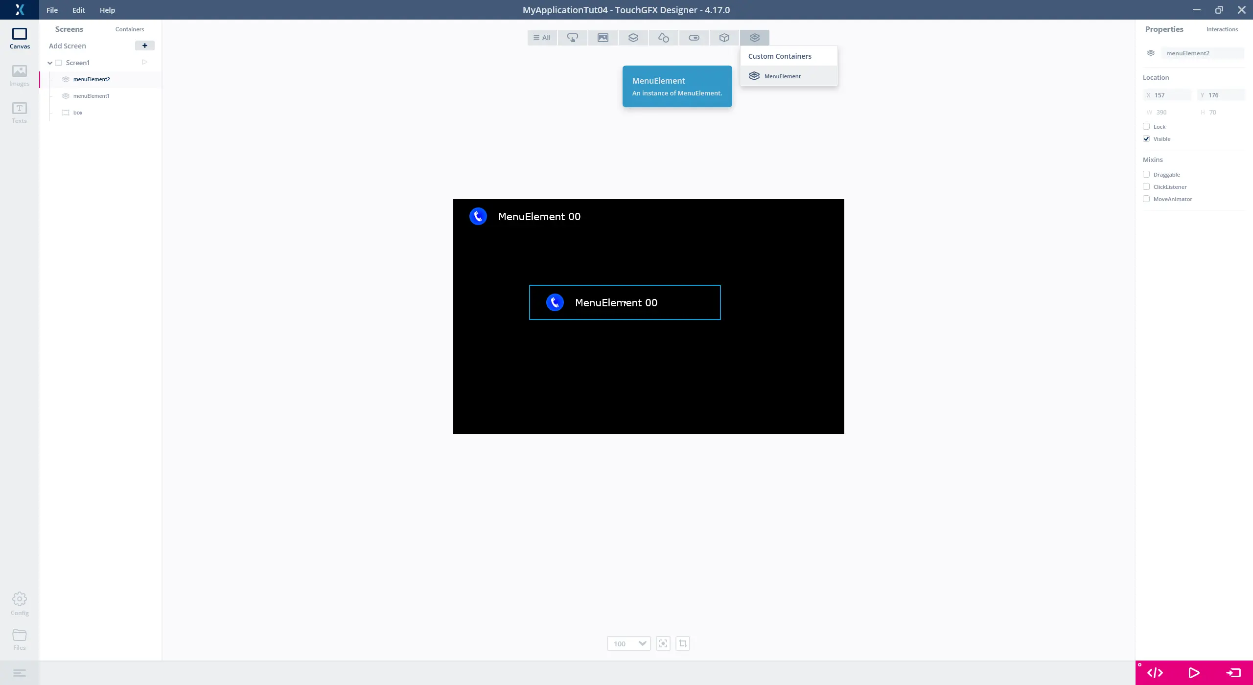
Inserting the Custom Container as a widgets on a screen
Step 2: Creating a Scroll Wheel
In this step of tutorial 4, we will create a Scroll Wheel by using the Custom Container, "MenuElement", created in step 1. As described in step 1, the Scroll Wheel is used to create a scrollable menu containing multiple selectable items. The items in the wheel are dynamically updated when scrolling and when selecting an item, it is moved into focus.
Adding items to the Scroll Wheel is done by selecting a Custom Container to use as the "Item Template". The concept of "Item Template" works by using the widgets in the Custom Container as the foundation for the items in the Scroll Wheel and use user code to update the widgets in the items at runtime.
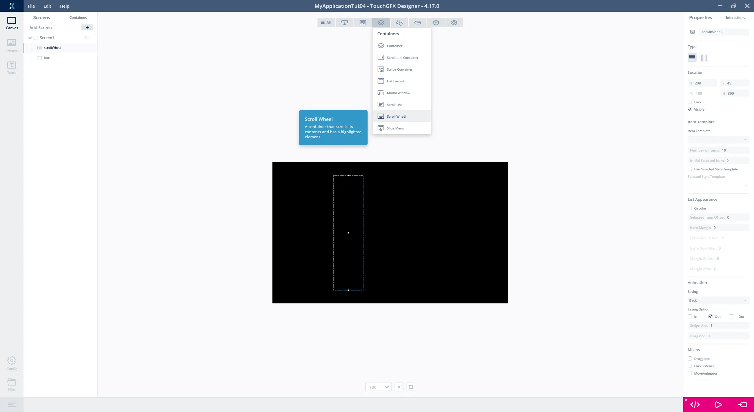
Creating the Scroll Wheel
Before creating the Scroll Wheel, remove the Custom Containers already inserted on the screen, leaving only the black box as the background. Select the Scroll Wheel located in the widgets menu under section Containers (1). Create a Scroll Wheel and set the location properties to X = 208, Y = 45 and H = 390 and change the name to "scrollWheel".
Inserting the Scroll Wheel and setting the name and location properties
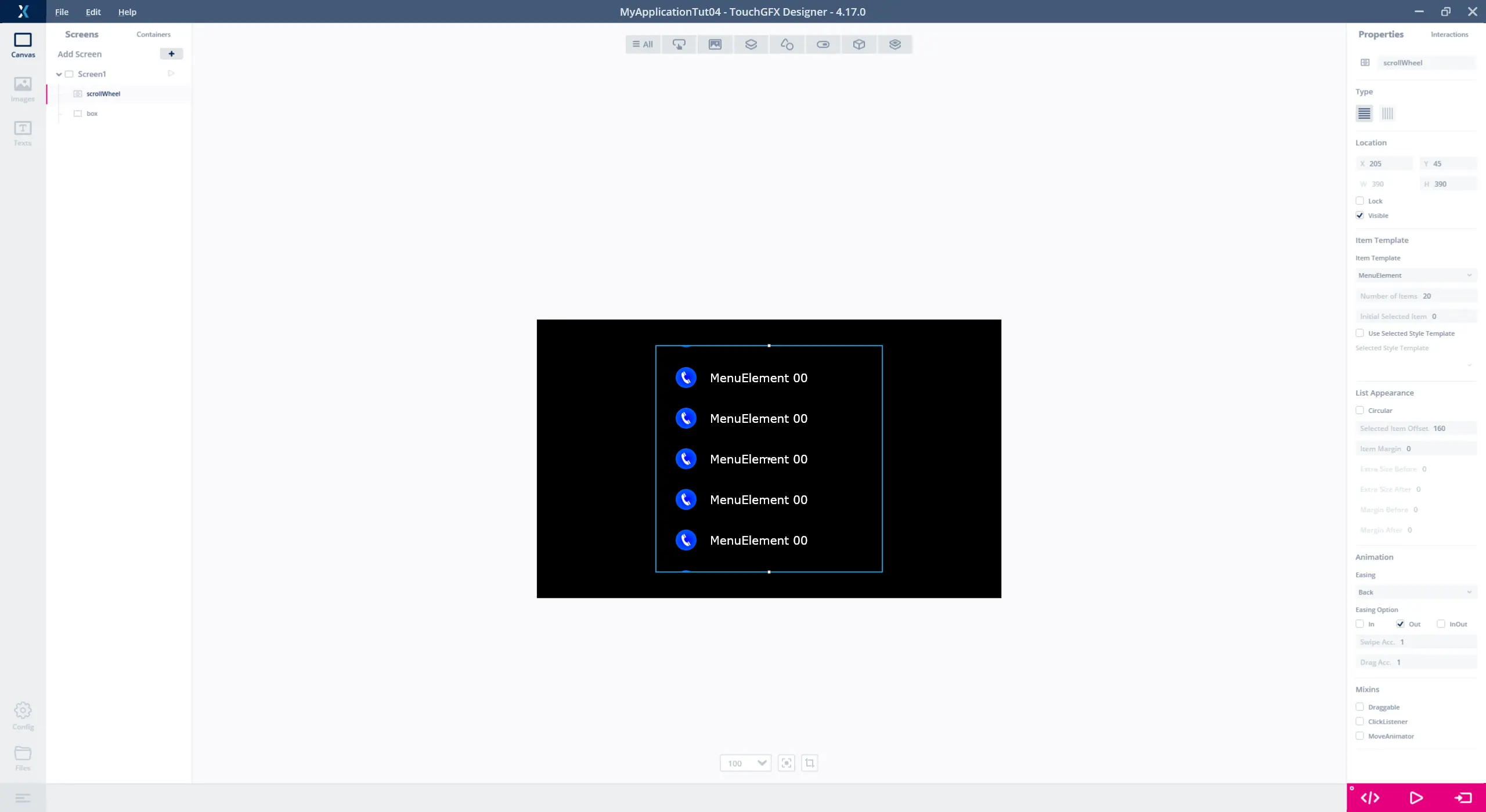
Adding Items to the Scroll Wheel
Select "MenuElement" created in step 1 as the "Item Template", which is done with the drop-down list under the Scroll Wheel property "Item Template" (1). The number of items in the Scroll Wheel is also set under "Item Template". Set this to 20 items.
Since the Scroll Wheel works by having a selected item in focus, setting where the selected item is positioned in the UI, is done by setting "Selected Item Offset" under the property "List Apperance" (2). We want the selected item to be in the middle of the Scroll Wheel and are therefore setting "Selected Item Offset" to (390-70)/2 = 160.
Adding the Custom Container to the Scroll Wheel and adjusting its properties
To highlight the area of the "scrollWheel", the two pictures background.png, and overlay.png from the .zip file downloaded in step 1 are used and is added to the application as Image widgets. The two images is a background that highlights the area of "scrollWheel" and an overlay which hides the items in "scrollWheel" when the are moved to the edge of "scrollWheel".
The image background.png are placed in X = 205 and Y = 45 and is placed behind "scrollWheel" so the items in "scrollWheel" is drawn op top of the background. The overlay.png is placed in X = 0 and Y = 0 on top of "scrollWheel" meaning that the items are drawn beneath overlay.png thereby hiding the items where overlay.png is not transparent.
Widgets can be moved back and forward in the Widget list by pressing CTRL-B and CTRL-F.
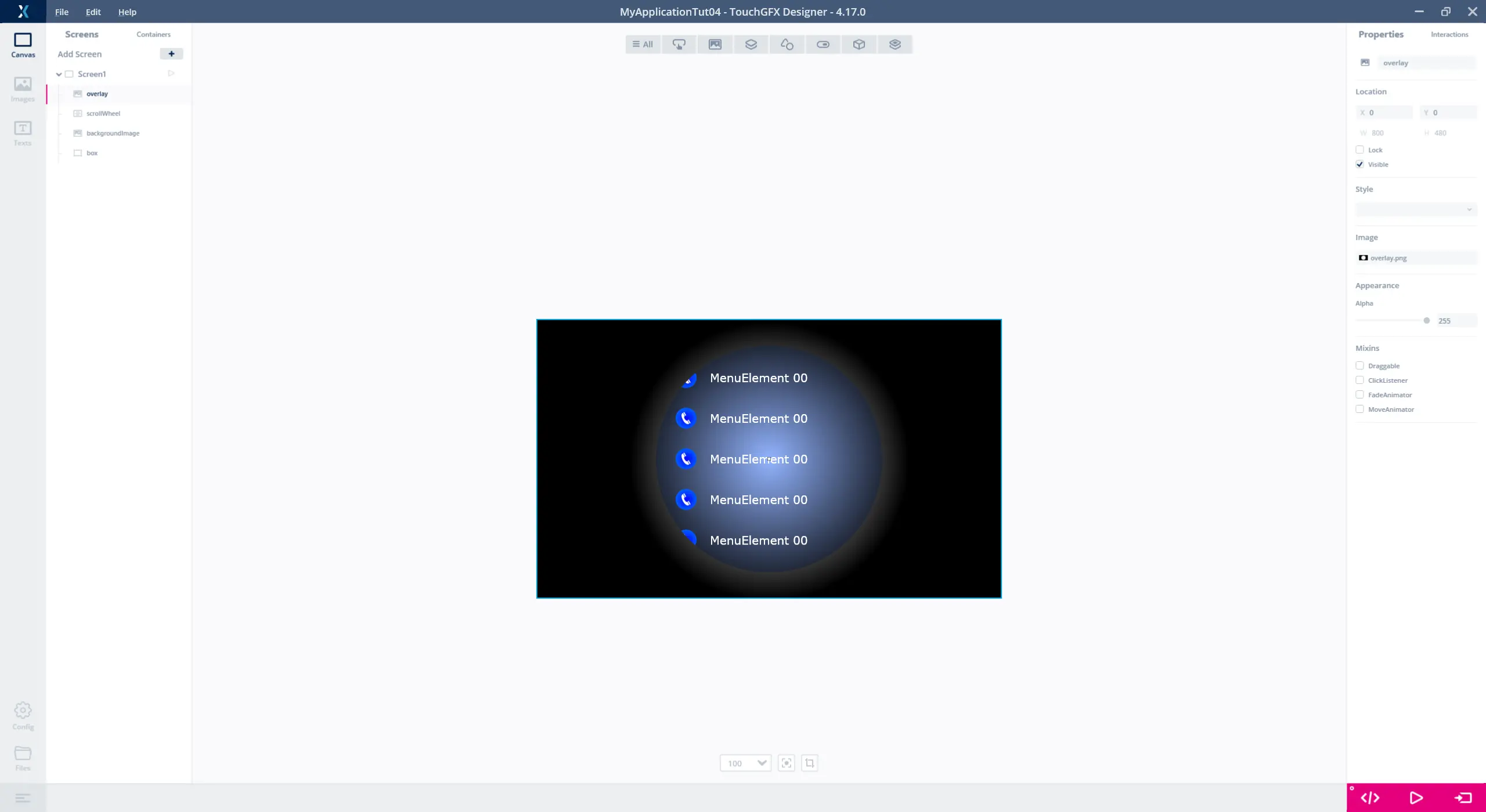
Graphics added to the screen with the Scroll Wheel
Since we only have adjusted the static properties for "scrollWheel", logic has not been added to it. Running the application will, therefore, result in a scrollable menu consisting of 20 items that all show the same. In the next step, we will add the logic to the "scrollWheel" with user code which updates the items in the wheel at runtime.
Step 3: Adding User Code to Scroll Wheel
With the Scroll Wheel, "scrollWheel", created and configured in the TouchGFX Designer, this step will create the logic, via user code, that updates the items in "scrollWheel", so they display different graphics based on the position of the item in the wheel. This step will, therefore, work with integrating designer generated code with user code. A more detailed description of integrating designer code with user code can be found on the Code Structure page.
Change Image and Text in MenuElement
Since the items in the Scroll Wheel are based on the Custom Container "MenuElement", created in step 1, user code for changing the icon and updating the wildcard needs to be added to "MenuElement".
When a Custom Container is created in the TouchGFX Designer it generates a .hpp and .cpp file with the same name as the Custom Container. The user code should be integrated in these files. The location of the files generated for "MenuElement" in the example application are:
MyApplication2\gui\include\gui\containers\MenuElement.hpp
MyApplication2\gui\src\containers\MenuElement.cpp
Enabling the items in "scrollWheel" to change their text and icon is done by adding the function setNumber(int no) to "MenuElement". The function uses the variable no to decide which icon the Image widget should show and change the Wildcard in the Text Area widget to the value of no.
As we are using the numbers 0 - 9 in the TextArea, we also need to add the range "0-9" to "Wildcard Ranges" for the Default typography.
Press F4 to have the files generated by the TouchGFX Designer.
The declaration and implementation of setNumber(int no) is done in the MenuElement.hpp which is shown below.
TouchGFX/gui/include/gui/containers/MenuElement.hpp
#ifndef MENUELEMENT_HPP
#define MENUELEMENT_HPP

#include <gui_generated/containers/MenuElementBase.hpp>
#include <BitmapDatabase.hpp>

class MenuElement : public MenuElementBase
{
public:
    MenuElement();
    virtual ~MenuElement() {}

    virtual void initialize();

    void setNumber(int no)
    {
        Unicode::itoa(no, textBuffer, TEXT_SIZE, 10);
        switch (no % 7)
        {
        case 0:
        icon.setBitmap(Bitmap(BITMAP_ICON00_ID));
            break;
        case 1:
        icon.setBitmap(Bitmap(BITMAP_ICON01_ID));
            break;
        case 2:
        icon.setBitmap(Bitmap(BITMAP_ICON02_ID));
            break;
        case 3:
        icon.setBitmap(Bitmap(BITMAP_ICON03_ID));
            break;
        case 4:
        icon.setBitmap(Bitmap(BITMAP_ICON04_ID));
            break;
        case 5:
        icon.setBitmap(Bitmap(BITMAP_ICON05_ID));
            break;
        case 6:
        icon.setBitmap(Bitmap(BITMAP_ICON06_ID));
            break;
        }
    }
protected:
};

#endif // MENUELEMENT_HPP
The code is using the BITMAP definitions to reference the images in the project. To get these available it is necessary to include the file "BitmapDatabase.hpp" as done above.
With the code added to update the content of the MenuElement, the next thing to do is to add code which updates the items in the Scroll Wheel.
Update the Items in the Scroll Wheel
When creating a Scroll Wheel, the TouchGFX Designer generates a virtual function in the Screen base class which is called each time a new item in the Scroll Wheel becomes visible. Overriding this function in the user code enables the code to interact with the items in the Scroll Wheel.
The name of the function is the name of the Scroll Wheel appended with UpdatedItem. For this tutorial, the function is called scrollWheelUpdateItem(MenuElement& item, int16_t itemIndex).
The parameter itemIndex is an index value informing which item is currently being updated and item is a reference to an instance of MenuElement which is currently visible in the Scroll Wheel. With itemIndex informing which item is being updated, setNumber() is called for item which will change the content of the item being updated based on the value of itemIndex. The code used for updating the Scroll Wheel items is shown below.
Screen1View.hpp
#ifndef SCREEN1VIEW_HPP
#define SCREEN1VIEW_HPP

#include <gui_generated/screen1_screen/Screen1ViewBase.hpp>
#include <gui/screen1_screen/Screen1Presenter.hpp>

class Screen1View : public Screen1ViewBase
{
public:
    Screen1View();
    virtual ~Screen1View() {}
    virtual void setupScreen();
    virtual void tearDownScreen();
    virtual void scrollWheelUpdateItem(MenuElement& item, int16_t itemIndex)
    {
        item.setNumber(itemIndex);
    }
protected:
};

#endif // SCREEN1VIEW_HPP
Running the simulator for the application now shows that the text for the items contains the value of their index and the icons change based on which item is showing. The images below shows an example of the simulator running with the code implemented.
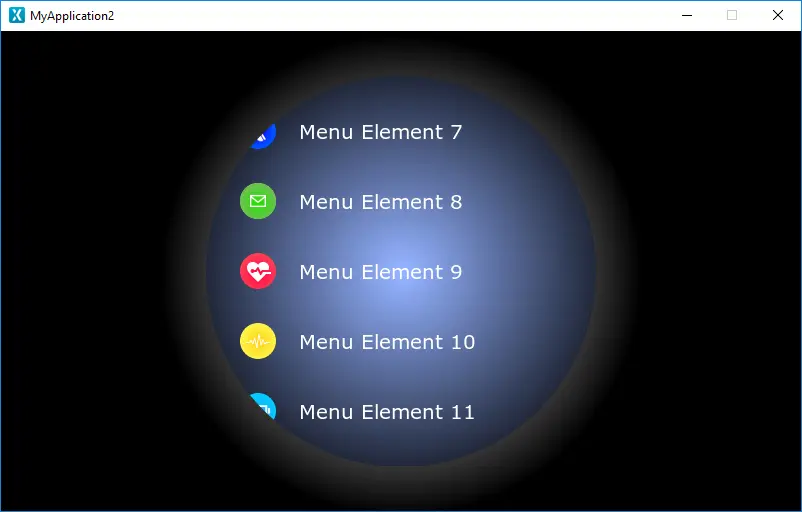
Running the simulator
Step 4: Adding Custom Behavior to Scroll Wheel
In the last step of tutorial 4, we will add custom behavior for the Scroll Wheel, by making it move in a circular pattern when scrolling through the items, thereby moving in a pattern similar to a dial.
Add Custom Behavior to MenuElement
Getting the Scroll Wheel to move in a dial pattern, is done by shifting the horizontal position of the Image and Text widget for each item that is visible in the Scroll Wheel. To do this the function setY() for "MenuElement" is overridden in MenuElement.hpp. The setY() function is called for a Custom Container each time it is moved in the vertical direction and is used for redrawing the Custom Container in its new position. By overriding setY(), we are able to also move the Image and Text widget horizontally insize the Container each time the Scroll Wheel is scrolled. The image below describes how to implement the new setY() function and shift the the two widgets in MenuElement.hpp. Note that math.h needs to be included.
MenuElement.hpp
#ifndef MENUELEMENT_HPP
#define MENUELEMENT_HPP

#include <gui_generated/containers/MenuElementBase.hpp>
#include <BitmapDatabase.hpp>
#include <math.h>

class MenuElement : public MenuElementBase
{
public:
    MenuElement();
    virtual ~MenuElement() {}

    virtual void initialize();

    //Adjusts the position of the text and the icon, based in the calculated offset(x)
    void offset(int16_t x)
    {
        icon.setX(30 + x);
        text.setX(80 + x);
    }

    //The new declaration and implementation of the setY() function
    virtual void setY(int16_t y)
    {
        //set Y as normal
        MenuElementBase::setY(y);

        const int circleRadius = 250;

        //center around middle of background
        y = y + getHeight() / 2 - 390 /2;

        //calculate x
        float x_f = circleRadius - sqrtf((float)((circleRadius * circleRadius) - (y * y)));
        int16_t x = (int16_t)(x_f + 0.5f);

        offset(x);
    }

    ...
With the new setY() function implemented, running the simulator shows that the Scroll Wheel is now moving in a dial pattern aligning with the curve from the overlay.
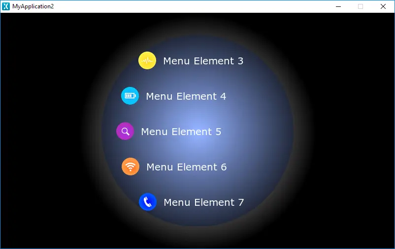
Running the simulator
This concludes tutorial 4.
Further reading
- The Scroll Wheel page describes how to create and configure the Scroll Wheel in TouchGFX Designer and how to create the logic in user code.
- The Custom Containers page discusses the Custom Container concept and usage.