Tutorial 2: Creating Your Own Application
Follow this tutorial to learn more about the basics of TouchGFX. You will learn how to add images to your application and use buttons. You will also see how to use texts and calculated numbers. In the last steps you will write code to enhance the look of the UI you have created with TouchGFX Designer. This tutorial assumes no knowledge of TouchGFX, but we assume a little experience with programming.
Step 1: Setting a Background Image
In this first step you will see how to insert a PNG image as a background. But first we will create a new project.
Starting a New Project
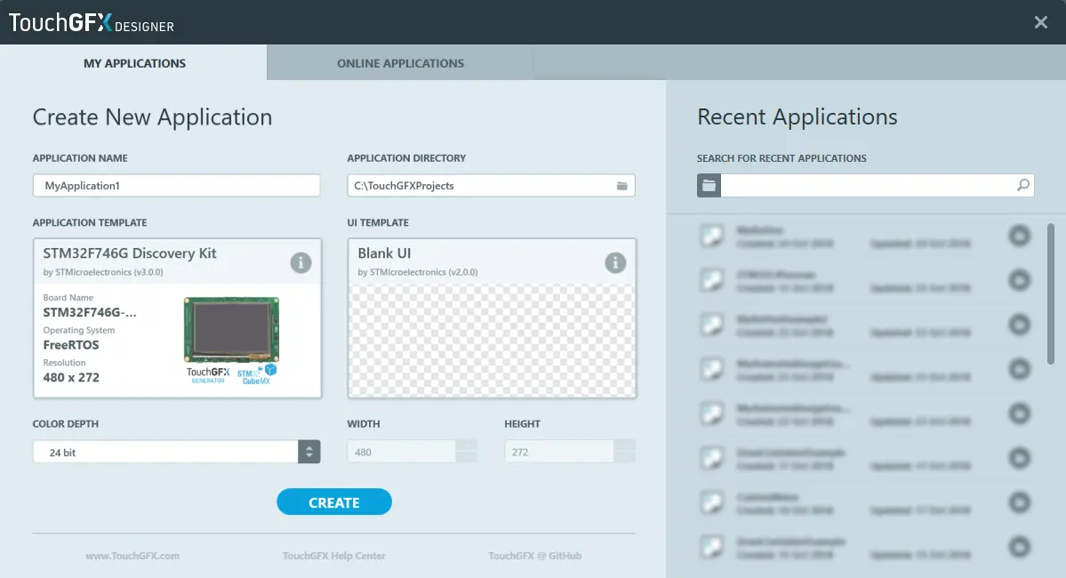
Start a new project in TouchGFX Designer. We will call the project "MyApplication1". The project is based on the "STM32F746G Discovery Kit" Application Template and the "Blank UI" UI template.
If you have a different STM32 Evaluation Kit, go ahead and look in the list presented in TouchGFX Designer when you are changing the Application Template to see if it is supported. If you do not have a supported board you can select the "Simulator" Application Template and just run the application on your computer.
Please be aware that this tutorial runs on a display with a resolution of 480x272. If you select an Application Template with a different resolution, the graphics will not fit the screen, but you should be able to complete the tutorial anyway.
Now that you have a newly created blank project let us start modifying it.
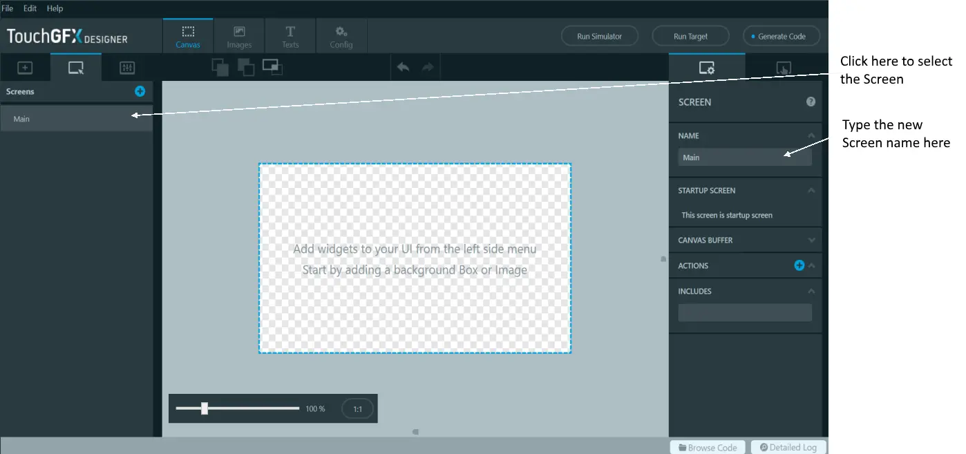
A TouchGFX application consists of a number of screens. The screens contain a number of widgets that make up the user interface. A Screen covers the whole display, so only one Screen is shown to the user at a time.
The first thing to do is to change the name of the initial Screen to "Main" as illustrated below:
Inserting a Background
It is normally a good thing to cover the complete background of a Screen with one or more widgets. For example, this can be a Box or an Image. In this application we will use an Image.
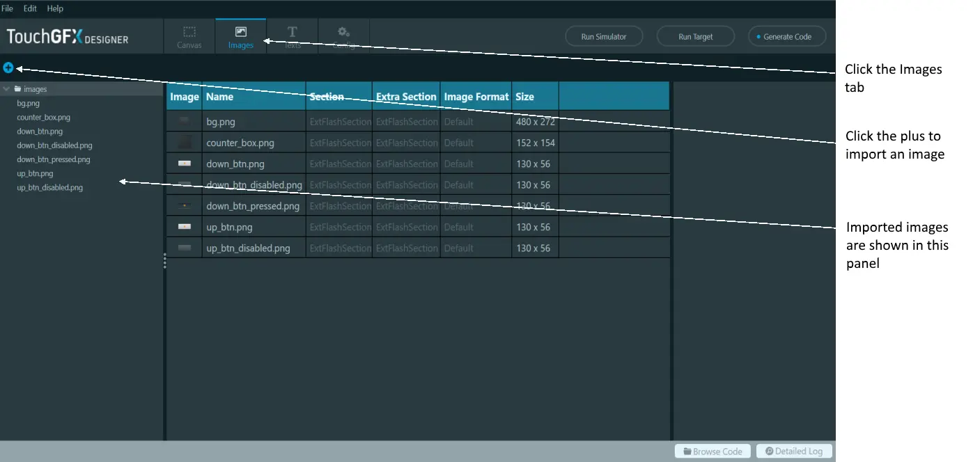
Before we can use an image in TouchGFX Designer, we need to import the file. TouchGFX supports BMP and PNG images (though TouchGFX Designer only supports importing PNG images). PNG files are preferred over BMP files as they are smaller and supports transparent pixels.
The images we will use in this tutorial can be downloaded from this link. Unzip the file to a directory on your disk.
We want to use the file named "background.png" as our background. To import that file:
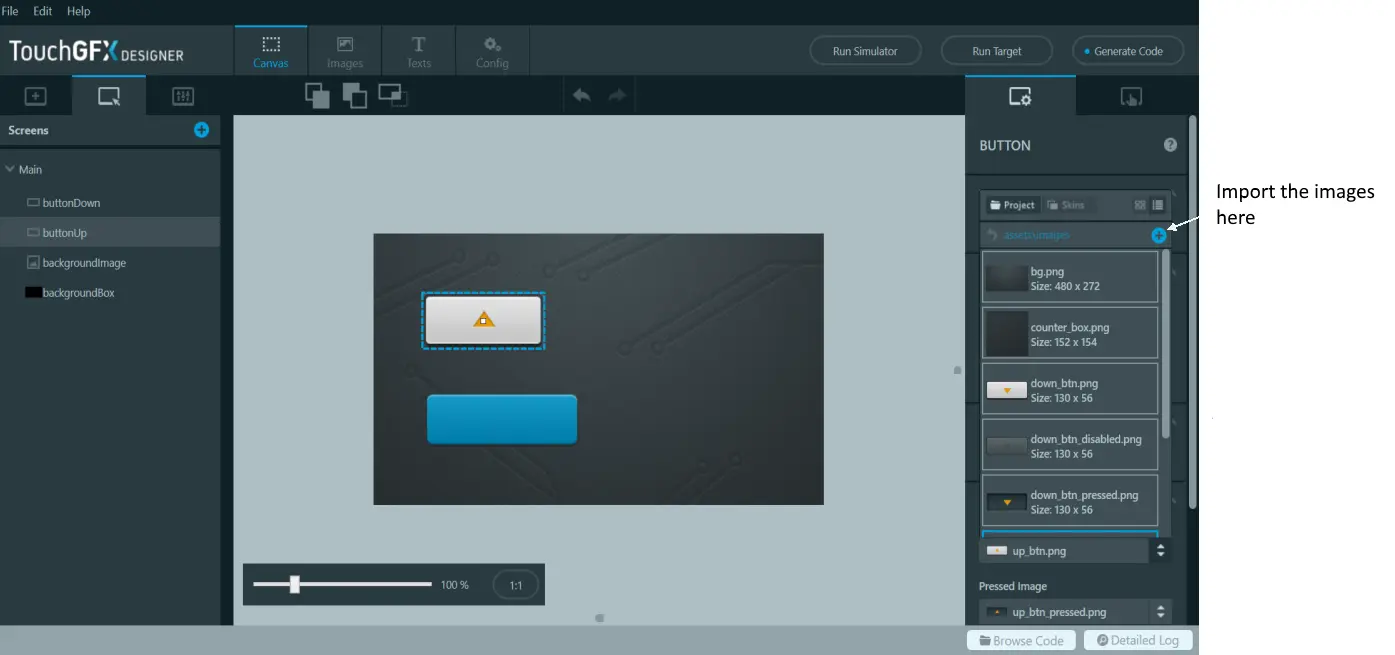
- Select the Images tab and click the blue plus icon.
- Navigate to the unzipped folder and select the "background.png" file.
- Press open to import it.
You can also "drag & drop" images from File Explorer onto the image tab, or even directly on the canvas, to import them to your project.
Be aware that images imported to your project will be converted and compiled into your project and thus take up flash space. So only import the images that you need.
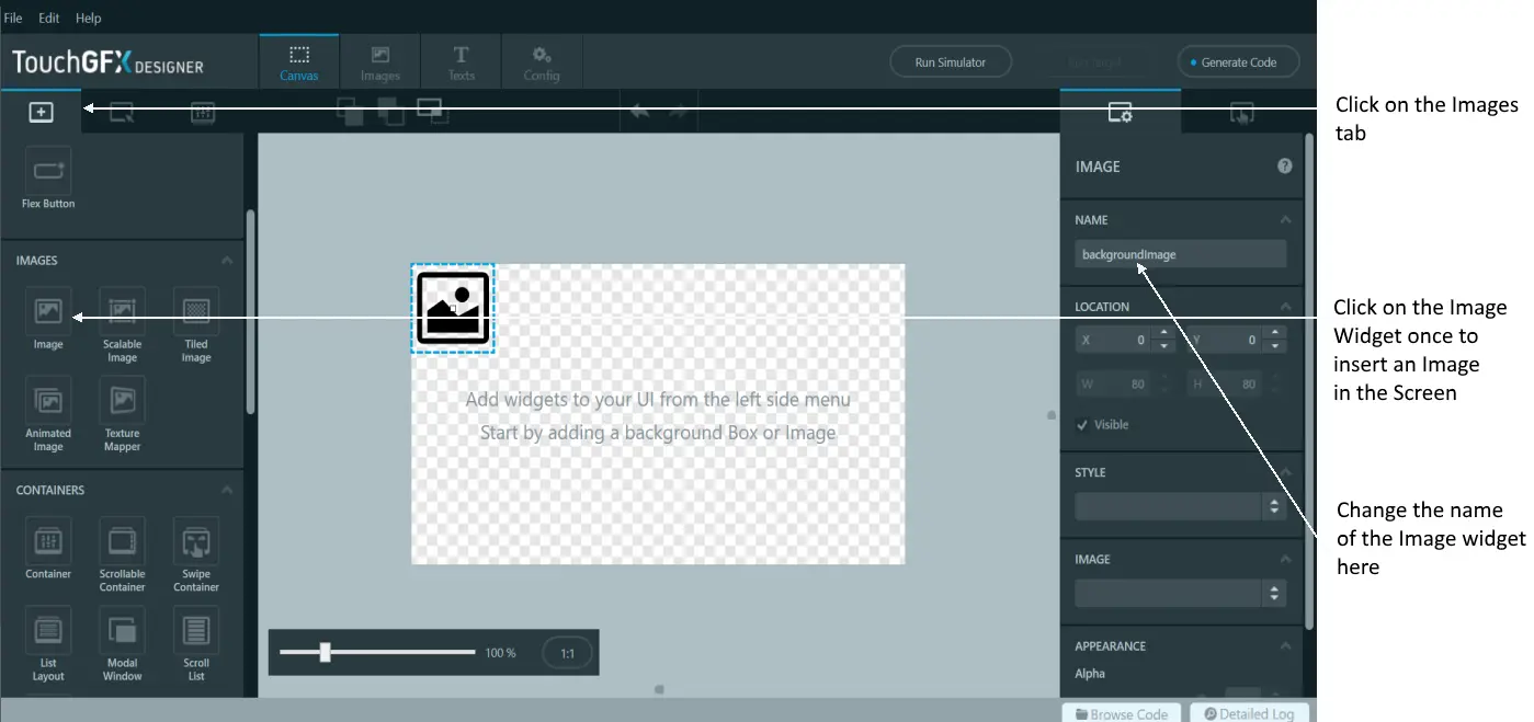
We are now ready to use the image in our application. To do that we need an Image widget.
- Select the Widgets tab in the Canvas tab
- Find the Image widget in the list of widgets
- Click it to insert an Image Widget on the Screen.
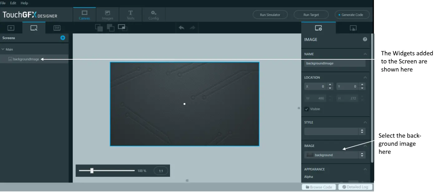
It is a good principle to change the name of widgets to something meaningful. In our case, something like "backgroundImage".
After inserting a widget we normally need to configure some of its properties like Position or Color. The properties of the selected Widget are shown to the right in the TouchGFX Designer. In this case we are satisfied with the position in the point 0,0, but we want to change the Image property to select the "background.png" file previously imported. Select the "background.png" in the Image drop-down list.
We have now created a simple application with one Screen consisting of only a background image covering the whole user interface.
Before moving on try to press the "Run Simulator" button to check that the project compiles and runs. You can still not interact with the application since we have not yet added any active widgets.
Step 2: Adding Buttons
In this step owe will add two buttons to the application and use different PNG files to give them a customized look.
Adding the Buttons
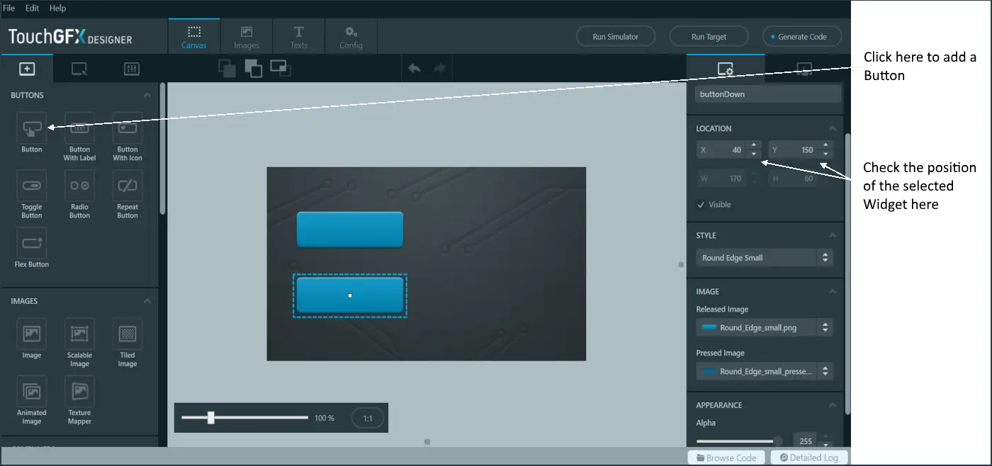
- Add a button to the Screen by clicking the Button widget in the Widgets tab.
- Move the new widget by dragging it with the mouse.
- Position the button at x=40, y=60.
- Name the new Widget "buttonUp".
- Add another Button at position x=40, y=150. Name this widget "buttonDown".
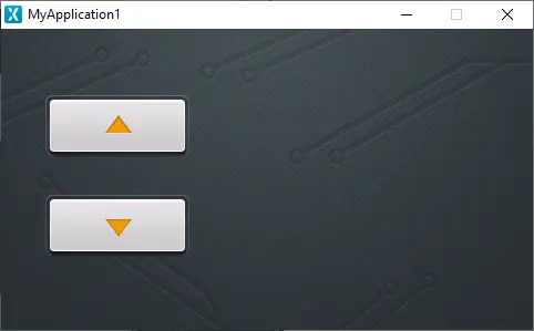
The project now looks like this:
You can use the small up/down button on the X and Y properties to fine-tune the position of the widgets. You can also select the button widget (by clicking it on the canvas) and adjust the position using the arrow keys on your keyboard.
Changing the Look
We will now change the look of the buttons. A Button is made up of two images. One image is shown when the button is pressed, and another image is shown when the button is not pressed (released). Most widgets come with a set of predefined styles, which is basically a set of values for certain properties of the widget describing a particular look. These styles are good for fast prototyping, but most often you will replace them when creating a real application.
Go to the Images tab as in previous step and click the "plus" icon to import some images. This time import the images: "button_down_pressed.png", "button_down_released.png", "button_up_pressed.png", and "button_up_released.png".
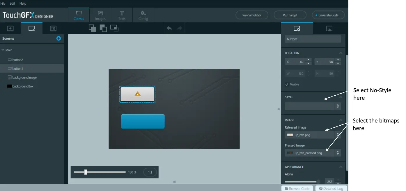
Now select the "buttonUp" button. For that button, select "button_up_released.png" for the Release Image property. Select "button_up_pressed.png" for Pressed Image.
You can immediately see the look of the button on the canvas in TouchGFX Designer.
For "buttonDown", select "button_down_released.png" for Released Image, "button_down_pressed.png" for Pressed Image.
You have now finished setting up the buttons. Click "Run Simulator" to try your application.
Try both buttons to verify that the buttons are configured correct.
Tip
Step 3: Adding Text
In this step we will add a large TextArea widget to the application.
All text is shown using a TextArea widget, but before we add a TextArea to the application, we will add another Image to give the text a better background.
Text Background
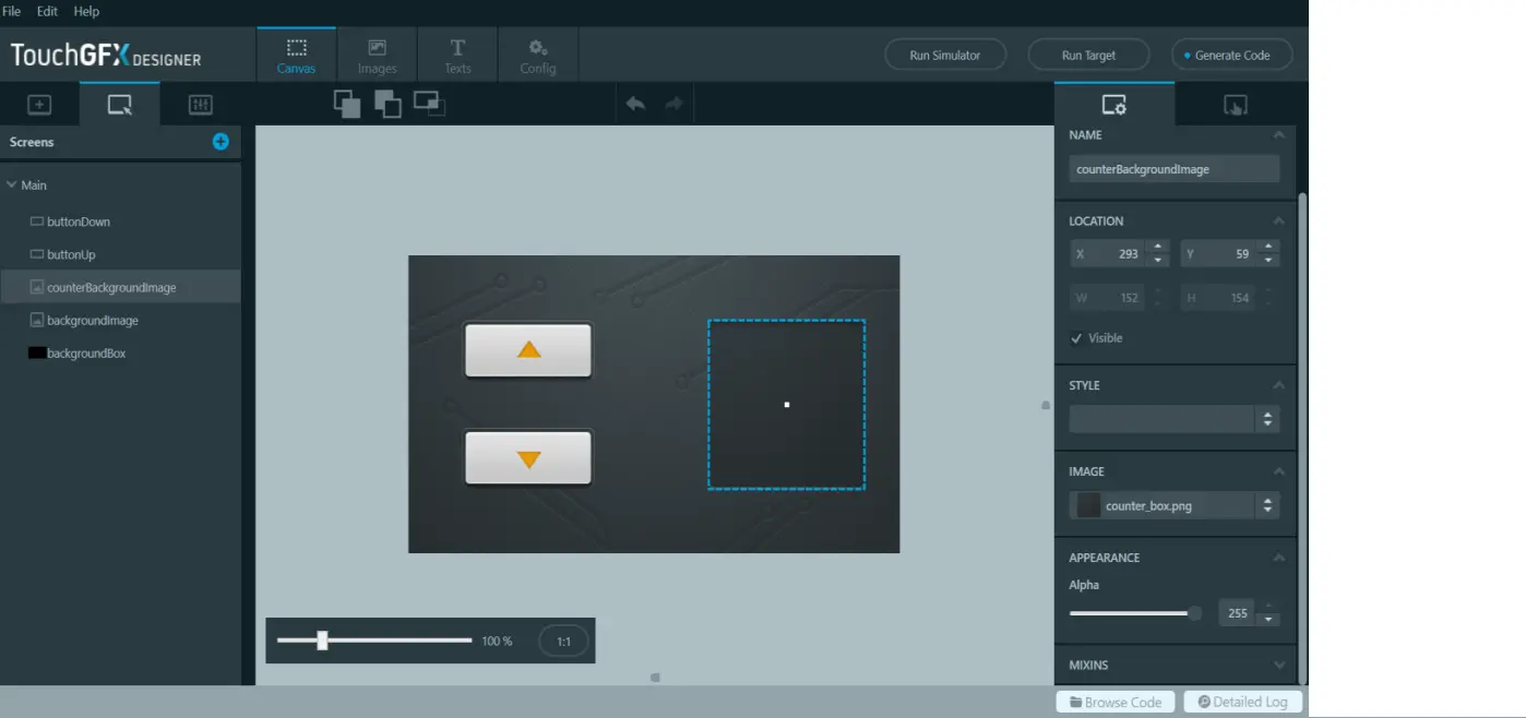
- Import another image file, "counter_box.png".
- Insert a new Image widget
- Name it "textBackground"
- Position it at x=250, y=59.
- Set Image property to "counter_box".
Adding the Text
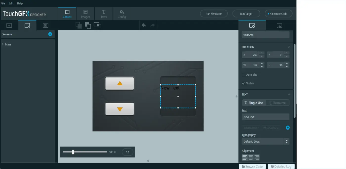
We are now ready to add a TextArea widget. Click the TextArea icon in the Widgets tab. Rename the widget to "textCounter" and move the widget to position x=250, y=90. We want the widget to show a large text, so un-check the Auto-size property, and set the size to a fixed width=152, and height=90.
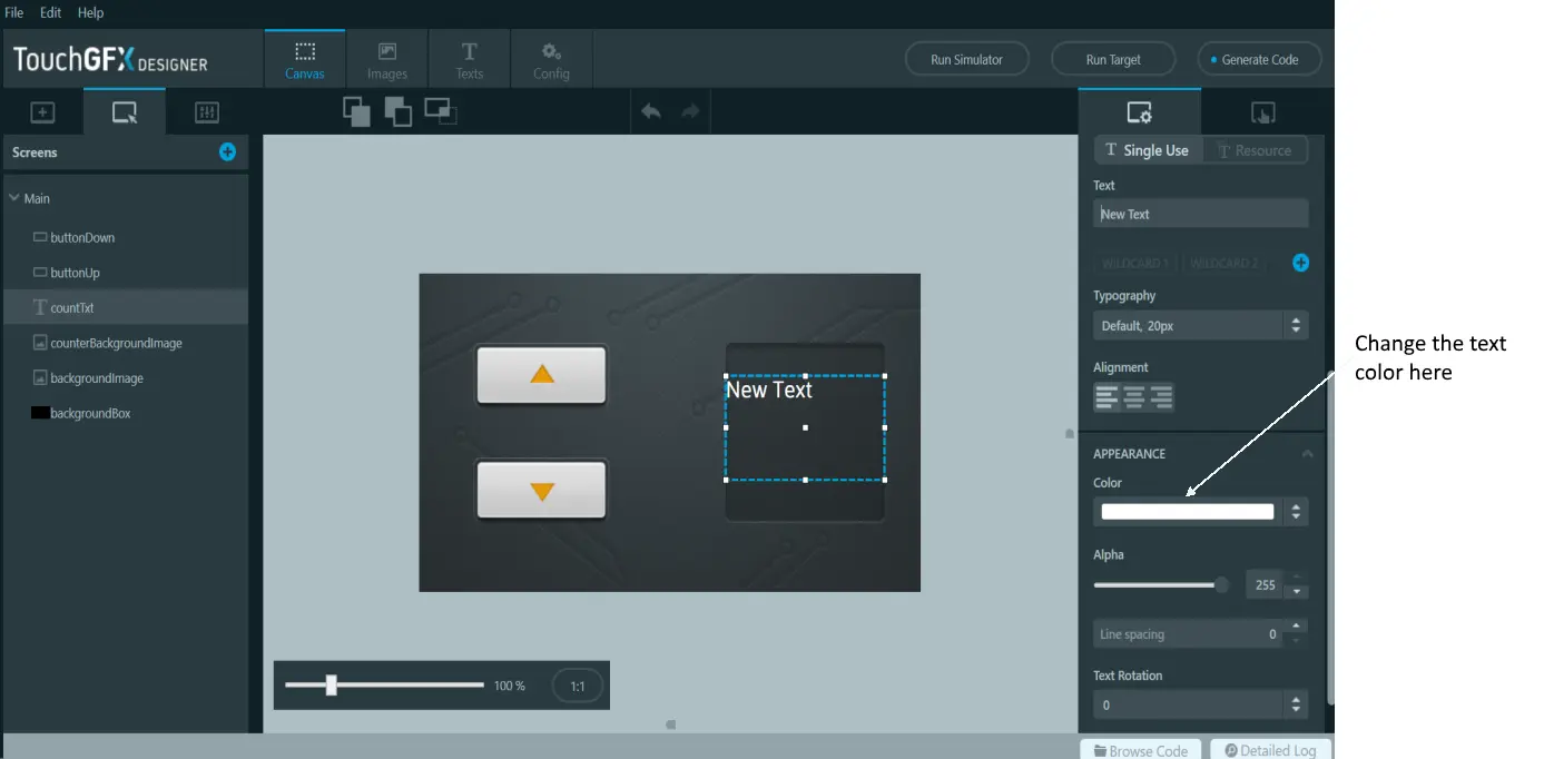
The default color of a TextArea widget is black, which is rather dark on our background. Select the Color property of "textCounter", and change the color to white.
Changing the Text Typography
We want the text to be bigger. The way to do that is to change the Typography used for the text. A typography defines the Font (e.g. Verdana), the Size, and the Alignment (left, right, or center) for a text.
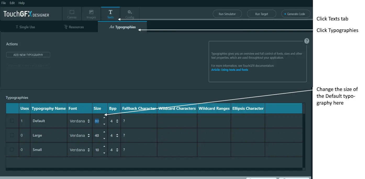
Select the Texts tab in the top of TouchGFX Designer, click Typographies, and update the size of the "Default" typography to 80.
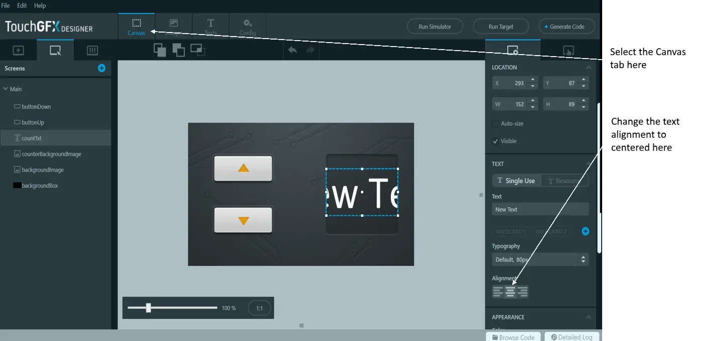
Going back to the Screen (by clicking the "Canvas" tab in the top), we see that the text is much bigger now. In fact we cannot read the complete text "New Text". Click the centered icon under the Alignment property to get the text centered.
Using a Wildcard Text
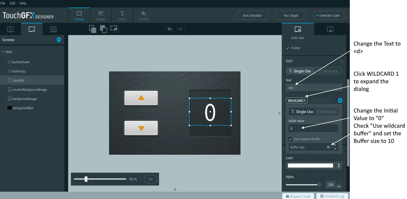
We want the TextArea to show a number that we can change with the buttons. To do that, we must change the text to include a "wildcard". A wildcard is a marker ("<d>") in the text that can be substituted with something else at runtime. We just want to show a number, so we will change the text to just "<d>". In other projects you can combine the dynamic parts with a fixed text, e.g. "Temperature: <temp> °C".
Note
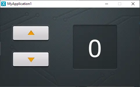
Click "Run Simulator" to try your application.
Further reading
Step 4: Adding Code
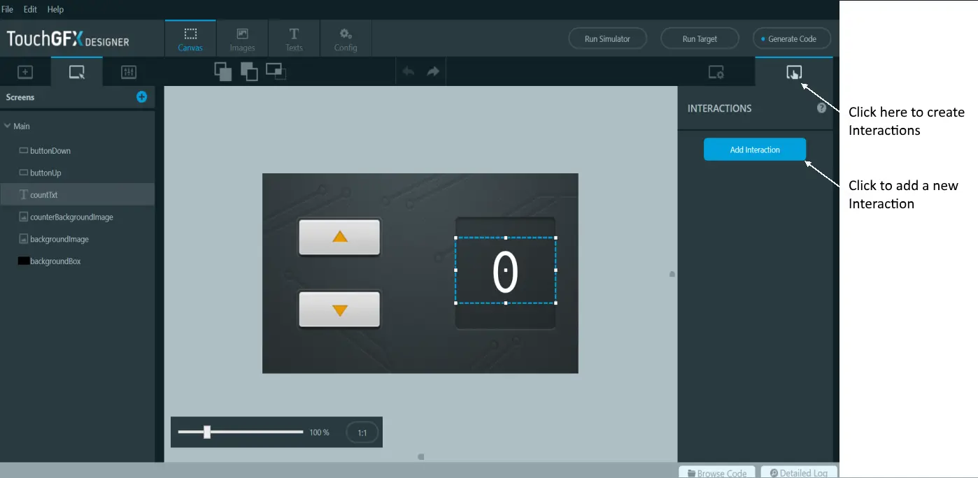
With TouchGFX Designer it is easy to link actions to a Button through an Interaction. An Interaction links a Trigger (e.g. a button press) to an Action (e.g. running code or moving an element).
Select the Interactions tab in the upper right corner and click the "Add Interaction" button to create a new Interaction
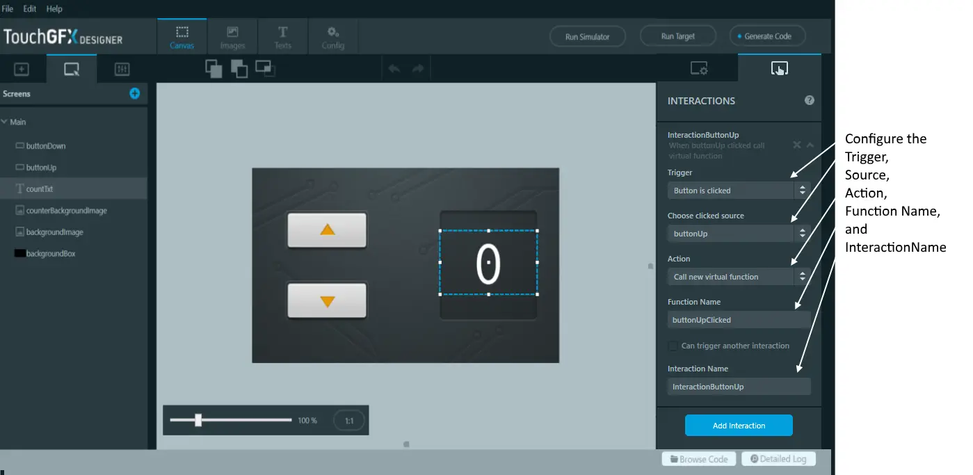
We will create two interactions, one for each of the buttons. We will setup both interactions to call a C++ method on the current Screen.
- Change the Trigger property to "Button is clicked".
- Set the Choose clicked source property to "buttonUp".
- Change the Action property to "Call new virtual function".
- For Function Name, type "buttonUpClicked".
- You should also give the Interaction an informative name, so that you can recognize it later on.
Create a similar Interaction with "buttonDown" as "clicked source":
- Change the Trigger property to "Button is clicked".
- Set the Choose clicked source property to "buttonDown".
- Change the Action property to "Call new virtual function".
- For Function Name, type "buttonDownClicked".
- You should also give the Interaction an informative name, so that you can recognize it later on.
If you either click the "Generate Code" button or "Run Simulator" button, TouchGFX Designer will update the generated code with the information you entered in the interactions just created. This means that it will create two new virtual functions in the view base class for this screen.
Let us investigate this more and see how we can have our own code executed. Click the "Browse Code" button in the bottom bar. This will give you a File Explorer placed in your application folder. Navigate to the folder:
MyApplication1/generated/gui_generated/include/gui_generated/main_screen/
and open the file MainViewBase.hpp. If you like you can also open one of the project files and find the file here:
| IDE | Path to project file |
|---|---|
| Visual Studio | simulator/msvs/Application.sln |
| CubeIDE | ProjectName.ioc |
| IAR Embedded Workbench 8 | target/IAR8.x/application.eww |
| KEIL uVision v5 | target/Keil/application.uvprojx |
Note
The new virtual methods are found in the public part of the MainViewBase class. The generated methods have empty implementations. The intention is that the programmer implements these methods in the subclass MainView.
MainViewBase.hpp
//*********************************************************************************/
/********** THIS FILE IS GENERATED BY TOUCHGFX DESIGNER, DO NOT MODIFY ***********/
/*********************************************************************************/
#ifndef MAINVIEWBASE_HPP
#define MAINVIEWBASE_HPP

#include <gui/common/FrontendApplication.hpp>
#include <mvp/View.hpp>
#include <gui/main_screen/MainPresenter.hpp>
#include <touchgfx/widgets/Image.hpp>
#include <touchgfx/widgets/Button.hpp>
#include <touchgfx/widgets/TextAreaWithWildcard.hpp>

class MainViewBase : public touchgfx::View<MainPresenter>
{
public:
  MainViewBase();
  virtual ~MainViewBase() {}
  virtual void setupScreen();

  /*
    * Custom Action Handlers
    */
  virtual void buttonUpClicked()
  {
    // Override and implement this function in MainView
  }

  virtual void buttonDownClicked()
  {
    // Override and implement this function in MainView
  }
...
Implementing the Virtual Methods
The remaining task is now to implement these two methods to change the counter value when the user presses the buttons. To do that, declare the methods again in the MainView class. This class can be found in:
MyApplication1/gui/include/gui/main_screen/MainView.hpp
Open this file and insert the two function declarations in the class:
MainView.hpp
#ifndef MAIN_VIEW_HPP
#define MAIN_VIEW_HPP

#include <gui_generated/main_screen/MainViewBase.hpp>
#include <gui/main_screen/MainPresenter.hpp>

class MainView : public MainViewBase
{
public:
  MainView();
  virtual ~MainView() {}
  virtual void setupScreen();
  virtual void tearDownScreen();
  virtual void buttonUpClicked();
  virtual void buttonDownClicked();
}
The next task is to implement the two methods by adding the implementation in the .cpp file. This file is located in:
MyApplication1/gui/src/main_screen/MainView.cpp
In the implementation below we have added calls to touchgfx_printf. This function is useful to print out lines of text when running the simulator. When running on target, the line will have no effect.
MainView.cpp
#include <gui/main_screen/MainView.hpp>

MainView::MainView()
{

}

void MainView::setupScreen()
{
  MainViewBase::setupScreen();
}

void MainView::tearDownScreen()
{
  MainViewBase::tearDownScreen();
}

void MainView::buttonUpClicked()
{
  touchgfx_printf("buttonUpClicked\n")
}

void MainView::buttonDownClicked()
{
  touchgfx_printf("buttonDownClicked\n")
}
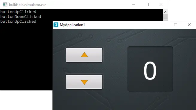
Click "Run Simulator" in TouchGFX Designer again to run the new code. Click the buttons a couple of times to see that the interactions and methods are working as expected:
Updating the Counter Value
The last task is to write C++ code in the new methods to update the counter value when the user presses the button. To do that we first add a new integer variable, counter, in the MainView class:
MainView.hpp
#ifndef MAIN_VIEW_HPP
#define MAIN_VIEW_HPP

#include <gui_generated/main_screen/MainViewBase.hpp>
#include <gui/main_screen/MainPresenter.hpp>

class MainView : public MainViewBase
{
public:
  MainView();
  virtual ~MainView() {}
  virtual void setupScreen();
  virtual void tearDownScreen();
  virtual void buttonUpClicked();
  virtual void buttonDownClicked();
protected:
  int counter;
}
In the buttonUpClicked method we increment the counter value. The new value is then converted to a string and copied to the 10 characters buffer we configured for the text in the previous step:
MainView.cpp
#include <gui/main_screen/MainView.hpp>

MainView::MainView()
{

}

void MainView::setupScreen()
{
  MainViewBase::setupScreen();
}

void MainView::tearDownScreen()
{
  MainViewBase::tearDownScreen();
}

void MainView::buttonUpClicked()
{
  touchgfx_printf("buttonUpClicked\n")

  counter++;
  Unicode::snprintf(textCounterBuffer, TEXTCOUNTER_SIZE, "%d", counter);
  // Invalidate text area, which will result in it being redrawn in next tick.
  textCounter.invalidate();
}

void MainView::buttonDownClicked()
{
  touchgfx_printf("buttonDownClicked\n")

  counter--;
  Unicode::snprintf(textCounterBuffer, TEXTCOUNTER_SIZE, "%d", counter);
  // Invalidate text area, which will result in it being redrawn in next tick.
  textCounter.invalidate();
}
Note that we call invalidate() on the textCounter widget after updating it. This ensures that the TextArea is redrawn after the counter value has been updated.
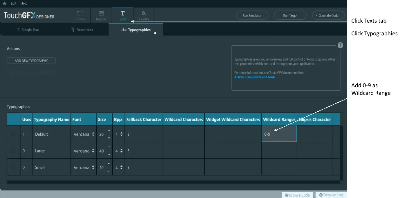
We need one more thing before the application is finished. TouchGFX only included the characters needed from the used fonts, so we need to tell TouchGFX Designer to include the characters 0-9 in the "Default" typography. To do that, go back to TouchGFX Designer and click the "Texts" tab, then the "Typographies" tab. In the "Wildcard Ranges" column for the Default typography, add the range "0-9".
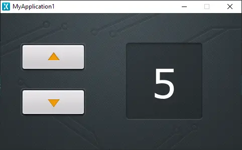
Now click "Run Simulator" again and click the up button a few times:
As the program is now, it will not handle negative numbers correctly. This can be fixed, either by inserting a guard in the buttonDownClicked() function to ensure the counter does not go below 0 or by adding the character "-" to the used typography. This can be accomplished simply by adding a minus ("-") in the Wildcard Characters cell for the Default typography.
This step concludes tutorial 2.
