Slide Menu
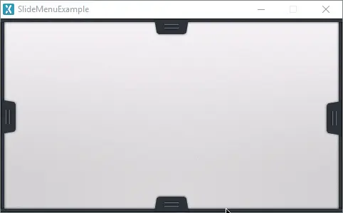
A Slide Menu in TouchGFX is a specialization of the Container that consists of an internal Container, an Image and an optional Button, which can animate between a collapsed and expanded state.
Widget Group
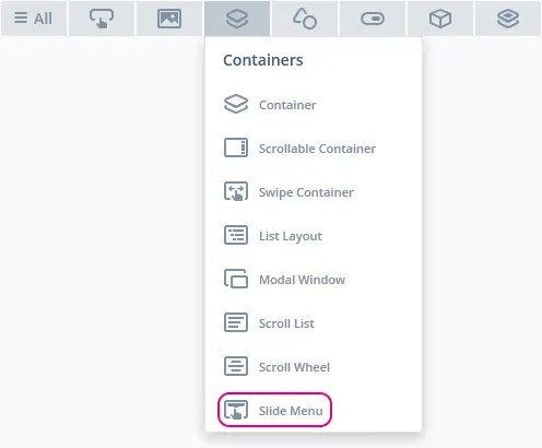
The Slide Menu can be found in the Containers widget group in TouchGFX Designer.
Properties
The properties for the Slide Menu are described in the following sections.
| Property Group | Property Descriptions |
|---|---|
| Name | Name of the widget. Name is the unique identifier used in TouchGFX Designer and code. |
| Location | X and Y specify the top left corner of the widget relative to its parent. W and H specify the width and height of the widget. The size of a Slide Menu is determined by the size of its background and button images. Lock specifies if the widget should be locked in its current X, Y, W and H. Locking the widget also disables interacting with the widget through the screen. Visible specifies the visibility of the widget. Making the widget invisible also disables interacting with the widget through the screen. |
| Expanding Direction | Expanding Direction specifies the direction the Slide Menu should expand. |
| State | State specifies the initial state of the Slide Menu, either collapsed or expanded. Collapsed: Visible Pixels specifies the amount of pixels that should be visible when the state is collapsed. Expanded: Hidden Pixels Specifices the amount of pixels that should be hidden when the state is expanded. Expanded Timeout specifies the amount of time before automatically returning to the collapsed state from the expanded state. |
| Background | Background Image specifies the image to use as background. Background Location specifies the x,y coordinate of the background image relative to the widgets' coordinates. |
| Button | Use Button Specifies whether or not to make use of a button to control the state of the widget. Released Image specifies the image to use for the buttons' released state. Pressed Image specifies the image to use for the buttons' pressed state. Button Location specifies the x,y coordinate of the button relative to the widgets' coordinates. |
| Animation | Easing and Easing Option specify which easing equation to use for animations. Duration specifies the amount of time the animation should take. |
| Mixins | Draggable specifies if the widget is draggable at runtime. ClickListener specifies if the widget emits a callback when clicked. FadeAnimator specifies if the widget can animate changes to its Alpha value. MoveAnimator specifies if the widget can animate changes to X and Y values. |
Interactions
The actions and triggers supported by the Slide Menu are described in the following sections.
Actions
| Widget specific action | Description |
|---|---|
| Change State of Slide Menu | Change the state of a Slide Menu to either collapsed or expanded |
| Reset Timer of Slide Menu | Reset the timer automatically returning the Slide Menu state to collapsed |
| Standard widget action | Description |
|---|---|
| Move widget | Move a widget to a new position over time. |
| Hide widget | Hides a widget (sets visibility to false). |
| Show widget | Make a hidden widget visible (sets visibility to true). |
Triggers
| Trigger | Description |
|---|---|
| Slide Menu animation ended | A Slide Menu animation from one state to another has ended. |
| Slide Menu state changed | A Slide Menu has had its state changed. |
Performance
A Slide Menu is a Container type and does not per default appear in the draw chain. Therefore, the performance is mostly dependent on the drawing performance of the children.
For more details on drawing performance, read the General UI Component Performance section.
Examples
Generated Code
In the generated code for the View base class we can see how the TouchGFX Designer sets up a Slide Menu.
Screen1ViewBase.cpp
#include <gui_generated/screen1_screen/Screen1ViewBase.hpp>
#include "BitmapDatabase.hpp"

Screen1ViewBase::Screen1ViewBase()
{
    slideMenuName.setup(touchgfx::SlideMenu::EAST,
        touchgfx::Bitmap(BITMAP_LEFT_SLIDE_MENU_BACKGROUND_ID),
        touchgfx::Bitmap(BITMAP_LEFT_SLIDE_MENU_BUTTON_ID),
        touchgfx::Bitmap(BITMAP_LEFT_SLIDE_MENU_BUTTON_ID),
        0, 0, 49, 111);
    slideMenuName.setState(touchgfx::SlideMenu::COLLAPSED);
    slideMenuName.setVisiblePixelsWhenCollapsed(24);
    slideMenuName.setHiddenPixelsWhenExpanded(0);
    slideMenuName.setAnimationEasingEquation(touchgfx::EasingEquations::circEaseInOut);
    slideMenuName.setAnimationDuration(18);
    slideMenuName.setExpandedStateTimeout(180);
    slideMenuName.setXY(0, 0);

    add(slideMenuName);
}
Tip
Slide MenuName.invalidate() if you change the appearance of the widget.TouchGFX Designer Examples
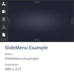
To further explore the Slide Menu, try creating a new application within TouchGFX Designer with the following UI template:


