Tutorial 8: Creating an Application for a Small Display
In this tutorial, we will create a simple GUI application using the basic features of TouchGFX. We will target the application for the "NUCLEO-C5A3ZG + RVA15MD" platform, which has the following specifications:
- NUCLEO-C5A3ZG (STM32C5A3):
- 144 MHz Cortex-M33 CPU
- 256 KByte internal SRAM
- 1 MByte internal flash
- Riverdi RVA15MD display module:
- 240 x 240 pixels, 16-bit color (64 MHz SPI)
- Capacitive touch controller (I2C)
- 8 MByte external serial flash (72 MHz SPI)
Starting a TouchGFX Project
In TouchGFX Designer, a TouchGFX Board Setup (TBS) is provided for the evaluation board, which sets up all the basic functionality to run a TouchGFX application. Create a new project based on this:
- Under the "Create" tab, select the board called "NUCLEO-C5A3ZG + RVA15MD".
- Set the "Application Name" to e.g. "DemoApplication".
- Click "Create".
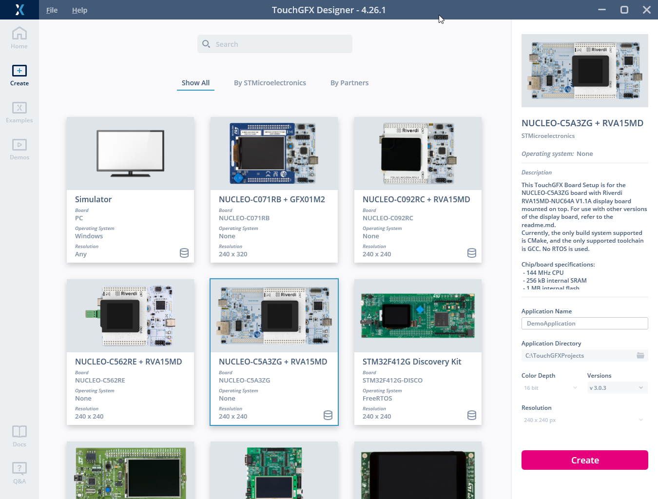
Creating a project for the display module
Building a Basic GUI
After creating the project, we have a blank 240 x 240 pixels canvas.
A TouchGFX application consists of a number of screens. The screens contain a number of widgets that make up the user interface. A Screen covers the whole display, so only one Screen is shown to the user at a time.
The first thing to do is to change the name of the initial Screen to "VolumeScreen" as illustrated below. Select the Screen in the list on the left (1), and change the name in the name field on the right (2). It is also possible to rename the Screen by double-clicking or right-clicking the Screen in the list (1).
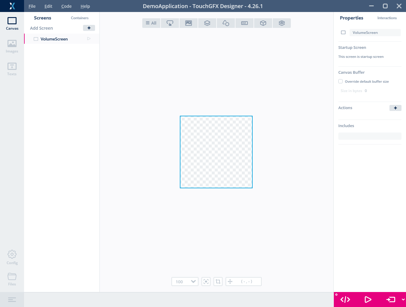
Changing the name of the Screen
Inserting a Background
It is normally a good thing to cover the complete background of a Screen with one or more widgets. For example, this can be a Box or an Image. The background will show as black if you do not cover it. In this application we will use an Image.
Before we can use an image in TouchGFX Designer, we need to import the file. TouchGFX supports BMP and PNG images (though TouchGFX Designer only supports importing PNG images). PNG files are preferred over BMP files as they are smaller and support transparent pixels.
The images we will use in this tutorial can be downloaded from this link. Unzip the file to a directory on your disk.
To import these images into your project, do the following:
- Select the Images tab and click the "+" button.
- TouchGFX Designer opens a normal file-browser. Navigate to the unzipped folder and select all the images.
- Press "Open" to import them.
Tip
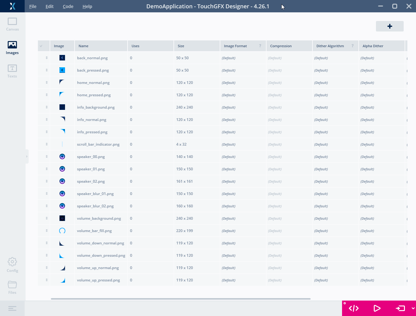
Importing images
Note
We are now ready to use an image in our application. To do that we need an Image widget.
- Click the Canvas button on the left (1)
- Find the Image widget in the list of widgets (2)
- Click it to insert an Image Widget on the Screen.
It is a good principle to change the name of widgets to something meaningful. In our case, something like "backgroundImage" (3).
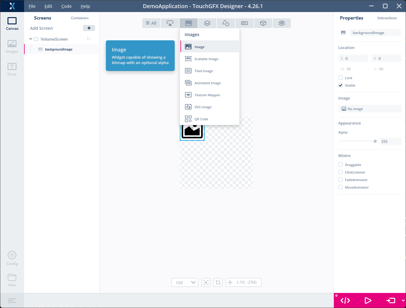
Inserting an Image widget
After inserting a widget we normally need to configure some of its properties like Location or Color. The properties of the selected widget are shown to the right in TouchGFX Designer. The widgets in the Screen are shown in the tree-view on the left (1). In this case we are satisfied with the Location in the point 0,0, but we want to change the Image property to select the "volume_background.png" file previously imported. Click the Image property (2) and select the "volume_background.png".
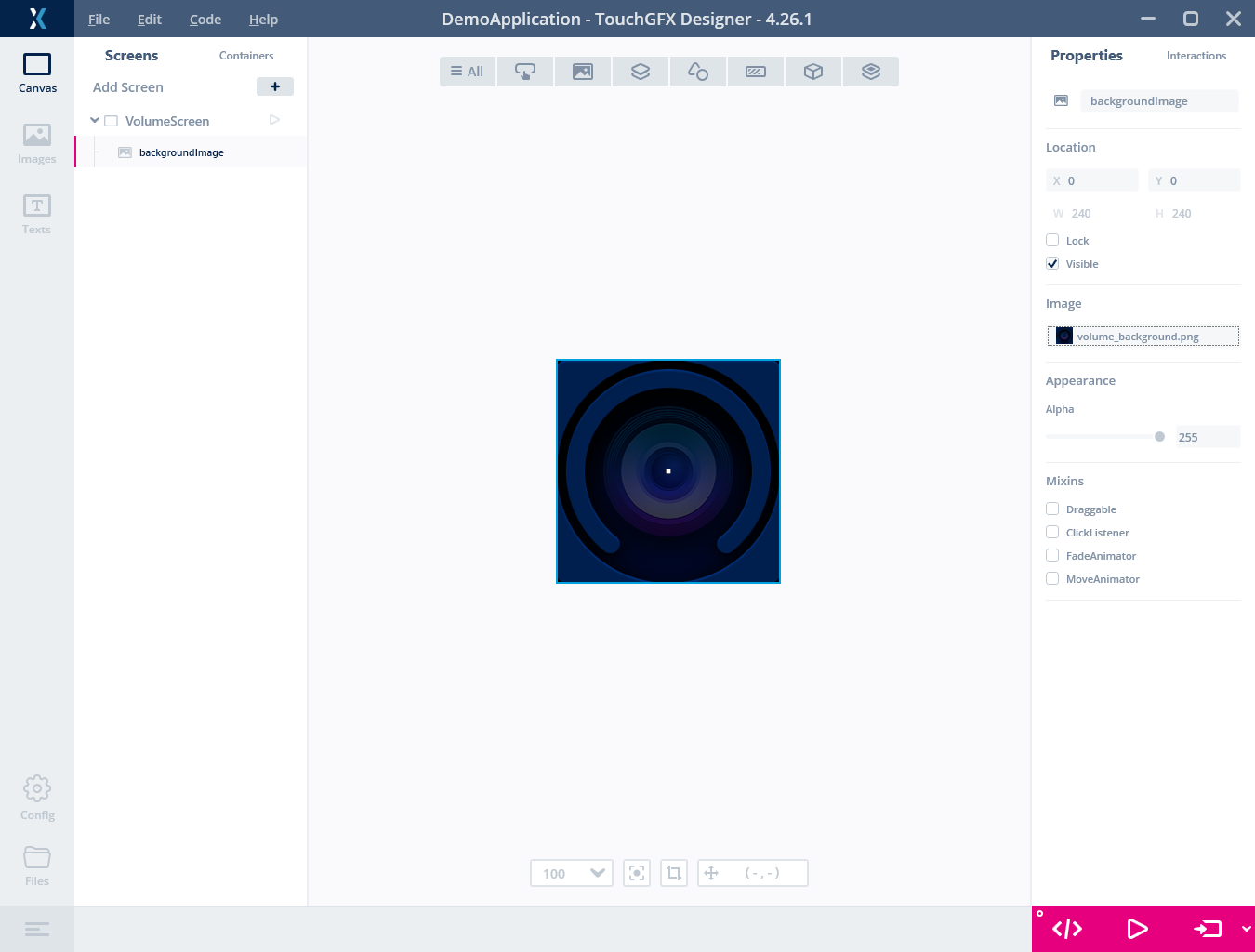
Selecting the imported image file as background
We have now created a simple application with one screen consisting of only a background image covering the whole display.
You can run the application at any time, to verify that it works as expected. Clicking the "Run Simulator" button in the lower right corner will build and run the application in a simulator on your computer. The simulator is a normal Windows application that simulates the display and touch controller. It is a good way to test your application without having to run it on the target hardware. If you have the "NUCLEO-C5A3ZG + RVA15MD" board connected to your computer, you can also click "Run on Target" to run the application on the display module.
Adding Buttons
In this step we will add two buttons to the application for controlling the volume. There are different types of button widgets available in TouchGFX Designer, which implement different types of appearances and trigger mechanisms. For this purpose we will use the Repeat Button, which fires multiple events when the button is pressed and held down. This is a good choice for volume control, since it allows the user to hold down the button to increase or decrease the volume quickly.
Adding a button
Add a button to the Screen by clicking the Repeat Button widget in the Widgets tab (1) and name it "plusButton". The project now looks like this:
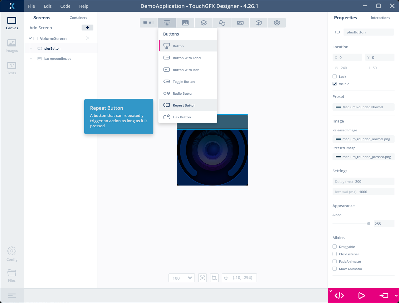
Adding a button
Changing the Look
We will now change the look of the buttons. A typical button is made up of two images. One image is shown when the button is pressed, and another image is shown when the button is not pressed (released). Most widgets come with a set of Presets, which is basically a set of values for certain properties of the widget describing a particular look. These styles are good for fast prototyping, but most often you will replace them when creating a real application.
- Click the "Released Image" property
- Click "Project" to browse the images in the project ("Stock" shows the images that come with TouchGFX Designer)
- Select the "volume_up_normal.png" image
- Repeat the above for "Pressed Image" property, but select the "volume_up_pressed.png" image
- Set the location of the button to x=120, y=120
Tip
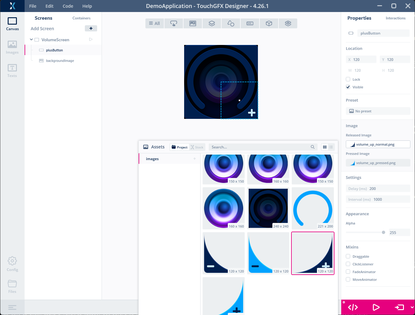
Setting the Button images
The plusButton is now configured. Repeat the above steps to add a second "minusButton" with the following properties:
| Property | Value |
|---|---|
| Released Image | volume_down_normal.png |
| Pressed Image | volume_down_pressed.png |
| X | 0 |
| Y | 120 |
Try both buttons to verify that the buttons are configured correctly.
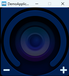
Running the Simulator
Tip
Adding Texts
In this step we will add two text areas to the screen. The first text area will show the current volume level with big numbers, and the second text area will just statically display the label "Vol".
Adding the big number text
All text is shown using a TextArea widget. Click the TextArea icon in the Widgets / Miscellaneous drop-down menu. Rename the widget to "numberText" and set the Color property to #C7EAFF.
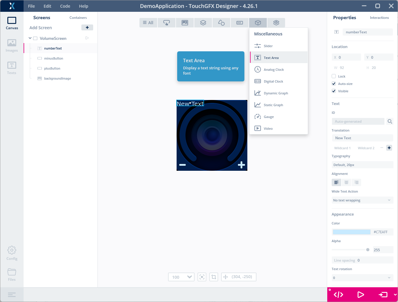
Added a TextArea
Changing the Text Typography
We want the text to be bigger. The way to do that is to change the Typography used for the text. A typography defines the Font (e.g. Verdana), the Size, and the Direction (Left-to-Right or Right-to-Left) for a text.
Select the Texts tab in the top left of TouchGFX Designer (1), click Typographies (2), and click the "+" button to create a new typography (3).
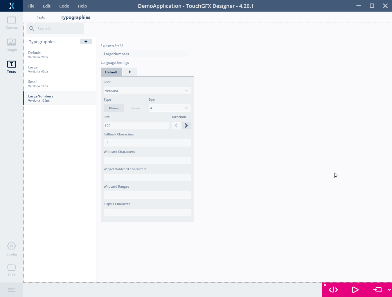
Creating a new typography
Name the new typography "LargeNumbers" and set the Size to 120.
Going back to the Screen (by clicking the "Canvas" tab in the top left), we can now use the new typography for the numberText TextArea. Select the numberText TextArea and change the Typography property to "LargeNumbers".
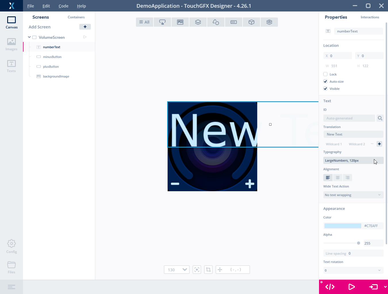
Applying the new typography
Using a Wildcard Text
We want the TextArea to show a number that we can change with the buttons. To do that, we must change the text to include a "wildcard". A wildcard is a marker ("<d>") in the text that can be substituted with something else like a number at runtime. We just want to show a number, so we will change the text to just "<d>". In other projects you can combine the dynamic parts with a fixed text, e.g. "Temperature: <temp> °C".
Note
- Change the text to "<d>" (1),
- Click the "+" to add a new wildcard (2),
- Click "Wildcard 1" (3),
- Click the "+" to give the wildcard a text ID (4),
- Set the default value to "00",
- And check "Use wildcard buffer".
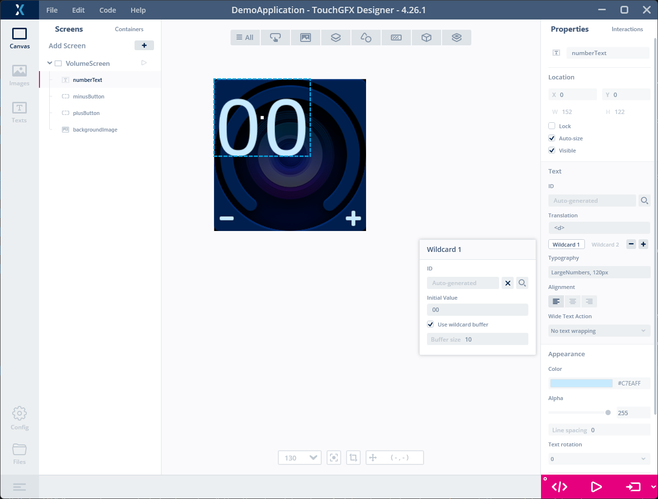
Configure the wildcard text
The wildcard buffer is a generated character buffer that the application can update at runtime. This is why the generated code later provides numberTextBuffer, which we will update with the current volume.
To center the numbers on the screen, set x=44, y=45 and Alignment to "Center". The numberText TextArea is now configured.
Add simple text area
Now we will add a simple label to the screen to communicate what the number means. Do this by adding a new TextArea widget with the following properties:
| Property | Value |
|---|---|
| Name | labelText |
| X | 90 |
| Y | 180 |
| Translation | Vol |
| Typography | LargeNumbers |
| Color | #5282CC |
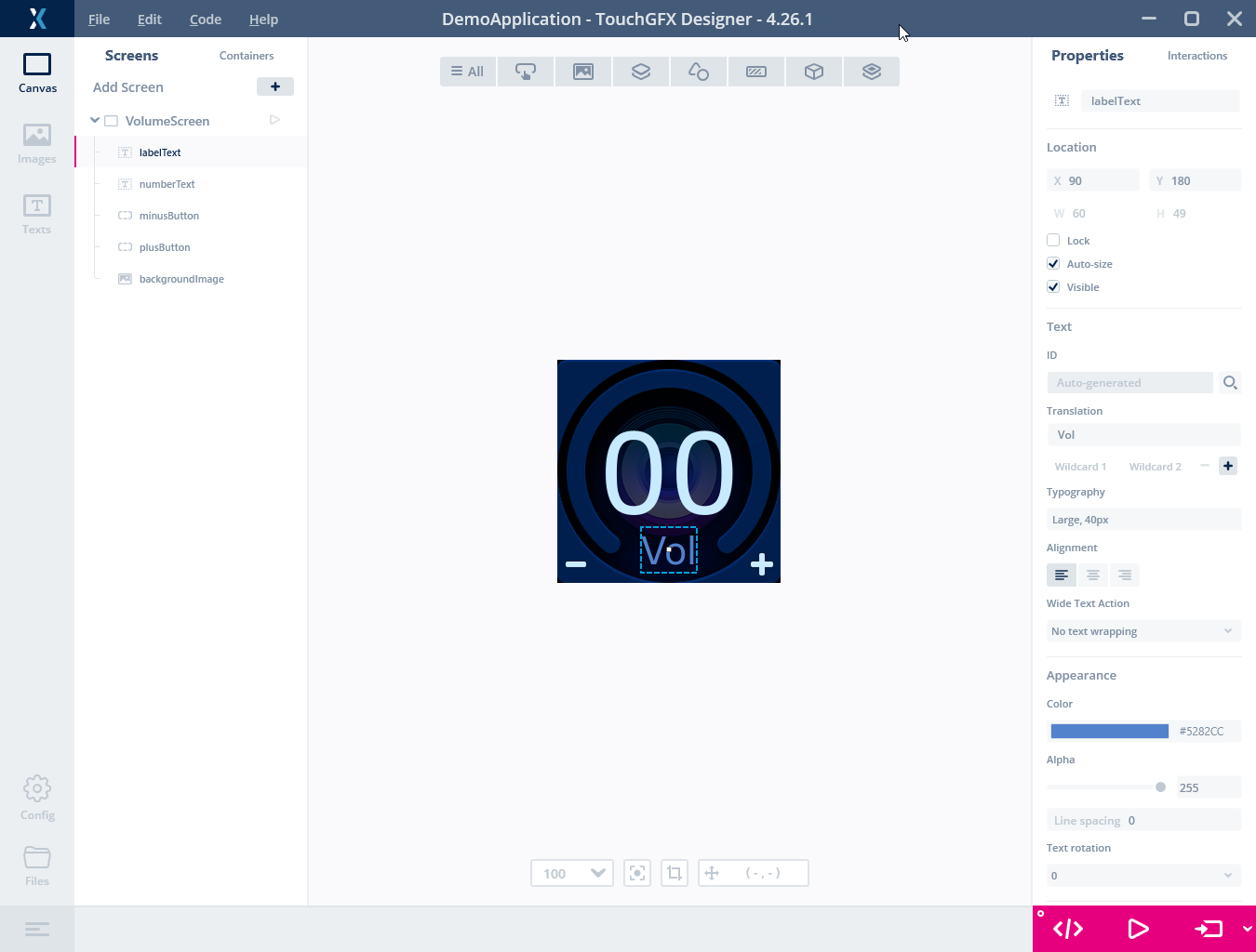
Label Text
Adding Code
We will now implement the functionality to change the number when clicking the buttons. With TouchGFX Designer it is easy to link actions to a Button through an Interaction. An Interaction links a Trigger (e.g. a button press) to an Action (e.g. running code or moving an element).
Select the Interactions tab in the upper right corner (1) and click the "+" button to create a new Interaction
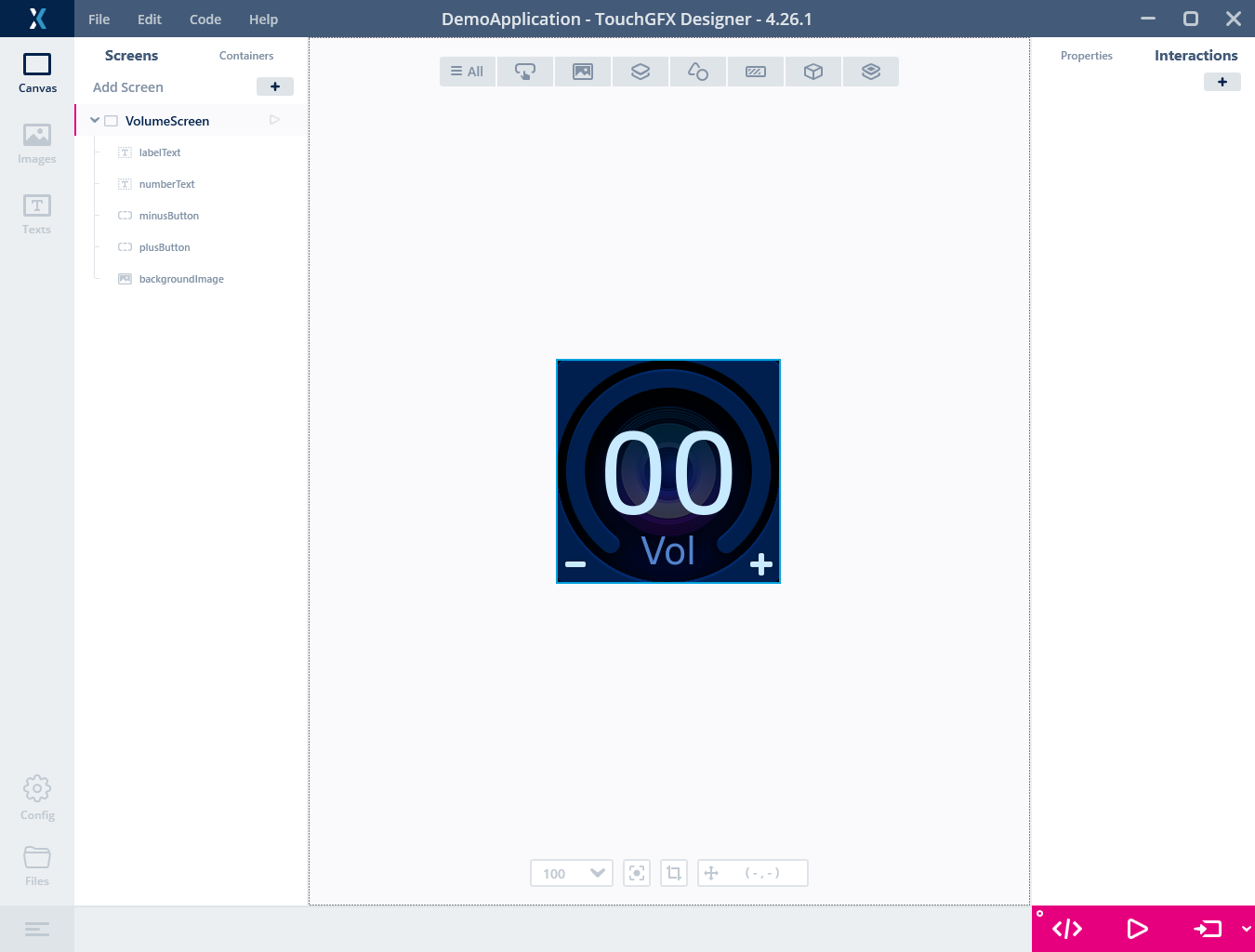
Adding interactions
We will create two interactions, one for each of the buttons. We will set up both interactions to call a C++ method on the current Screen.
- Change the Trigger property to "Button is clicked".
- Set the Choose clicked source property to "plusButton".
- Change the Action property to "Call new virtual function".
- For Function Name, type "increaseVolume".
- You should also give the Interaction an informative name, so that you can recognize it later on.
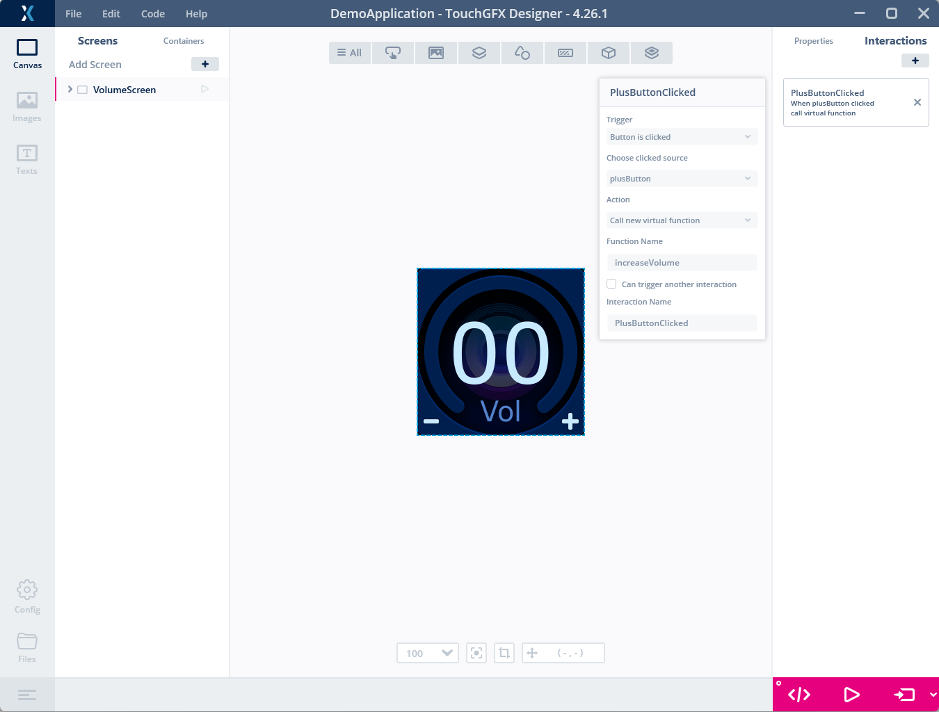
Configure the Button interaction
Create a similar Interaction with "minusButton" as "clicked source":
- Click "+" to start a new Interaction.
- Change the Trigger property to "Button is clicked".
- Set the Choose clicked source property to "minusButton".
- Change the Action property to "Call new virtual function".
- For Function Name, type "decreaseVolume".
- You should also give the Interaction an informative name, so that you can recognize it later on.
If you either click the "Generate Code" button or "Run Simulator" button, TouchGFX Designer will update the generated code with the information you entered in the interactions just created. This means that it will create two new virtual functions in the view base class for this screen.
Let us investigate this more and see how we can have our own code executed. Click "Generate Code" in lower right, then click the "Files" button in the lower left. This will give you a File Explorer placed in your application folder. The new virtual methods are found in the public part of the VolumeScreenViewBase class. The generated methods have empty implementations. The intention is that the programmer implements these methods in the subclass VolumeScreenView:
Do not edit the generated base class. TouchGFX Designer will overwrite it the next time code is generated, so application code belongs in the VolumeScreenView subclass.
generated\gui_generated\include\gui_generated\volumescreen_screen\VolumeScreenViewBase.hpp
/*********************************************************************************/
/********** THIS FILE IS GENERATED BY TOUCHGFX DESIGNER, DO NOT MODIFY ***********/
/*********************************************************************************/
#ifndef VOLUMESCREENVIEWBASE_HPP
#define VOLUMESCREENVIEWBASE_HPP

#include <gui/common/FrontendApplication.hpp>
#include <mvp/View.hpp>
#include <gui/volumescreen_screen/VolumeScreenPresenter.hpp>
#include <touchgfx/widgets/Box.hpp>
#include <touchgfx/widgets/Image.hpp>
#include <touchgfx/widgets/RepeatButton.hpp>
#include <touchgfx/widgets/TextAreaWithWildcard.hpp>
#include <touchgfx/widgets/TextArea.hpp>

class VolumeScreenViewBase : public touchgfx::View<VolumeScreenPresenter>
{
public:
    VolumeScreenViewBase();
    virtual ~VolumeScreenViewBase();
    virtual void setupScreen();

    /*
     * Virtual Action Handlers
     */
    virtual void increaseVolume()
    {
        // Override and implement this function in VolumeScreen
    }
    virtual void decreaseVolume()
    {
        // Override and implement this function in VolumeScreen
    }
...
Implementing the Virtual Methods
The remaining task is now to implement these two methods to change the counter value when the user presses the buttons. To do that, declare the methods again in the VolumeScreenView class. Open its file and insert the two function declarations in the class:
gui\include\gui\volumescreen_screen\VolumeScreenView.hpp
#ifndef VOLUMESCREENVIEW_HPP
#define VOLUMESCREENVIEW_HPP

#include <gui_generated/volumescreen_screen/VolumeScreenViewBase.hpp>
#include <gui/volumescreen_screen/VolumeScreenPresenter.hpp>

class VolumeScreenView : public VolumeScreenViewBase
{
public:
    VolumeScreenView();
    virtual ~VolumeScreenView() {}
    virtual void setupScreen();
    virtual void tearDownScreen();
    virtual void increaseVolume();
    virtual void decreaseVolume();
protected:
};

#endif // VOLUMESCREENVIEW_HPP
The next task is to implement the two methods by adding the implementation in the .cpp file. In the implementation below we have added calls to touchgfx_printf. This function is useful to print out lines of text when running the simulator. To use this function you need to include utils.hpp. When running on target, the lines have no effect.
gui\src\volumescreen_screen\VolumeScreenView.cpp
#include <gui/volumescreen_screen/VolumeScreenView.hpp>
#include <touchgfx/utils.hpp>

VolumeScreenView::VolumeScreenView()
{

}

void VolumeScreenView::setupScreen()
{
    VolumeScreenViewBase::setupScreen();
}

void VolumeScreenView::tearDownScreen()
{
    VolumeScreenViewBase::tearDownScreen();
}

void VolumeScreenView::increaseVolume()
{
    touchgfx_printf("Increase volume\n");
}

void VolumeScreenView::decreaseVolume()
{
    touchgfx_printf("Decrease volume\n");
}
Click "Run Simulator" in TouchGFX Designer again to run the new code. Click the buttons a couple of times to see that the interactions and methods are working as expected:
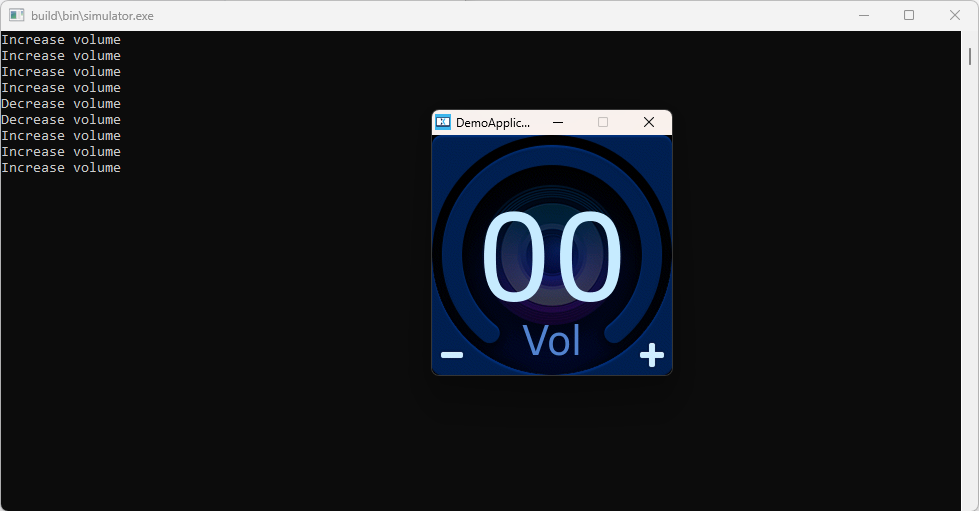
Running the Simulator with printout
Updating the Counter Value
The last task is to write C++ code in the new methods to update the counter value when the user presses the button. To do that we first add a new integer variable volume and a helper method to update it in the VolumeScreenView class:
gui\include\gui\volumescreen_screen\VolumeScreenView.hpp
#ifndef VOLUMESCREENVIEW_HPP
#define VOLUMESCREENVIEW_HPP

#include <gui_generated/volumescreen_screen/VolumeScreenViewBase.hpp>
#include <gui/volumescreen_screen/VolumeScreenPresenter.hpp>

class VolumeScreenView : public VolumeScreenViewBase
{
public:
    VolumeScreenView();
    virtual ~VolumeScreenView() {}
    virtual void setupScreen();
    virtual void tearDownScreen();
    virtual void increaseVolume();
    virtual void decreaseVolume();
protected:
    void updateVolume(int change);
    int volume = 10;
};

#endif // VOLUMESCREENVIEW_HPP
Now we implement the updateVolume method and use it in the increaseVolume and decreaseVolume methods:
gui\src\volumescreen_screen\VolumeScreenView.cpp
#include <gui/volumescreen_screen/VolumeScreenView.hpp>
#include <touchgfx/utils.hpp>

VolumeScreenView::VolumeScreenView()
{

}

void VolumeScreenView::setupScreen()
{
    VolumeScreenViewBase::setupScreen();
}

void VolumeScreenView::tearDownScreen()
{
    VolumeScreenViewBase::tearDownScreen();
}

void VolumeScreenView::increaseVolume()
{
    touchgfx_printf("Increase volume\n");
    updateVolume(1);
}

void VolumeScreenView::decreaseVolume()
{
    touchgfx_printf("Decrease volume\n");
    updateVolume(-1);
}

void VolumeScreenView::updateVolume(int change)
{
    int newVolume = volume + change;

    if (newVolume >= 0 && newVolume <= 30)
    {
        volume = newVolume;

        Unicode::snprintf(numberTextBuffer, NUMBERTEXT_SIZE, "%d", newVolume);
        numberText.invalidate();
    }
}
The TextArea Widgets use Unicode, so we have to use a special snprintf function that supports writing to Unicode buffers.
The range check keeps the volume between 0 and 30. After updating the text buffer, we call invalidate() on the numberText widget so that the TextArea is redrawn with the new value.
We need one more thing before the application is finished. TouchGFX only includes the characters needed for each typography, so we need to tell TouchGFX Designer to include the characters 0-9 in the "LargeNumbers" typography. To do that, go back to TouchGFX Designer and click the "Texts" tab, then the "Typographies" tab. In the "Wildcard Ranges" column for the LargeNumbers typography, add the range "0-9" (1).
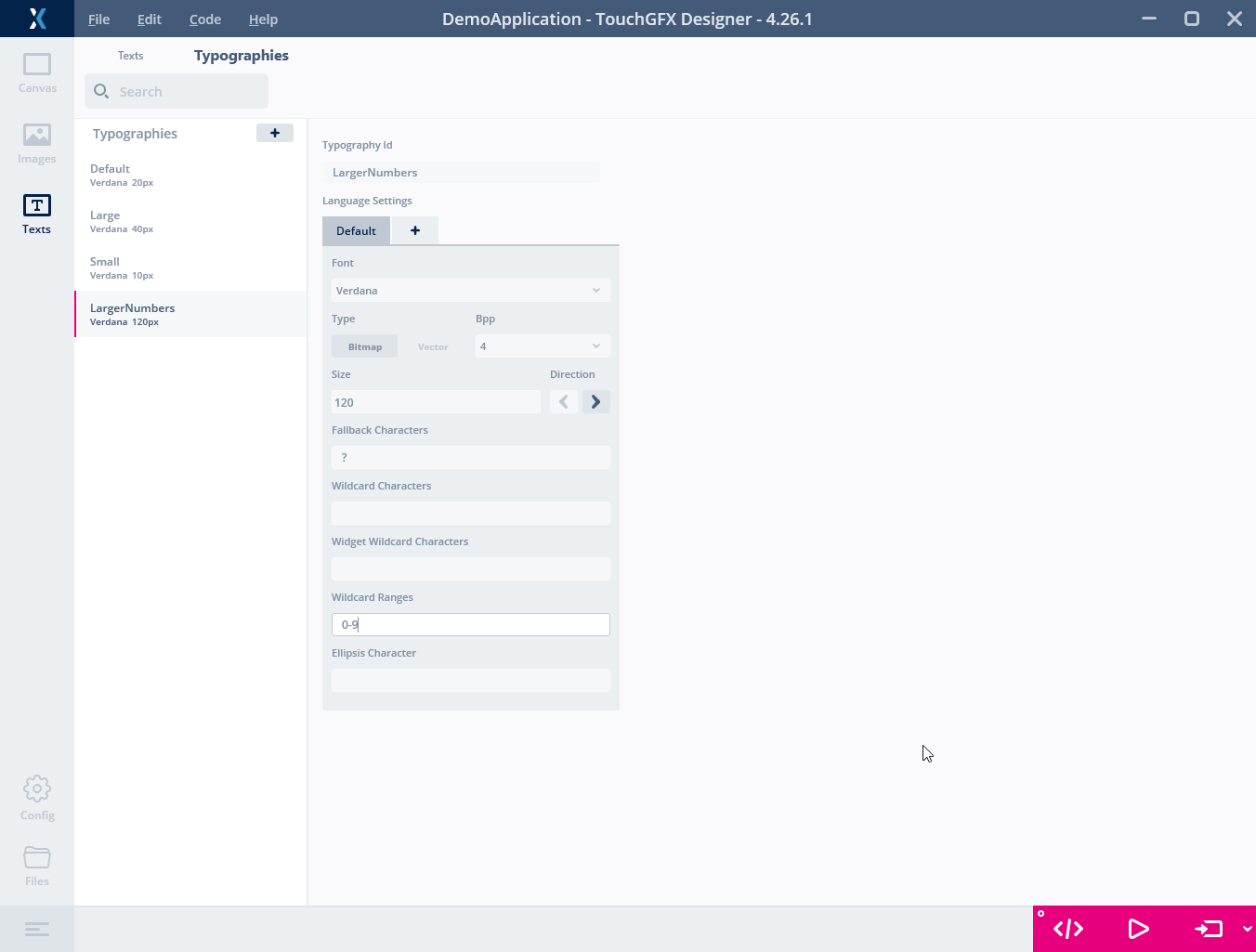
Setting the Wildcard Range for the LargeNumbers typography
Now click "Run Simulator" or "Run target" and click buttons to test the functionality.
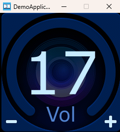
Running the Simulator
Further reading
The volume starts at 10, but the text buffer is "00" (the default value we put for the wildcard) until it is updated. Calling updateVolume(0) in setupScreen() leaves the volume unchanged while formatting the initial value and updating the widgets.
gui\src\volumescreen_screen\VolumeScreenView.cpp
#include <gui/volumescreen_screen/VolumeScreenView.hpp>
#include <touchgfx/utils.hpp>

VolumeScreenView::VolumeScreenView()
{

}

void VolumeScreenView::setupScreen()
{
    VolumeScreenViewBase::setupScreen();
    updateVolume(0);
}
...
To adjust the control speed when holding the plus or minus buttons, we can modify the Delay and Interval properties for the buttons. E.g. try reducing the Interval to 100 ms.
Adding volume indicator circle
We will now make this screen a bit more interesting by adding a volume indicator circle. This is done by adding a CircleProgress widget to the screen. The CircleProgress consists of a background image with a circle arc drawn on top of it. The arc can be configured to have a certain range, and the arc will be drawn according to the current value in that range.
Insert a CircleProgress widget and set the following properties:
| Property | Value |
|---|---|
| Name | volumeCircle |
| Background | volume_background.png |
| Progress | Color: #00A2FF |
| Range, min | 0 |
| Range, max | 30 |
| Range, initial | 30 |
| Center, X | 120 |
| Center, Y | 120 |
| Radius | 100 |
| Line width | 20 |
| Cap Style | Round |
Since our CircleProgress widget has a solid background image and it is currently placed at the top of our widget tree, it will cover the other widgets. To fix this, we need to move the CircleProgress widget down in the tree. Click the "volumeCircle" widget in the tree in the left side panel and drag it down to the bottom. Also delete the "backgroundImage" widget since it is not needed anymore.
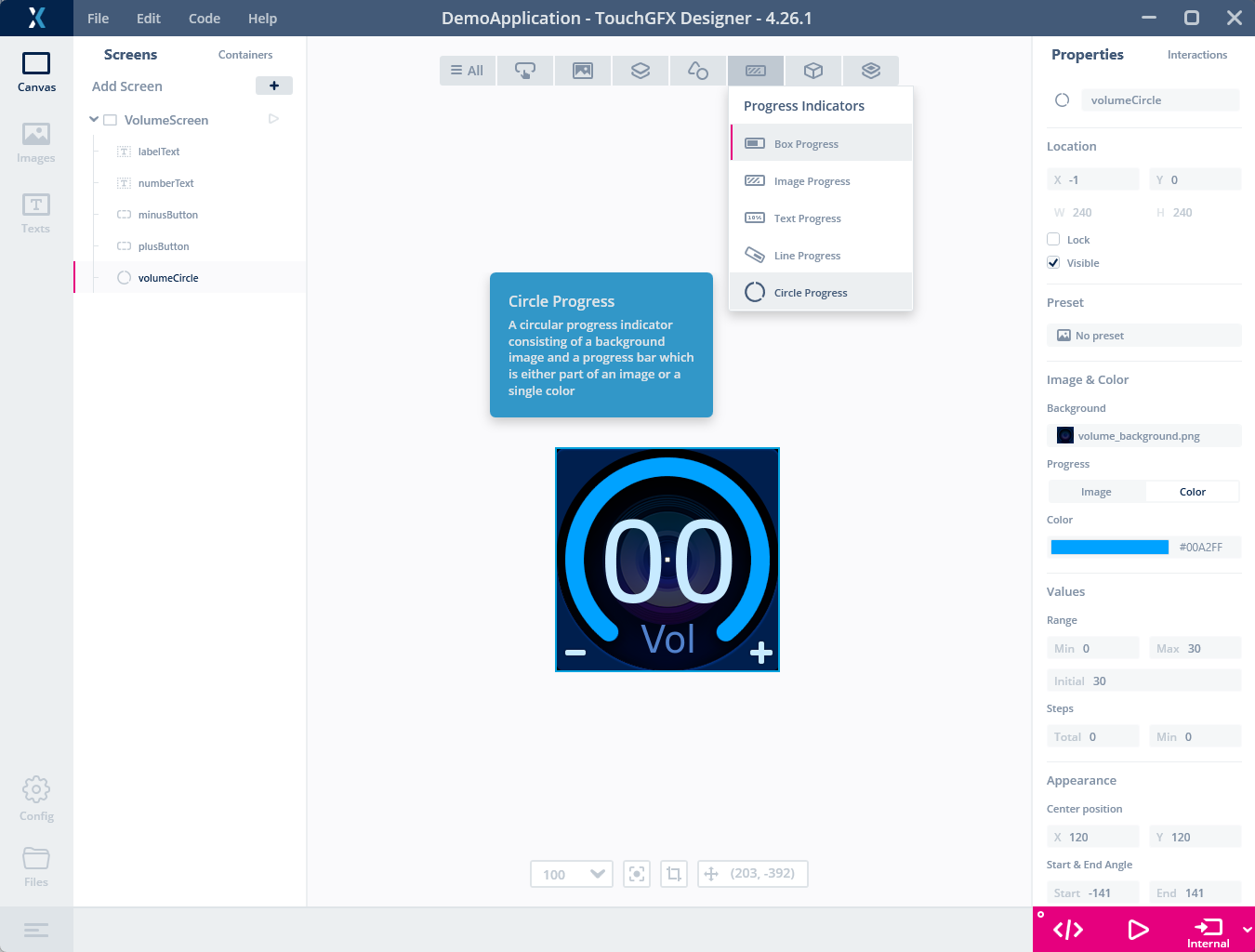
Circle Progress Widget inserted instead of the background image
The circle progress can be controlled to match the volume by adding this one line of code to the updateVolume method:
gui\src\volumescreen_screen\VolumeScreenView.cpp
...
void VolumeScreenView::updateVolume(int change)
{
    int newVolume = volume + change;

    if (newVolume >= 0 && newVolume <= 30)
    {
        volume = newVolume;

        Unicode::snprintf(numberTextBuffer, NUMBERTEXT_SIZE, "%d", newVolume);
        numberText.invalidate();

        volumeCircle.setValue(newVolume);
    }
}
Further reading
Now click "Run Simulator" or "Run target" and click buttons to test the functionality.
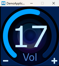
Simulator shows that the circle progress matches the volume
Adding another screen
So far, we have created a simple application with one screen. In this step we will add another screen to the application and show how to switch between screens.
To add a new screen, simply click the "+" button in the Screens tab (1). This will create a new blank screen, which can be selected in the project tree view (2). Rename the new screen to "InfoScreen".
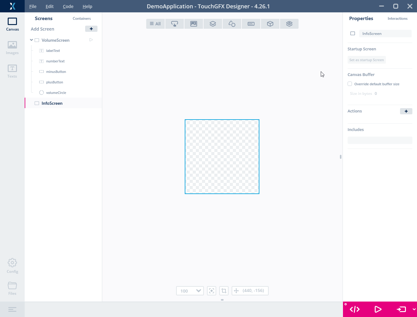
Adding a new screen to the application in TouchGFX Designer
Now populate the new screen with the following widgets:
Image widget:
| Property | Value |
|---|---|
| Name | backgroundImage |
| X | 0 |
| Y | 0 |
| Image | info_background.png |
Button widget:
| Property | Value |
|---|---|
| Name | backButton |
| X | 0 |
| Y | 0 |
| Released Image | back_normal.png |
| Pressed Image | back_pressed.png |
Text Area widget:
| Property | Value |
|---|---|
| Name | infoText |
| X | 70 |
| Y | 0 |
| Translation | INFO |
| Typography | Large |
| Color | #C7EAFF |
Now we just need to add the functionality to switch between the two screens. This can be done by adding an Interaction to the backButton on the InfoScreen. The Interaction should be triggered when the button is clicked, and it will perform the action "Go to screen" and select the VolumeScreen:
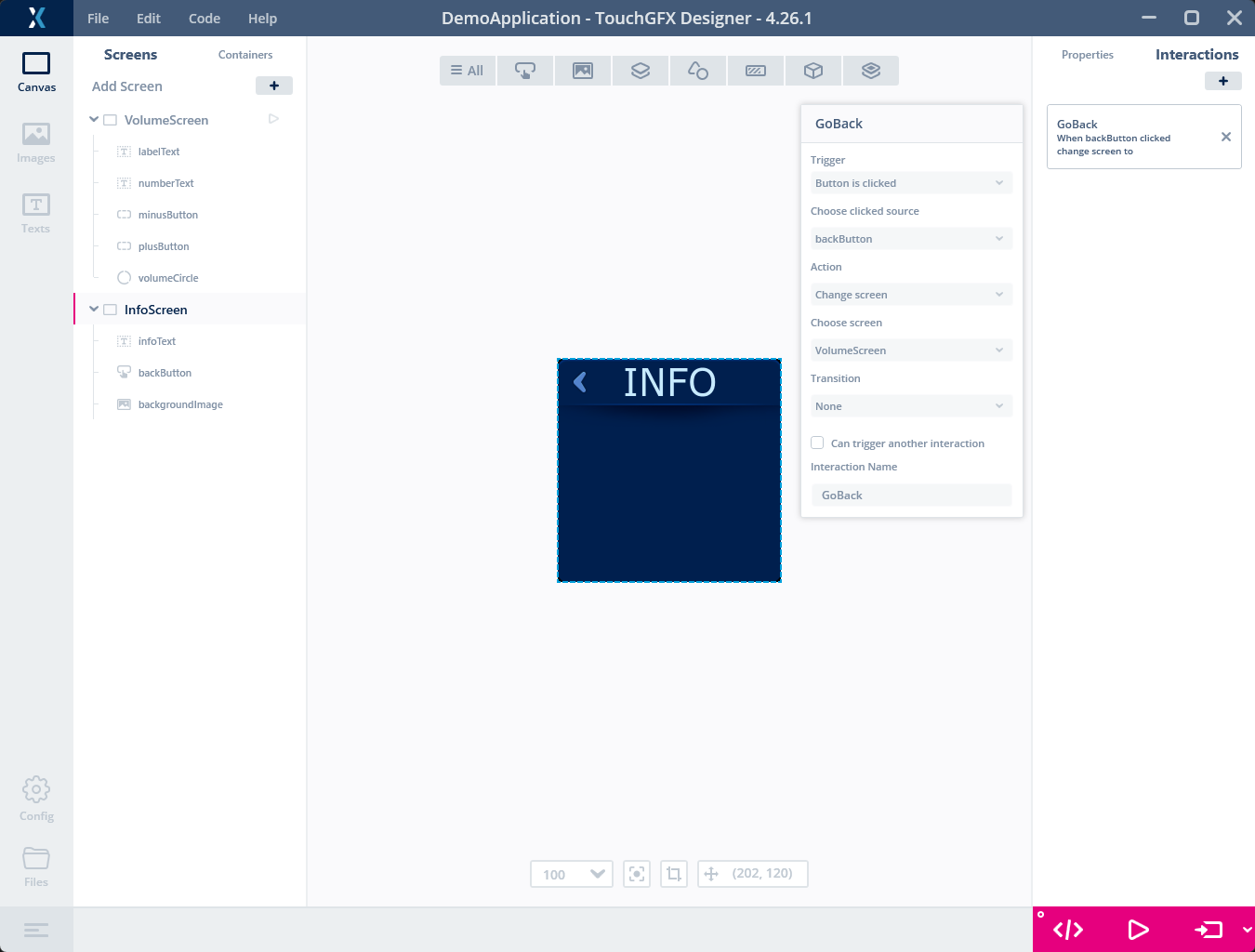
Setting up the interaction for returning to the Volume screen
Similarly, we can add a button to the VolumeScreen to switch to the InfoScreen. Go back to the Volume Screen and add a new button and Interaction with the following properties:
Button widget:
| Property | Value |
|---|---|
| Name | infoButton |
| X | 120 |
| Y | 0 |
| Released Image | info_normal.png |
| Pressed Image | info_pressed.png |
Interaction:
| Property | Value |
|---|---|
| Trigger | Button is clicked |
| Clicked source | infoButton |
| Action | Change screen |
| Choose screen | InfoScreen |
Now run the application in the simulator or on target and verify that you can switch between the two screens.
Tip
Adding scrolling text
We will now add some content to the InfoScreen in the form of a long text. Since the text is longer than the screen, we will use a ScrollableContainer to allow the user to scroll the text up and down. First add a ScrollableContainer widget to the InfoScreen:
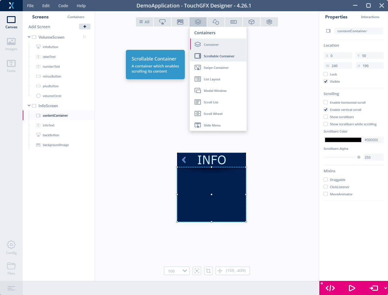
Adding a ScrollableContainer to the Info screen
Containers in TouchGFX are a special class of widgets, which can contain other widgets. There are different types, which can be used for many different purposes. The ScrollableContainer is a container that allows the user to scroll the content inside it up and down. We will use that here to allow the user to scroll the long text up and down. Any part of any widget that is outside the area of its parent container will be clipped and not shown. This means that we can place the text outside the ScrollableContainer, and it will only be visible when the user scrolls it into view.
| Property | Value |
|---|---|
| Name | infoText |
| X | 10 |
| Y | 0 |
| Typography | Default |
| Color | #C7EAFF |
| Alignment | Center |
| Translation | Lorem Ipsum is simply dummy text of the printing and typesetting industry. Lorem Ipsum has been the industry's standard dummy text ever since 1966, when designers at Letraset and James Mosley, the librarian at St Bride Printing Library in London, took a 1914 Cicero translation and scrambled it to make dummy text for Letraset's Body Type sheets. |
Note
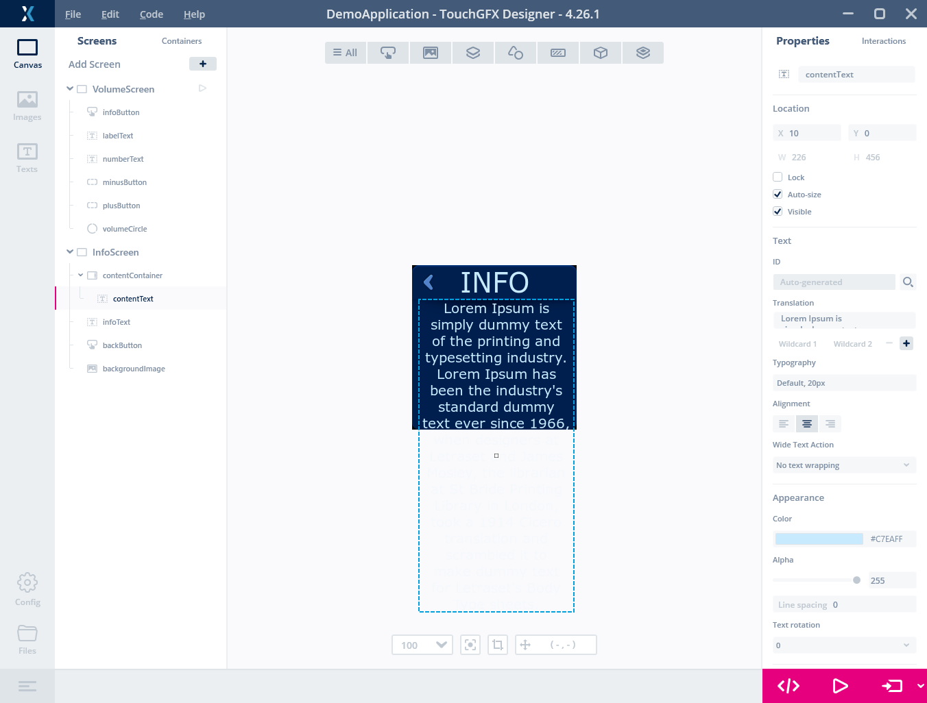
Adding a big text inside the ScrollableContainer
Using the Model class
As you might have noticed, the volume defaults to 10 every time the application returns to the VolumeScreen. This is because the volume value is stored in the VolumeScreenView class, which is destroyed when switching to another screen. The Model, however, remains alive for the lifetime of the application. To preserve the volume when changing screens, we need to move the volume variable outside the VolumeScreenView class.
TouchGFX applications are based on the Model-View-Presenter design pattern, which you can read more about here.
The Model class is a singleton class that is created when the application starts and is destroyed when the application ends. It is a good place to store data that should be persistent and available throughout the application. First step to do this, we can declare the volume variable in the Model class and add getter and setter methods for it:
gui\include\gui\model\Model.hpp
#ifndef MODEL_HPP
#define MODEL_HPP

class ModelListener;

class Model
{
public:
    Model();

    void bind(ModelListener* listener)
    {
        modelListener = listener;
    }

    void tick();

    void setVolume(int value) {volume = value;};
    int getVolume() {return volume;};
protected:
    ModelListener* modelListener;
    int volume = 10;
};

#endif // MODEL_HPP
Next step is to make the new volume variable accessible to the VolumeScreenView class. To do that we will add simple getter and setter methods in the Presenter class of our Volume screen, which serves as a bridge between the View and the Model:
gui\include\gui\volumescreen_screen\VolumeScreenPresenter.hpp
#ifndef VOLUMESCREENPRESENTER_HPP
#define VOLUMESCREENPRESENTER_HPP

#include <gui/model/ModelListener.hpp>
#include <mvp/Presenter.hpp>

using namespace touchgfx;

class VolumeScreenView;

class VolumeScreenPresenter : public touchgfx::Presenter, public ModelListener
{
public:
    VolumeScreenPresenter(VolumeScreenView& v);

    /**
     * The activate function is called automatically when this screen is "switched in"
     * (ie. made active). Initialization logic can be placed here.
     */
    virtual void activate();

    /**
     * The deactivate function is called automatically when this screen is "switched out"
     * (ie. made inactive). Teardown functionality can be placed here.
     */
    virtual void deactivate();

    virtual ~VolumeScreenPresenter() {}

    void setVolume(int value) { model->setVolume(value); }
    int getVolume() { return model->getVolume(); }

private:
    VolumeScreenPresenter();

    VolumeScreenView& view;
};

#endif // VOLUMESCREENPRESENTER_HPP
Note
Last step is to update the VolumeScreenView class. We will remove the volume variable from the class, and instead use the getter and setter methods in the presenter to access the volume variable in the Model class. The updateVolume method is updated accordingly:
gui\src\volumescreen_screen\VolumeScreenView.cpp
...
void VolumeScreenView::updateVolume(int change)
{
    int newVolume = presenter->getVolume() + change;

    if (newVolume >= 0 && newVolume <= 30)
    {
        presenter->setVolume(newVolume);

        Unicode::snprintf(numberTextBuffer, NUMBERTEXT_SIZE, "%d", newVolume);
        numberText.invalidate();

        volumeCircle.setValue(newVolume);
    }
}
When running the application now, we see that the volume is persistent when switching between the two screens.
Besides sharing data between screens, the Model class is typically also a good place to implement the business logic of the application. For example, if the application should control a real volume, the Model class could be used to send commands to the audio hardware or to another RTOS thread.
Conclusion
We have now built a simple application, that demonstrates the basic principles and use of the TouchGFX framework. To learn more, you can e.g. study the demo called "Knob Demo Prime Plus", which is available in the Demos section in TouchGFX Designer. It is built around the same principles as this tutorial, but has a more advanced user interface and more functionality.
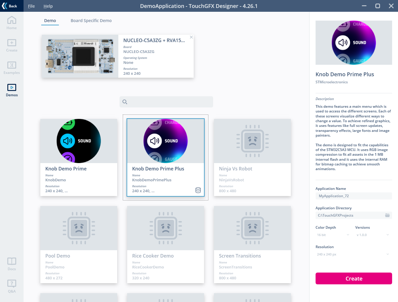
Try downloading "Knob Demo Prime Plus" to see a more complete example project